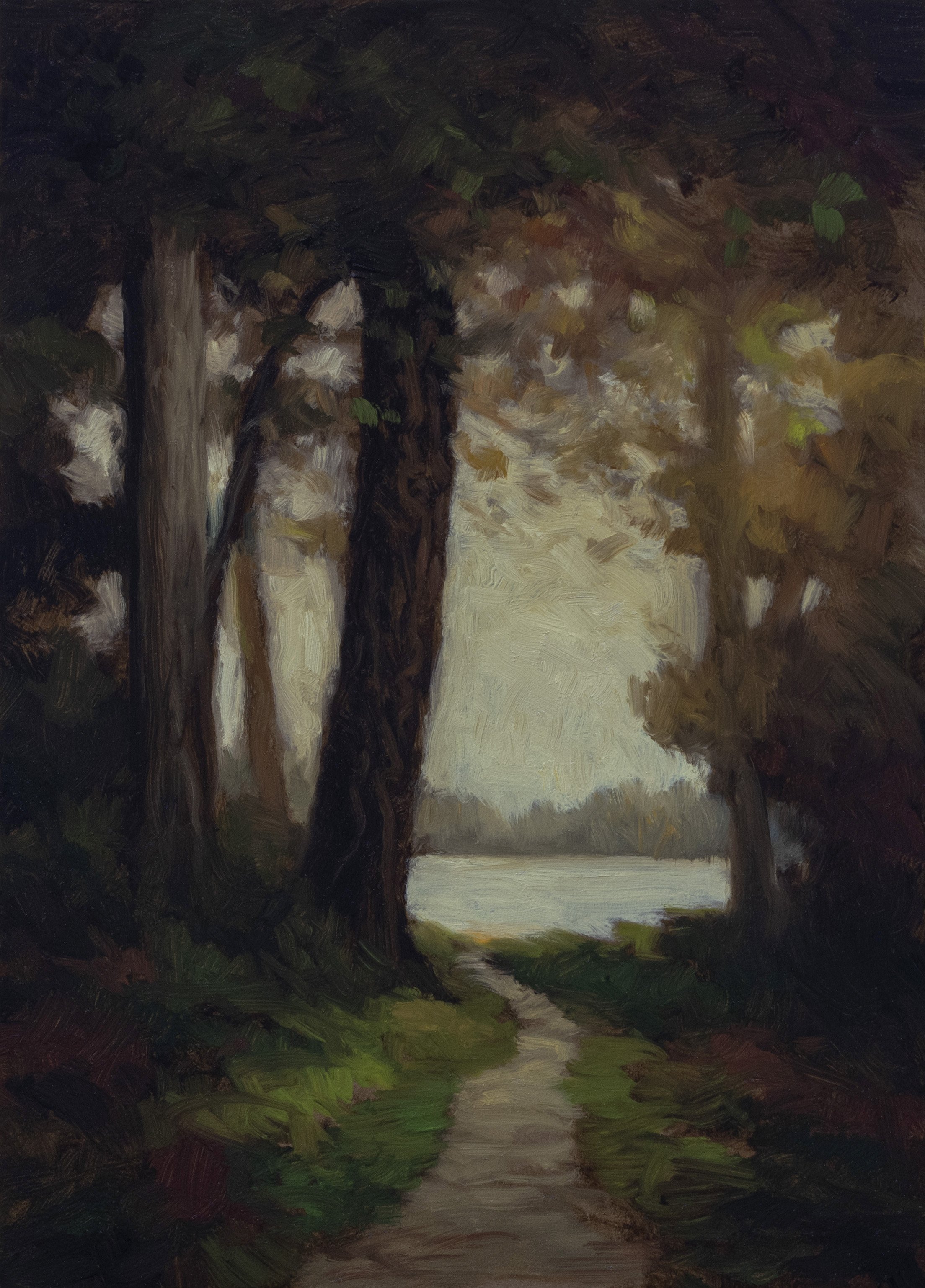
The Quiet Path 5x7
Exploring loose brushwork, opaque color mixing, and the art of knowing when to stop
Summerized Transcript
This painting is very loosely based on an Inness study - and I say very loosely because it really doesn’t resemble the original much anymore. I ran the initial concept through digital manipulation extensively, then worked it heavily in Photoshop to get something I thought would work as a painting reference.
Now, I was a commercial illustrator, so I know all about time-saving tips and tricks. I don’t do the digital manipulation because it’s a time-saver - I do it because I’m looking for riffs. You want to riff on the masters, man. I could do this a lot of different ways.
The Quiet Path 5x7
Making Art vs. Making Money
I don’t know if I’ll ever sell this painting, and it doesn’t really matter, does it? If you start making stuff just because you know you’re going to sell it, well, that makes you a commercial artist. I had no shame - I was one - but I will say be careful. Are you making art to make money? There’s better ways to make money. Go into real estate or buying and selling currency. Actually, for some of you younger types, Bitcoin. Figure that stuff out if you want to make money.
The Drawing Phase
I’m pretty happy with this drawing. The way the light hits everything is really one of the best features of this reference - it takes on a glow. And of course, we have our path winding through.
No outlines in this one. That’s it, Mike. You’ve had your fun. This would be great for my new foliage technique, which is dappling. In the reference, the hills are quite big, but we don’t want that. We want something more effective - a little bit on one side of the path, a little bit on the other.
Color Strategy and Palette Setup
I’m not going to bother with formal color mixing demos - we’re just going to mix as we go. It’s all colors I’ve done a gazillion times before, but the variations, my friend, it’s all in the variations. You know, I don’t worry about being original. I think that’s a trap. I don’t need to stress about expressing myself in a beautiful manner. How could anything good come from that sort of concern?
Key Players Today:
Yellow Ochre - topped up the crusty tube, it’s like pricey paste
Mars Yellow - such a key, important color, gonna be a player
Mike’s Green - acrylic yellow and ivory black mix
Cadmium Orange - gonna be a player
Mixing Red - Winton cadmium red hue
Burnt Sienna - really gonna be a player, especially for making opaque versions
Mars Black - for the darks
Sky Work
Let’s make some sky color. We’re gonna put the two whites together - doesn’t look like sky to me at first, but then it comes together. Making a darker version too - it’s gone a little greener, that’s why we have the mixing red to neutralize it.
Dark sky, light sky - that’s our range.
The Dark Strategy
Similar to my last painting, I want to try and avoid real strong, actual blacks. That’s my plan. The reason for the Mars Black is because I want to come in pretty thin, basically just sort of tint what’s there.
You can see the difference between Mars Black and Ivory Black - not much different, but a little darker with the Mars, and that’s what I want.
Green Mixing Technique
Starting with perylene green, a good chunk, a little bit of Mars Yellow just to orient us. I do some of that mixing with the knife, especially that initial mixing - it’s just going to save on wear and tear.
The Green Strategy:
Basic color mixing, making it opaque and earthy
More mileage with opacity
A variant that’s darker with more red in it
Green, then red, then green - moving into dark green
That red mixed with the green - that’s a trick I’ve been doing with burnt sienna forever, but the trick actually works even better with the mixing red.
The Foliage Technique
What I like to do is green, then red, then green. You don’t want it to be like one side green, the other side red - don’t do that. The opacity is really helping us out. Everything I’ve been doing lately has been quite transparent, so this opaque approach is refreshing.
Where the colors meet, we’re going to get into a goldier red - that’s the magic transition area.
Tree Work and Final Details
The reference has two trees, but to me, that’s not a good plan compositionally. I’m keeping it to one main trunk with the path winding around it.
I really like the way that foliage looks - I’m not going to mess with that. I’m pretty happy with the way the whole thing looks.
The Danger Zone
I’m dangerously close to overworking this, I know it’s hard to believe. I’m just going to let it be the little painting it is. I’m not going to try and make this a perfect little painting - it is everything it’s going to be right now.
What we do need to do is a little bit of refining of where some areas bunch up, but that’s about it.
The Overworking Lesson
Funny enough, I just put in a detail and immediately regretted it. That’s how you know you’re overworking things. Sometimes you add something and immediately think “I don’t like that” - that’s the painting telling you it was done before you added that last bit.
Better to step back and leave it alone.

Reference Image

Final Thoughts
This loose, brushy approach with the opaque color mixing really gives the painting a different quality from my recent transparent work. The digital reference manipulation gave me something to riff on without being tied to a specific photographic reality.
The key was knowing when to stop - that moment when you realize the painting is everything it’s going to be, and any additional work is just going to diminish what’s already working.
This study demonstrates the balance between digital reference tools and traditional painting techniques, showing how contemporary methods can enhance rather than replace fundamental artistic skills.
Cheers,
Mike