2015- 2016 Blog
I'm still blogging though just click here
100 days of Tonalism started as a blog just for that project but since completing thec100 days I've done posts with videos featuring my own work. I will still be presenting more Tonalist studies after Masters there as well so check it out!
Happy Holidays!
Not a big year for blogging 2014. Who knows though? Perhaps 2015 will be better!
I completed a lot of paintings in 2014 and overall I'm happy with the quality of my work this year. I've got a good rhythm of painting going as I'm in the studio hitting it hard everyday.
Paintings - Ahoy!
Hi Everyone,
I'm going to do double duty with this blog post today as I am now presenting work on Ugallery.com.

My page on Ugallery is here. I am super excited about working with Ugallery. After looking at many online venues for my work I selected them because:
- Professional presentation on multiple devices like computers, phones and tablets.
- Curated art (this was crucial as many online galleries are a free for all armature fest)
- I like the site originators philosophy and ideas.
- I needed online representation.
Also I know I've been a lax blogger. I've made promises that weren't kept but I'm going to try to do one blog post per week. I may pick a day like a Tuesday and do that. Stay tuned...
Cheers,
A bit about "Woodland Brook". I painted this one in early December. I'm happy with it because it's the type of scene I found hard to handle until last year. This type of scene is all about simplification and using the reference only lightly. There were tons more trees in the photo I took of this scene.
What Not, To Do
Hi all,
I've been painting a lot as usual. It occurred to me today that knowing what not to paint was probably just as important as knowing what does work well.

"Sundown" Size 8x10 by M Francis McCarthy
It's a list that keeps growing and changing as I progress as a landscape painter. BTW, That list is going to be different for different artists with unique styles and temperaments. As an artist you should be in touch with your inner guidance. Intuition is also best, when aided by reason and experience.

"Sundown" Size 5x7 by M Francis McCarthy
Here's some of the things that don't work for me:
- Blue skies with fluffy clouds. Sigh...
- All in a row type compositions. Note I have found some ways out of this type of issue. Today's painting shows one way.
- Fences, alas, do not work for me. I say alas as they can be and have been used very effectively by other artists.
- Certain types of trees, like poplars and conical pines. I have done some pretty good paintings that had these types of trees but they present myriad challenges.
- 100% white or black, doesn't work in my art. I've always gotta hold something back.
- Roads or paths that are too horizontal, tend to cut up the picture plane too much.
- Lot's of tiny brush strokes, strangle the art. Sometimes can't be avoided if you'r struggling to get something across
That's just off the top of my head. There's about fives times that. I'm not recalling it all right now. Like I said the list grows AND changes. I recently pulled off a nice painting that had a tea tree in it and that was not something I could do well in the past.
I'm always trying to stretch the boundary and often I do succeed in striking an item off the list of "No Go". While at other times I end up just reminded of the path best not taken, yet again.
Cheers,
A bit about "Sundown". "Sundown" is a imaginary scene based on a photo of a field that I'm quite pleased with. Most of the larger version was painted at the local artists market last month and touched up a bit later in the studio. My original conception of the scene had a different sky that after painting the first version of the 5x7, I realized needed to be improved. I used the 5x7 to recreate the sky and took that to the larger painting later.
As I mentioned above. This is a good example of what I call a "all in a row" composition. Usually this type of composition is too lacking in movement to work well. My strategy to solve this was to create compositional interest on the ground with wetlands/puddles and above in the sky with strategic cloud placement. I'm chuffed with the final painting. I'm especially pleased with the fracture in my brush strokes.
Quality = Quantity
Hi all.
I was reading this article today: Quantity is priority. Though it's on some kind of corporate marketing site, I'm in strong agreement with the author. I feel it applies to landscape painting 100%.

"Near Evening" Size 8x10 by M Francis McCarthy
With each year that I've been painting here in New Zealand I've striven to increase the amount of actual paintings that I create. While there are some artists that feel they need to ruminate and procrastinate to accomplish that masterpiece. The truth is, odds are going to dramatically increase if you are painting all the time. There is no substitute for experience.
Here's a question for you. Who is likely to be the better painter: the person who reads 200 books and does one painting, or will it be the artist who reads a few books and does 200 paintings. We all know the answer to that is going to be pretty obvious.

"Near Evening" Size 5x7 by M Francis McCarthy
I know that I harp on working hard quite a lot here. And hey, this article gave me another excuse to talk about working hard at painting. Experience is the best teacher and if you want to paint very well, it is the only teacher that will get you there.
Cheers,
A bit about "Near Evening". Both the 5x7 and 8x10 versions of this motif were done last month. This is a very "New Zealand" type of scene with the Tea Tree featured prominently in the foreground. It's not often that I paint trees like this but my confidence in handling more wispy types of trees has increased. I'm happy with both versions.
For the 8x10 I used a technique whereby I removed excess paint from the tree trunks by painting in the sky, letting it dry, then panting my tree over the top. I then used apiece of paper to blot up the excess paint. This gave the nice subdued effect that I was after.
Why Paint the Landscape?
When I was a young artist I hardly ever drew the landscape. I was fascinated with drawing people, their figures and faces.
There were a few times I went after the landscape in the 80's. I had an instructor for a short time in oil painting. And, I did a series of drawings of oak trees also. There was also some commercial illustrations that I did of various points of interest in California.
"Daybreak" Size 8x10 by M Francis McCarthy
But this hardly detracted from my constant work at the human form. I was driven to master all the aspects of figure drawing and I practiced it constantly.
So, why did I become a landscape painter then? Why not paint people instead?

"Daybreak" Size 5x7 by M Francis McCarthy
I guess I always knew in my heart that one day I'd be a landscape painter. When I was younger I'd cast my mind into the future and sometimes the idea of being a landscape painter would strike me. The idea always felt right. Like a comfortable pair of old jeans.
Because it felt right I could also find lot's of reasons that I'd like to do it. Some of the reasons to become a landscape painter that I was attracted to were:
- I like the idea of creating an independent artwork. A painting stands on it's own and moves were it's wanted.
- Landscape painting is the purest way (next to abstract art) to convey and create emotions with art. Because there are no people in it, a landscape painting is totally open to the viewer. They can occupy and enjoy the space that's been created by the artist with few barriers.
- Landscape painting is classic. I'm connected to a tradition stretching back hundreds of years. This gives me support as a painter as I add my own interpretation of the landscape to the body of paintings that have gone before me.
- I thought landscape painters made good money. Some do, and one day I will as well. The ability to create without dealing with editorializing by a committee or art director is absolutely awesome either way.
- I want to be involved in something that has some permanence. Good paintings accomplish this, working in something like bronze would be even better. Paintings on good wood panels will do though.
- Landscape painting is fun. It is...
Guess that's enough for now. Thought it would be nice to lighten things up after my last two posts. I love Art and I love painting the landscape. I've said it before but I'm lucky to have such work and I do my best to create paintings that are worthy of the time spent creating them.
Cheers,
A bit about "Daybreak". I'm showing both the small oil sketch version and the larger 8x10 here. The differences are interesting. You wouldn't think that a jump in size of only double would be much different but the 5x7 size is far more restrictive when it comes to detail and brushwork.
I do scale up my brush sizes as I increase my paintings size. I like to work with a brush that's slightly too big. I written about why in several blog posts.
The inspiration for these paintings came from a trip my wife and I made to Kauai Hawaii. This outcropping of trees was at the end of the freeway that goes around two thirds of the island. Though the inspiration is a Hawaiian scene. Like all of my paintings it could be anywhere. What I try to paint is the reality just below the surface. You could call it the spiritual landscape.
Good Art.. What is It Really?
Hey all,
Well after writing the Slog last week, I thought I'd talk a bit about Art. What it is, isn't, and how I feel about it.
I was touring around a bit today here in Northland New Zealand, and there are quiet a few art events going on here and there that got me thinking about Art with a capital A.
First off let me say that this is a topic that I feel strongly about and I'm not too interested in being PC about my thoughts on this topic. If you are an artist, or consider yourself an artist, that's between you and God. My opinion is just that. My opinion.

"Summer Dusk" Size 8x8 inches by M Francis McCarthy
With that said...
So much that I see called art out there, frankly, appalls me. Much of it is amateurish crap with prices attached. Sorry but that's the truth. I wish that people would work harder at their art. Not just squirt out some paint on a canvas in a style that copped from some other half-assed yahoo.
It's not just a lot of "modern" styled art that's crap, but much of the representational art I see is lacking quality and, or, originality also. Why is there so much bad art out there? What can be done about it if anything?
I think there's so much bad art because much of our generation of artists and a few proceeding us, have been taught that art is something you just "feel" and that it will just magically occur with little or no skill needing to be being employed on the part of the artist. That, Art just pops into existence from some kind of divine lightning bolt of inspiration.
This fallacy has come about in large part due to the work of many untutored "modern" artists being embraced by the art establishment. There is such a thing as good amateur art. But, it is the rarest of commodities. Truth be told most good "modern" art has been created by artists that knew how to draw and paint but as a part of their artistic progression, choose to subsume or even obliterate representational qualities from their work.
As far as I'm concerned if you don't have some skill at drawing or a lot of practice in painting the odds of you creating good original Art, are close to zero. If by some chance, you do create something good, odds are great that you will not be able to keep your work at a high level without outright copying another artists work or style. You'll just keep repainting your last successful piece over and over like some sad automaton.
By the way, when I said that calling yourself an artist is between you and God. That means even if your successfully fooling the art establishment, your peers, and yourself, you're still not fooling the universe. Good art is, truth, beauty, and most importantly, lasting. Crap art will eventually sink like a turd to the bottom of the bowl. Only to be flushed by art history.
So, what can be done?
First off. Stop lying to yourself. Stop being lazy and roll up your sleeves. Get to work. If a jobs worth doing, it's worth doing well. Stop believing your friends when they tell you that your latest crappy painting is inspired goodness. They probably don't have the guts to tell you the truth. Or perhaps letting you think you're hot stuff is salving their lazy praise craving egos as misery loves company.
Either way, knowing when you are creating worthless art is the first job of any self respecting artist. And, deciding that you can and will do better is the only way out. If creating good art was easy, there would be a lot more of it around. It's not easy. It's hard, and inspired or not, an artist must work at their art until they are the master of it. Not the broken product of a half-baked art establishment that passes bullshit off as great art.
In conclusion, I want to say that this information may come off as harsh but if you are one of these halfway artists pursuing an art dream, you owe it to those of us that have to look at your crappy art, to at least try harder. Quit doing art for praise of even money (if you are making any) and start to think about what you are putting into this world, why it matters and who will care about it in 100 years.
Cheers,
A bit about "Summer Dusk". This painting was inspired by a recent trip to Hawaii. It's really all about the sky in this one. One of the reasons I love painting in a square format is that it allows me tons of room for the sky. I'd say painting skies is probably my favorite part of landscape painting..
I'm pretty happy with the end result I got on "Summer Dusk". I feel that it strikes a good balance between being finished but not over finished. It's too easy to over work a painting and end up choking all the life out of it.
The Slog...
Hey all,
Well I did the artisans fair today. It was disappointing, at least sales wise. I did enjoy doing a painting outdoors. That is fun. Also fun, meeting lot's of people and getting positive feedback on my art.

"Road Above the Valley" Size 11x11 by M Francis McCarthy
I'm calling this post the slog because I'm being forced more and more to deal with the marketing side of my art and it does feel like a slog. I don't think I'm alone among my fellow artists in preferring painting to marketing. I think most of us would love for some type of fairy godmother to materialize and solve all of our marketing challenges.
Many artists have a hard time even producing their art. Excuses not to paint present themselves too readily. I'm fortunate that my work ethic helps dispel that particular issue in my case. I'm getting more prolific and the quality of my art is also improving. In fact, good paintings are starting to pile up.
That is an upside problem. Having many good paintings about the studio is wonderful. However, art is not a closed circuit. It must flow and circulate among the people.
Some of us secretly dream of post death fame resulting from the sheer genius of our work bearing upon the orbs of the future. That has happened... For a tiny few of the unmarketing motivated painters of the past. We've all heard of Van Gogh and we're thinking, hoping, that we'll get the same treatment.
I'm pretty sure it doesn't work like that though. It doesn't work like that at all...
If we believe in what we're doing. That our work is good and deserves to be in people homes and be positively regarded. We must take the reigns of our own marketing and we must devote a portion of our time to creating markets and venues for our work. No one else seems to want to, or be able to do the job.
That's what I'm doing. So, watch out. I may be coming to your town...
Cheers,
A bit about "Road Above the Valley". There are two paintings underneath "Road Above the Valley". The first painted a year ago, then another about 6 months back. Not only that, the motif is one I painted three years ago after arriving in New Zealand.
I'm pretty happy with the final result. I like the square format that features a big sky full of color. My painting has been getting more colorful of late especially in the skies. This was one of the paintings I had with me today at the fair.
Radio Interview
Greetings all
I've been meaning for awhile to post this interview by Robert Nathan of Radio Ngati Hine.
Radio Ngati Hine is a great station located here in Whangarei, Northland, New Zealand. Robert does a regular show wherein he interviews local artists each Friday at 11:30.

"Afternoon Trail" Size 8x10 by M Francis McCarthy
Thanks to Robert and Radio Ngati Hine for putting me on their program. I hope you all enjoy it!
Cheers,
A bit about "Afternoon Trail". This is quite different subject matter for me. Asw most of you know I like to paint trees in fields with interesting skies. "Afternoon Trail" is a big departure from this. This inspiration comes from a trip I made to England with my wife a year ago.
One great thing about England id the country lanes that border many fields and that are open to people that want to walk about. Many of these trails are bordered with trees that create a canopy over the path. In "Afternoon Trail" I'm trying to capture that intimate feeling of being in shade looking out into a brighter landscape.
I'm fairly pleased with this painting though it is different than my usual. It features a lot of imagination as the photo reference I took in England has tons more detail and far less color.
Photographing Paintings - Part Three
Greetings all.
This is part three of my posts on photographing paintings. In the first part I covered gear, in the second, photography setup and technique. In this final post I'm going to go into my workflow in Adobe Lightroom and Photoshop.
"Woodland Path" Size 8x10 by M Francis McCarthy
I thought it might be more expedient to capture my onscreen work flow using Snagit to record each step. So, for the first and not the last time this blog is going full multimedia!
Lightroom workflow:
And, most importantly my approach to dealing with specular highlights:
BTW, specular highlights are unavoidable using the type of setup that I've outlined in these posts about photographing paintings. I've heard of many different approaches to the issue of specular glare caused by a glossy painting surface.
Some of the better ideas I've heard are:
- Photograph outdoors in the shade preferably on a cloudy day
- Point your lighting upwards with extensive baffles so that the light in the room is diffused.
- Use polarising film over your lights and on you cameras lens.
I've had limited success with photographing outdoors in the shade and none with diffusion setups. The polarizing film over the lamp sounds promising but I've not been able to acquire it out here in New Zealand. It's maybe a good idea but I suspect ultimately not worth the effort.
Either way those little specular glints can be super distracting. So, I make the effort to manually remove them using the process I've recorded in my video. It took many years of trial and effort to find a way that was semi automated yet still retained all the painting's fine detail. I'm happy to share it now with my interested fellow artists.
Cheers,
A bit about "Woodland Path". This scene is based on a photo I took on my last trip to England. There are lots of trees overhanging lanes there. I took a bit of a different approach than my usual on this painting. I started with an initial sepia sketch as I always do but for the color phase I did a fairly bold block in. Later after that dried I went over that with dark paint in varying degrees of transparency and tints. Finally I did a bit of glazing. Over all I'm happy with the result and with the different subject matter.
Photographing Paintings - Part Two
Hey all. Been awhile I know...
Anyway unto it photographing paintings part 2!

"Sundown over the Glen" Size 8x8 inches by M Francis McCarthy
The greatest issue in getting good photos from paintings is glare. There are many solutions to this problem, but the one I use is two tungsten photo lamps. The key to minimizing glare when using lamps is to set the angle of the lights at 45 degrees from the painting that's being photographed. I also turn the light shields on my lamps so that the light hitting the painting's surface is slightly indirect.
The camera is placed on a tripod in between these two lights as far back as the lens will allow. I do my best to photograph the painting as large as possible. Since I'm using a prime lens, this means moving the camera itself backwards or forwards to fill the frame.
I then make sure all lighting except the lamps is off. BTW I photograph at night to eliminate any other sources of light. Many times I've found there to be glare showing up in my photos from stray light sources when I've shot in the day, so now I work only at night.
I set the camera's focal length at 6.3 and the light balance to tungsten. I then set the camera to shoot on a 10 second delay. I've tried shorter delays and even a remote set to 2 seconds. The best results I've had are with a long delay so that the camera and tripod are completely stable when my shot is being exposed.
The painting is set upon a cardboard box I've wrapped a black tee shirt around. This keeps any glare from reflecting up from the support. This box is set upon a table. And I sometimes add or subtract flat (pizza) boxes underneath it to get a desired height.
Now I look through my camera's viewfinder and use autofocus to get the exposure sharp. I've recently discovered that setting the camera to use only the center point when focusing gives a more consistently sharp photo. I'm a bit obsessive about this as I want my brush strokes to be photographed as sharp as possible. No amount of photoshopping can replace the sharpness you get with a tripod, timer delay and a great lens set at an optimal focal length.
I shoot each painting twice. Note for vertical paintings I turn the camera vertical so I can get the painting as large as possible in the frame. What does not work in my experience is turn the painting on it's side when photographing it. For some reason the lighting setup his the wood grain of my boards in a bad way when I've tried this so I just take the time now to shoot vertical paintings with the camera turned sideways.
As you can see, there's quite a lot to keep straight. For this reason, I like to do photography for about 15 to 20 painting in a session.
We'll talk about my Lightroom and Photoshop workflow in part three.
Cheers,
A bit about "Sundown over the Glen". This is one of many sunsets I've recently painted in the square format. I've been fascinated with painting this blue into orange type sky for quite awhile now. The scene itself is composed from many different elements. I'm pretty happy with it over all and my favorite bit is the water on the ground reflecting gold back up into the sky.
Photographing Paintings - Part One
Greetings.
I did some photography last nite so I'll be posting up some images of my latest paintings over the next few weeks.
I like to do photography in batches. These days I'm producing a lot of paintings so I've been having to photograph more often.

"(Morning) After the Storm" Size 8x10 by M Francis McCarthy
Having a high quality, sharp and high resolution photo of each painting I do is a priority to me. I put a lot into my paintings and when the original is sold I want to have the best recording of it possible.
As many of you know having professional photos taken of your art is very expensive and yet it's vital to have that high quality should you want to create prints of a painting. Not to mention having a permanent record of your work for future collectors and art historians to ponder and write about.
My journey to mastery of art photography was primarily driven by economics. I can do it far more reasonably in my studio than paying a professional even when you factor in needing to use professional gear.
Heres my equipment setup:
- Camera: Canon EOS 5D Mark II. This is the most popular prosumer camera, with good reason. It has the best quality to price ratio of anything on the market. 21 mega pixels is quite a lot of resolution and because it's a full frame sensor those pixels are nice and large. I got mine a couple of years back for about $1200.
- Lens: Canon EF 100mm macro. I use this lens because it's my sharpest. I want to capture every brush stroke, and using a sharp high quality lens like the 100 mm Canon is the best way to do that. No amount of post processing of a photo can add quality. So, it's vital that your lens be sharp. Note: prime lenses are almost always sharper than even very expensive zoom lenses. This lens cost about $700 dollars. BTW I'm sure that a cheaper lens could be used but not a lens that is too short. I have used my canon ef 50mm f/1.8 lens known as the (nifty fifty) but it creates lighting problems because I have to position my camera so close to the painting I'm photographing. 100 mm is a much better distance and provides less glare. More about glare in part two.
- Tripod: Not sure what brand I'm using but it was about $120 and utilizes a ball type mount. You can spend a lot of money on tripods but I'm happy with my midrange unit and it works well. One thing is for sure. You must use a tripod to get sharp reproduction quality photos of your paintings
- Lights: Again I'm not too sure what brand I purchased but I use two good quality tungsten studio lamps. Using tungsten means that I have to make lighting adjustments in camera and also lightroom. After much research this is the lighting set up I chose because it gives clean consistent light that is easy to adjust and arrange. The lights I bought cost me about $200 dollars each.
This is a pretty extensive topic so I've decided to write this is several parts. Stay tuned...
Cheers,
A bit about "(Morning) After the Storm". I posted the 5x7 version here and wrote a bit about it. I'm pretty happy with this painting. It's a common type of scene here in Northland New Zealand.
One thing I did on this painting that I'm quite proud of is that I deviated from my photo reference extensively. The most important thing I did was removing a band of hills that were behind the trees. This really opened up the composition and it's the kind of thing I know works better because I've been painting a while now.
It definitely feels good to know that something works well because you've learned it from experience. Painting can be a tough mistress but she does reward the diligent.
Consistency...
Greetings. Spring still trying to get out here in sorta sunny Northland New Zealand. I guess I can't complain as it's still officially winter.
Lets chat today about consistency. I think every artist or craftsperson has to contend with doing consistently good work. Being able to do good work consistently is the foremost hallmark of the professional. That said, even professionals have great days and just good days.

"Summer Creek" Size 5x7 by M Francis McCarthy
So what do you do when the works not leaping off the brush unto the canvas? What can be done if anything to create good work when inspiration isn't carrying the day?
This is what I recommend doing:
- Keep painting. Don't stop and wait for inspiration. Just keep painting. Sure, many times you will produce a dud but even duds can be partially or completely repainted. Also becoming good at painting requires many hours of hands on practice. No amount of inspiration can replace this.
- Do prep work like, preparing boards, researching reference or sorting out your work space. Don't get too carried away though. Many times these types of activities become great ways of avoiding painting. So, do them in moderation.
- Rework sections of previous duds. This actually tends to create excitement for me as I don't have to construct an entire painting wholesale. I can just correct, adjust or clean up paintings that are laying around waiting for their time to shine. BTW todays featured painting "Summer Creek" is one of those rescued duds.
- Go outside and walk the dog. Or, if you really need a reset, take a vacation. Sometimes this is the best plan. To be honest though, I think just keeping on painting is almost always going to further your art more than these other occupations.
Too many of us were taught that artists should await inspiration before getting to work. When it's not showing up for us we assume that painting anyway is a bad idea. I hope today that I've disabused you of this false notion. Inspiration shows up when your working far more often than just coming as a bolt from the blue.
Cheers,
A bit more about "Summer Creek". The original idea for this painting had a big bunch of trees on the right. After painting the motif it became apparent that what I'd planned was a bad idea in that I had two competing points of interest between the two clumps of trees in the painting.
So I took it up again one day and started hacking away at those trees on the right. I ended up removing the lot and set it aside.
Later I thought the sky in it was boring and lacking interest so I painted in the current sky. That sky actually makes the painting and it functions as the focal point now. I'm pretty happy with this piece though I'm not sure if I'll paint it larger. There are times that I enjoy just letting these little reworked paintings stand on their own.
Morning Light
I read somewhere recently that it takes tens years to master painting and only five or six years of study to become a doctor.
I agree. When I first started oil painting in 2007, I expected to get good fast because of my many years employed as a full time illustrator.

"Morning Light" Size 5x7 by M Francis McCarthy
While I feel that my years of art experience have saved me some time learning my craft, I have to admit it's not nearly as much time saved as I would have reckoned.
To paint well requires lots of on the job training. No amount of books, DVD's, lessons or workshops can replace hours spent at the easel. Even with lots of painting time under one's belt, each painting presents fresh challenges and demands concentration and focus.
Still, what a great way to spend your time on this earth. I can personally think of nothing I'd rather be doing that working in my studio every day. It's awesome to see the paintings pile up. The good ones we keep, the ok ones we tweak and the bad ones we paint right over.
One of my greatest issues with doing commercial illustration was that reproductions of my art were often headed for a dumpster after that tee shirt wore out or that mug got broken.
One thing I love about original paintings is that I know that if they are good, someone will treasure them and in turn pass then unto their loved ones to enjoy and so on. It makes me feel good to think that I'm creating something that is beautiful and thus has intrinsic value.
I'm lucky to have such work.
Cheers,
A bit about "Morning Light". I've painted this motif before. You can find it here on my website. I set out one early morning for Silvercreek Park. I had to drive a bit to get there, and I had to leave early because I wanted strong diagonal light. This painting is based of a photo I took that morning.
This painting is all about light as there's just some bush and some grass really. I really enjoy paying the dappled morning light playing on the grass. I've also recently painted this motif as a 8x10. I'm really happy with that painting and as soon as I photograph it I will post it here.
Paint What You Love
Sunday here in Northland New Zealand and Spring is sprung.
I'm still working on an arc of small 5x7 paintings. There is about 12 in the series. The best of the 5x7's I will paint up to 8x10's and the best of those up to 11x14's, sometime.

"Twilights Glow" Size 8x10 by M Francis McCarthy
I've been painting mostly sunsets or twilight or dawn scenes as I love to paint that transition from dark blue at the top of the sky down to orange and then yellow or white.
I used to avoid this type of sky in my paintings. I felt that many of the sunset paintings I'd seen were maudlin. Recently, I think I've found a way to make it work for what I do. And now I'm completely hooked.

"Twilights Glow" Size 5x7 by M Francis McCarthy
It's important for a fine artist to follow their muse and be willing to change what they paint to suit a new time or mood. Important, as long as these changes come from the inner muse and not a desire to make more money from your work. Change motivated by commerce, while often successful in generating income, can trap an artist, removing them from the inner voice that strives for a harmonious and moving ideal in their painting.
It is a symptom of our age that what something is worth in dollars often becomes the most important measure of an artist or their work's success, not only to people in general but also in the minds the artists themselves. This manner of thinking to me is harmful.
The most important measure of any work of art is it's ability to transmute feeling to it's beholders.
The highest works of art transmit the highest feelings that man is capable of. If an artist follows they're muse and works diligently, they have a shot at communicating these higher feelings in their work. Should they opt for the lesser route of public acclaim or using their art to chase a buck, the work will reflect the aims of the artist and in most cases fall far short of that mark.
Now, this is not to say that there is any harm in selling our paintings or pleasing the public with our pictures. Just that this cannot be the major criterion of the fine artist. Also, I'm not saying that illustration or design that was commissioned for pay is unable to move us as much or more than fine art. If the work is done from the heart with all the passion and drive that the artist can bring to bear, this increases it's odds of becoming something fine that moves those that see it.
Cheers,
A bit about "Twilights Glow". The 8x10 version of this motif is painted on canvas. I enjoyed working on canvas instead of my usual wood panel but I still very much prefer painting on wood. I'm fond of this painting but not sure I completely got across what I was seeing in my head. I feel the canvas texture dominates the gestures in my brush strokes. I often find that I'm doing a lot more scrubbing when I work on canvas as well.
I'm interested in how the dark foreground frames the lighter distance. I've been playing with this a bit lately, and I'm sure I'll do more in the future. Many old landscape pictures use this type of composition technique though you see it less in tonalist painting than in the landscape art of older schools like the Hudson River School. I'm looking at the technique through modern eyes and "Twilights Glow" reflects this.
Landscape Painting: Using Brushes
The painting has been going well lately.

"(Morning) After the Storm" Size 5x7 inches by M Francis McCarthy
I'm doing lot's of small paintings at the moment. What I really like about doing these little gems is how the focus goes to color and composition.
The smallest brush I paint with is a #2 flat and that's really only for certain dark passages. I use a #4 flat for 80% of the painting on my 5x5's and 5x7's. That's about 1/4 inch wide or 6.35 mm. relatively huge for such small sizes.
Why use a brush so large for a painting so small?
The answer is: because I don't wish to be persnickety. I want air, light and feeling in my paintings and excessive detail works against that. In addition, the effort of using a large brush creates a more painterly aspect.
I encourage my students to use large brushes relative to the size they are painting also. Using a small brush takes more time for one thing but the real issue is that small brushes give the painting a tight uncomfortable feeling that's hard to disguise or obviate later.
Cheers,
A bit about "(Morning) After the Storm". I've done a larger version of this motif that I've not yet photographed. This is the type of scene you see in Northland New Zealand all the time. It's a bit lighter than many of my recent works.
I'm happy with the light, morning feeling of this little painting and It's big brother as well. There are some striking differences between the two and I'm often interested in this when painting a motif again and again.
I feel that paintings contain a strong reflection of consciousness at the moment of creation. This is one of the reasons I became increasingly interested in originals after many years of working digitally.
It's nearly impossible without using overt technical aids for me to replicate a painting. So, I'm free to explore any motif repeatedly, confident that each original painting I create will be unique and also valid as a work of art.
Breaking Light
Hey all,
I picked up a bunch up wood panels today from Scooters Plywood and Joinery here in Whangarei an excellent local source of high quality plywood.

"Breaking Light" Size 5x7 by M Francis McCarthy
I've been painting my 5x7's on Kauri but I find for the smaller painting sizes that pine works quite well and is a very stable substrate. Since I like to texture my smaller panels before painting, using kuari is a waste. The reason I like to use kuari for my larger pieces is because it has such a lovely, fine grain.
I'm doing a lot of small paintings at the moment. I enjoy them. The smaller size allows me to sell them at reasonable prices. Frankly, they are a super good value. Though they are small, I put a lot of time and care into them.
I recently purchased a bunch of panels that did not work out. They were a nice hardwood, but the grain depth was so deep that it became intrusive to the painting. A lesson I'd learned once before but forgot...
My friend Barry suggested mounting some cotton duck to the board's. I occasionally enjoy working on canvas but never at small sizes. At a size like 5x5 or 5x7 the weave of most grades of canvas is too coarse, the texture dominates the art to much for my taste.
Each of us as artists must seek and find the substrate and painting medium that suits us best. This is not something to take lightly as how a painting starts is generally the most important phase of the work. If you have to struggle against your materials, it will show in the final work. Better to spend a little bit more on your surface, or take a bit of extra time prepping the surface before starting to paint.
Cheers,
A bit about "Breaking Light". I finished this a few moths ago and it's in my family's private collection. The original version of this painting had a very different sky. Sort of a God's eye type of composition.
That never satisfied me, so one day I painted in the sky you see here and I'm really happy with it now. The scene is very reflective of my adopted homeland of New Zealand. A country that is 95% rural.
I think this painting shows what you can do with a big brush on a small piece. I've written quite a bit about brush handling on my blogs so please search if you're interested.
Positive Feedback
Last week was pretty good for positive feedback on my work.
As many of you know I work every day in my studio at the Quarry Arts Center in Whangarei, Northland, New Zealand. The winter months (opposite of the northern hemisphere) are pretty quiet for visitors, but I do have visitors to my studio this time of year.

"Long Shadows" 8x10 by M Francis McCarthy
I enjoy interaction with the public. Many artists are put off by interruptions, after years in a working art department I'm disturbed not at all when people visit. It's forced me to have ready answers to questions about my art as well as develop a thick skin when my paintings are criticized.
Working in an American tonalist mode means that many of my guests are not familiar with the style of painting I do. I hear my work compared to Constable a lot as most New Zealanders are not at all aware of American Tonalism or of the American landscape tradition that I'm connected to.
I persevere in my method of working though and I try to educate people about what it is I'm doing if they're interested. Some people are interested, many are not. Either way I must create work that I value whether I'm praised or compensated. That's part of my life as an artist
Every once in awhile, somebody will come into my studio and really let me know that they get what I'm doing. It's awesome when this happens. I'd be lying if I told you that I didn't enjoy the positive feedback.
I thank those of you that have visited and enjoyed my work from the bottom of my heart. Thank you for your support both moral and financial.
Cheers,
A bit about "Long Shadows". I did a painting many years back based on the same reference. There is a bike trail along Los Gatos Creek in Campbell California that I used to ride my bike to work along. The reference photo was taken there.
This is painted on a Pine wood panel that I've lightly textured. All in all, I'm pretty happy with this painting. I simplified the original motif extensively, opening up the composition.
Speaking of composition I've also broke some "rules" with this painting in that the main point of interest (the pine) is located smack dab in the middle of the board. I've adjusted for this by offsetting the main tree on either side with two trees of differing weight. I think it works pretty well actually.
Painting in the Studio
I prefer to paint in my studio.
I've done some painting en plein air but I much prefer working in controlled conditions indoors.
Especially living here in Northland New Zealand. The locals love to joke about having four seasons in one day but the fact is that it's pretty close to the truth. The weather here goes from sunny to rainy very quickly all the time.
"Clearing Storm" (8x10) by M Francis McCarthy
Especially living here in Northland, New Zealand. The locals love to joke about having four seasons in one day but the fact is that it's pretty close to the truth. The weather here goes from sunny to rainy very quickly all the time.
That's not to say painting outdoors cannot be done here or that those that like painting outdoors are wrong in anyway. I'm only speaking of my feelings, preferences and experience on this blog.
That said, I love to just get down to painting in my studio. No hiking. No sand flies. No onlookers asking questions or even worse regarding me suspiciously as I survey their environs. Just the joy of painting.
So, what are the downsides?
For starters I rely more on photography. That can be a dangerous place to be as a painter because of photography's inherent limitations as well as the inherent desire many artists share with myself to faithfully copy the reference we are using for inspiration.
I've written a lot about this in my blog already. The antidote to this trap in my view, is to access the nature within and free it by use of imagination with the guidance of intuition.
One of the greatest differences between the tonalist approach to painting and the impressionist approach is that most tonalists prefered working indoors and pursuing a spiritual vision of the landscape on canvas.
In the impressionist mode the painter is often more concerned with representing certain light effects present in nature. This is definitely easier to do outdoors and is also a wonderful approach and attainment, when it's pulled of well.
I am more in alignment with the poetic vision of tonalism. I try to realise that vision in contemporary terms that are informed by the masters of the past.
If you've not tried outdoor painting I recommend that you do. I can honestly say that working outdoors improved my painting and approach to color in my art.
After a taste you might like it or like myself you may take the lessons outdoor painting has to offer and then decide to make your studio the place you primarily work.
Cheers,
A bit about "Clearing Storm". Revised twice, this painting is based on a scene here in New Zealand. I've done enough posts about my revision process so I'll spare that for now.
I am quite happy with the finished painting. I use this compositional motif a lot with different variations. Trees on one side, trees on the other, light in the middle streaming on a distant field, a colorful sky full of clouds above.
I love it... and I paint this motif a lot. Trees bigger on one side or smaller on the other and so on. It works well for the feeling I'm after in my painting.
The Edge of Summer
Greetings all,
Just a short post today.
Seems I spent a lot of the early part of 2013 revising paintings I'd done in 2012. I've talked a lot about the reasons why in my blog this year.

"Edge of Summer" (8x10) by M Francis McCarthy
So, all I'll say in this post that the main reason for all this rework was: a greater ability to see things in my work that needed addressing, a greater desire to revisit and correct paintings and also embracing of imagination as the driving force behind what I do as an artist.
About halfway through that process, I began developing a new arc of work that reflected my deeper understanding of the landscape in painting.

"Edge of Summer" (5x7) by M Francis McCarthy
When I first started Oil painting I would go out and take pictures with my Canon Powershot and then pretty much just render those photos in oil paint on wood. That was fine for quite awhile and I would take some artistic liberties while painting.
These days I still prepare photos for reference but they are composed from multiple sources and imagination starts and ends the process. While painting from this reference I will use what is good or even abandon entire passages if needed to get the painting right.
This leads us to todays painting "Edge of Summer" I'm showing both the 5x7 and 8x10 versions here. I finished the 5x7 a few moths back and the 8x10 last week. Both are painted on textured boards though the 5x7 is more heavily textured.
I'm really happy with these paintings and this motif also. I may go on to do a larger version one day. For now I'm painting lot's of 8x10's and 8x8's and I'm pretty content at those smaller sizes.
BTW I just photographed "Edge of Summer" last night. That's an involved process that I'll be blogging about in the future.
Cheers,
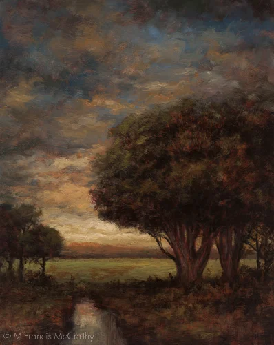
A bit more about "Edge of Summer" I liked the verticalness of the cypress trees. The inverted "L" shape they create with the field is the focus of the painting. The stream at the bottom leads the eye into this backwards "L"
The 8x10 has a smoother texture but is still textured. I'm really noticing how this affects my painting right now as I'm back on smooth boards after months of painting on either an existing painting or on a board that I've textured prior to painting