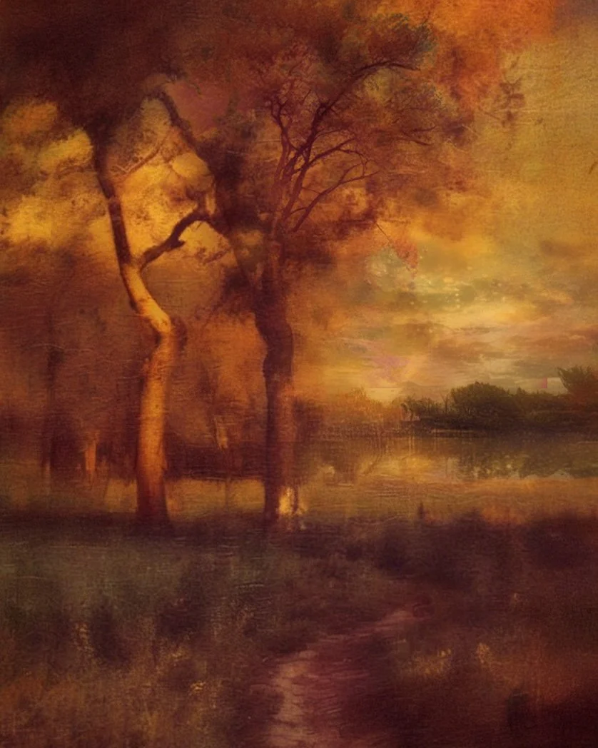
Where Light Lingers: 8×10 painting Session LIVE
A soft-focus exploration of atmospheric color and loose brushwork Tonalist inspired by George Inness...
Transcription
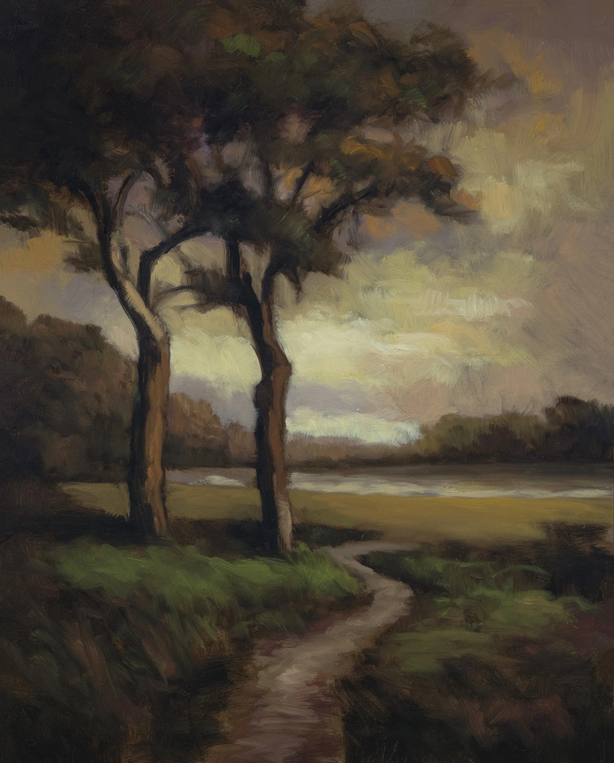
This session started with something quite different—I spent an hour manipulating a reference image using AI tools. I ran an original scene through Stable Diffusion, which gave me something wonky but still resembling the original. Then I took that composite into Sim Theory using one of their photo-realistic filters. Unfortunately, we lost all the golden tones in that process, but it brought in some other nice colors. The AI took my 8×10 proportions and made them skinny, but left the trees in the same spot. I brought that in using merge mode to create our final reference.
Where Light Lingers 8×10
The California Oak Feel
What’s exciting about this painting is it’s based in California—quite different from my usual subjects, but quite the same in approach. All the paintings I’m doing that aren’t seascapes right now are going really cold, and this one definitely has that California oaky feel. I brought in another tree because the whole area was just falling apart. That’ll be one of the challenges of this painting—navigating areas that aren’t necessarily distinct.
Working in Holy Territory
We are in holy territory as far as inspirations go with George Inness. I think this is pretty exciting, though I don’t know if the painting’s gonna turn out well. The image I created is interesting, but there were some things I wasn’t able to reconcile.
The Soft Focus Mission
After lunch, I decided our mission would be to do a loose, feely, colorful, totally soft-focus painting. The real goal is that nothing is actually delineated—everything loose and brushy. This whole painting could be quite soft focus, so we’re not necessarily making sure everything’s etched clear.
Color Strategy and Palette Work
Sorry, no formal color mixing demonstration today—I’m just going to show you what I’m doing on my palette as I go. The palette paint is cold, but I’m only short a few colors.Purple came to mind as I was working. The thing with dioxazine purple is you’ve always got to work it—it comes with a lot of saturation that needs managing.
Mars Yellow is doing a lot of jobs I would have done with cadmium orange. Cadmium orange always comes with a saturation cost, so Mars Yellow is a great problem solver here.
Mars Black is the new addition to my palette. It’s warm, at least this version is, which works well for this kind of atmospheric work.
The Transparent Paint Challenge
I’m really struggling with transparency throughout this whole painting. What I’m doing is bringing in this really super opaque Mars Yellow. There is a Mars Orange which would be perfect for this, but I basically made my own Mars Orange. This painting is practically painted like watercolor in its thinness—maybe not best practices, but it’s working for the soft, atmospheric effect we’re after.
Tonalism 101 in Action
This is Tonalism 101. The approach is about working with board color—basically letting the warm undertone of the canvas contribute to the overall harmony. I remember hearing “Don’t get too many colors in your mixtures,” but here’s my take: don’t start painting until you think the mixture is the right one. Then you can really lean into that paint color.
Green Strategy
The greens here are really driven by burnt umber more than anything. To compensate for burnt umber’s transparency, I’m bringing in that opaque Mars Yellow.
My proper green work is usually a two-step operation:
First, see what the mixture really is with white in it
Then adjust and build up the opacity
I’m bringing in mixing red (cadmium red hue) to kill the green where needed, though I should have gone for straight cadmium red for better opacity.
Tree Work and Final Details
I’m defining the tree largely through the sky work—I’ve talked about that approach a lot. You never know with these paintings—sometimes they’re one way before they’re cleaned, another after. For the tree trunks, I’m using a reddish brown since there’s red in the reference. The chroma distribution throughout keeps things from getting too flat.
The Modulation Technique
A lot of my modulation is coming from loose pressure with the brush. You can’t have the same green on one side as the other—constant variation is what creates that atmospheric depth. If you ever catch yourself overworking something, don’t do anything. Leave it. If you were meant to do something, you would have done it.
Inness Riff Reference

Final Thoughts
This painting is quite dark when I look at it outside the studio light, but that’s often how these atmospheric studies work. The technique advancement was one thing I wanted to accomplish, and I think we got there.
The painting might be a dark old thing, but it’s beautiful in its own way. This soft-focus, Inness-inspired approach challenges you to work with impressions rather than details, and that’s exactly what makes it valuable for developing your tonal sensibilities.
This loose, atmospheric study demonstrates key Tonalist principles while exploring AI-assisted reference creation. The focus on soft edges, warm undertones, and atmospheric color makes this an excellent example of how historical techniques can be adapted for contemporary practice.