Forest Passage 8x14 Live Session
Mike’s Forest Path Painting Session - Member Transcript

SETTING UP & INITIAL COMPOSITION
I’m working on an 8x14 today - nice size. I was going to go smaller but didn’t feel like prepping boards, and I want to get this done.
I’ve been working on my forest technique. The last painting I did is going up tomorrow, and that was utilizing this same technique. It’s the looseness in the wrist and with pressure in general. It’s hard - very hard to teach because it’s a lot of subtle mechanisms that are going on.
In the reference we have a tree over here too far. That’s the first thing we’re going to do is bring that right over. Then we have some here - there’s two, but we want to probably just make it one. There’s two trees right there, but I’m going to make it one significant tree.
Look at these intervals. I don’t have a choice on this tree - it’s got to go there. So something else has to give and it will be: closer, further, closer, further, closer. This is the structure of the painting.
Now with something like these coastal scenes I’ve been doing, that grid is so critical. It’s a decent string of intervals.
THE FOUNDATION PRINCIPLE
This painting is really about the light with the foliage. But if you don’t have your structure with these intervals nice, you’re wasting your time. It won’t matter what else you do.
Here’s another thing - this is open space over here. We don’t want that. We’re going to bring in some darkness here. I don’t need people going off over there. We’re going to make it dark in the corners.
I’m not saying that I’m automatically going to succeed in this painting. I might just fail. But I don’t want to solve every problem right now. I think that’s going to be one of the ways I’m going to succeed in this painting.
COLOR MIXING STRATEGY
This is going to be the big fat exercise in greens today. If you struggle with greens, you’re going to see every strategy I’ve got.
Sky Colors: Starting with titanium buff, raw umber, and yellow ochre - that’s dark sky color. Light sky color is the same, but less of it.
Path Color: Marish Yellow, Dioxazine Purple, all the colors that went into that other color - Yellow Ochre, Raw Umber, White. When you get too into the burnt umbers, you get chroma. I don’t want all that chroma. I just wanted the dead. I want to get more with the raw umber. The burnt umber has more intrinsic chroma.
GREEN STRATEGIES
In my brain I was thinking: you’re not going to go brown greens, you’re just going to go greens. But some of those greens would be brown. Some of those greens would be gray. Some of those greens would be lightened with orange. Some would be lightened with Yellow Ochre. Modified with raw umber, burnt umber. There’s a lot of ways you can move green around.
Dark Greens: We need a bunch of burnt umber, and then the perylene. If it was perylene alone, without all that burnt umber in it, it would have felt too fake for this.
Modified Greens: Permanent Green Light modified with orange. That’s going to make us another green. Permanent Green Light modified with the orange, been pumped up subtly, so it’s going to have a different feel, different direction.
TECHNICAL APPROACH
I’ve got a dedicated dark brush now, but the idea with this painting is that everything has a lot less separation and division. That was the epiphany I had.
Very wet paint. Very thin. This is kind of a more classically blocking approach, except that I’m not planning on refining it. One of the things going through my mind - I’m thinking I could just let this dry and then do a finish over the top that would be really cool.
Brush Strategy: A lot of times I would retain that dark brush because you do need a clean brush for your darks sometimes. But with this painting, everything is more connected.
LIGHT AND FOLIAGE WORK
Job one is bringing the lights coming in from the main foliage. More orange to kill some of that intensity. Raw umber, yellow ochre - but I don’t really want that yellow ochre to take over.
Those gray greens back there need ivory black mixed in. Classic approach - get that lighter green that’s moving into less chroma than that, but still not chroma-free.
What I’m thinking is yellow ochre - that’s everything averaged out. It’s a bit flat, so we’re going to juice it up.
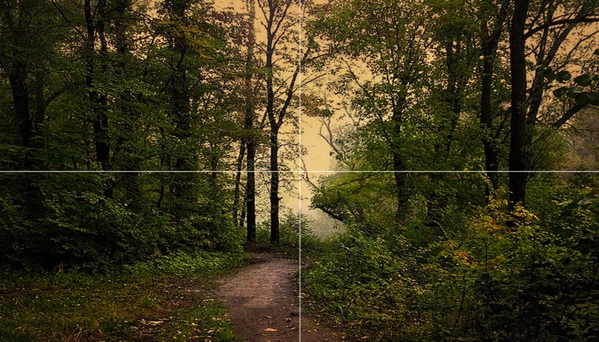
Reference Image

FINAL NOTES
If you’re wondering what colors I’m using, I’ve got the color palette shown at the beginning. Just freeze that, take a screenshot.
The tough thing on these kinds of scenes is the light with the foliage, but the foundation has to be those intervals. Get that right first, then everything else can work.
Session Notes: This was painted alla prima in approximately 45 minutes, focusing on big brush work and expressive handling of light through foliage. Key techniques demonstrated: interval composition, green color strategies, and wet-into-wet blocking approach.