Style - A Byproduct
At some point I think every artist becomes obsessed by artistic style.
My first awareness came as my interest in comics grew back in the 70's. One artist would have a realistic style like Neal Adams while another like Jack Kirby could verge on the abstract.
It's often too easy to get caught up in the surface aspects of style. It's easy to disregard strong draftsmanship and structure in an over fixation with style.
This becomes a real problem only if you're copying the style of only one artist. An attitude of exploration and learning on the other hand can pay big dividends.
Regarding developing your personal style in various mediums, I feel that it comes best as a natural result of doing tons of drawing. Piles of paintings and practicing both as often as possible.
The personal style that results from that kind of effort is far harder for other artists to replicate as it is based on a titanium foundation of hard work.
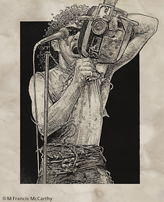
Today's drawings we're done with pencil on paper back in 1990 or so.
Boss Tweed and Jim Fisk were crooked politicians in New York back abound the turn of the 20th century. I enjoyed trying to capture their smug self satisfied expressions.
I've given the drawings vignetted borders to sort of help along the sad fact that these are scans of photo copies. You get a sense of the drawing at least. It will be great to scan the actual drawings in one day.
Cheers,
My first awareness came as my interest in comics grew back in the 70's. One artist would have a realistic style like Neal Adams while another like Jack Kirby could verge on the abstract.
It's often too easy to get caught up in the surface aspects of style. It's easy to disregard strong draftsmanship and structure in an over fixation with style.
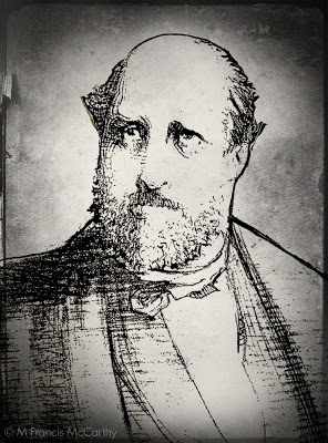 |
| Boss Tweed by M Francis McCarthy |
Ultimately, style should be and is naturally, a byproduct of who you are as an artist. It should not be worn like a suit of clothes that is put on, changed often then discarded for something else.
As a hired gun illustrator I was called on to mimic many different styles as part of my job. So many I can't count them all.
I'll admit I took pride in my ability to mimic the styles of others but such work can become tiring. It drains the soul and as a consequence a toll is taken for the wage earned.
Mimicking the style of an artist you admire for a drawing or two is something I recommend all beginning artists do at times. It can really open your eyes to the means of craft that artists you admire use to create their art. It can also become a terrible crutch, if the learners spirit is coming from the wrong place.
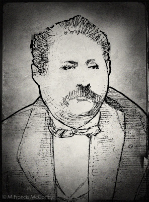 |
| Jim Fisk by M Francis McCarthy |
This becomes a real problem only if you're copying the style of only one artist. An attitude of exploration and learning on the other hand can pay big dividends.
Regarding developing your personal style in various mediums, I feel that it comes best as a natural result of doing tons of drawing. Piles of paintings and practicing both as often as possible.
The personal style that results from that kind of effort is far harder for other artists to replicate as it is based on a titanium foundation of hard work.
Today's drawings we're done with pencil on paper back in 1990 or so.
Boss Tweed and Jim Fisk were crooked politicians in New York back abound the turn of the 20th century. I enjoyed trying to capture their smug self satisfied expressions.
I've given the drawings vignetted borders to sort of help along the sad fact that these are scans of photo copies. You get a sense of the drawing at least. It will be great to scan the actual drawings in one day.
Cheers,
Website Update
I've been working super hard on updating my website as I mentioned in previous posts here.
Still a few niggling, odd errors but over all it's been nicely updated. I've managed to link Google docs with an inventory/pricelist that's got to be typed in.
I worked with Net object fusion for years and then Adobe Dream Weaver. Must say I hated Dreamweaver. Ezgenerator is much simpler to use and suits an artists temperament. It has many good templates and even more crappy ones but I manage to get a good result generally.
 |
| Still Pond by M Francis McCarthy |
Technology is getting more awesome each day really. BTW the program I use for my web site is Ezgenerator. From their site:
EZGenerator is a combination offline Website builder and online content management system.
Create the structure of your website offline, add pages, blogs and other features then upload it and continue to edit ‘live’ content online.
Easily create a website without installing any other software on your PC or server, EZGenerator does all the hard work for you and set-up everything you need to have online
I worked with Net object fusion for years and then Adobe Dream Weaver. Must say I hated Dreamweaver. Ezgenerator is much simpler to use and suits an artists temperament. It has many good templates and even more crappy ones but I manage to get a good result generally.
Here's a few sites I've done with Ezgenerator:
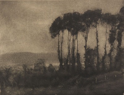
Pictorialism
Some of you may be wondering what happened to that blog I mentioned on Tonalism. Well I'll be honest it was way to much work to re-write information, chase facts, names ect. So I bagged it.
One reason I've been able to keep this blog up (though it too requires a good bit of work) is because here I tend to write mostly about what comes from me and my experience.
I also like to post about great art movements and artists that I find to be cool once in a while. And that leads us to today's topic Pictorialism
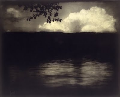 |
| The Big White Cloud by Edward Steichen |
Pictorialism was a photographic movement that ran along side Tonalism starting in the late 19th century. One of it's greatest proponents was Alfred Edward Stieglitz along with his magazine Camera Work. Most of the images I've posted here are from various issues of Camera Work
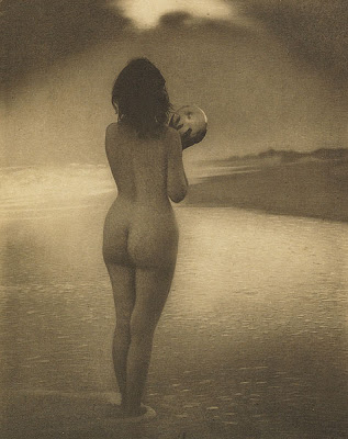 |
| Dawn by Alice Boughton |
What many of these photographers were attempting to do was paint with light. Many times the negatives and prints were highly manipulated to get a desired effect.
Many Pictorialist works were created using photogravure. A process very like etching that can produce stunning one of a kind prints.
Here's a link to great site with many awesome images dedicated to photogravure past and present.
 |
| Toucques Valley by Robert Demachy |
I love the moody atmospheric quality of pictorialism and it has been a huge influence on my painting along with Tonalism. Unlike Tonalism though I hadn't even heard about Pictorialism until I started studying photography in earnest after I'd arrived in New Zealand.
What attracts me most to Pictorialism is the emotive quality and high art aesthetic that most Pictorialist photos seem to have. Dramatic contrasts blended with blurred edges and enigmatic subjects to create many moving and memorable Pictorialist images.
Speaking of Photography, I am a keen, semi-advanced hobbyist. I post a lot of photos on Flicker. My Flickr page is here. Have a gander if you're inclined.
Cheers,
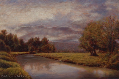
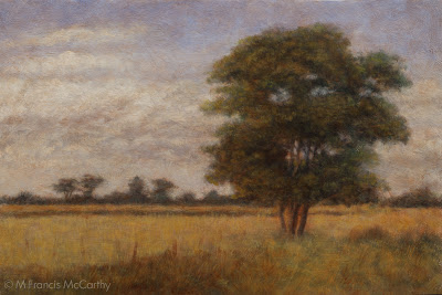
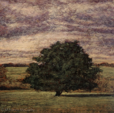
Landscape Painting - Tonalism
Lets chat a bit about Tonalism today.
Tonalism was a movement in American landscape painting that lasted from about 1870 to 1920 or so.
As a movement it was heavily influenced both by the Hudson river and Luminist schools that came before it but most importantly by the French Barbizon movement.
Here's a bit I wrote about Tonalism in an old blog:
"Tonalism is about a poetic interpretation of the emotive response we have to nature. It's about using the landscape and paint to convey emotion through the picture plain and into the mind and heart of the viewer. It is much more than a "tone" or any color effect or style.
Tonalism is often a bit diffused but it is not about that either. It's about expressing the plane just below the surface of life/nature and the emotive currents of the scene it's light, space and colors fractured as brushed paint"
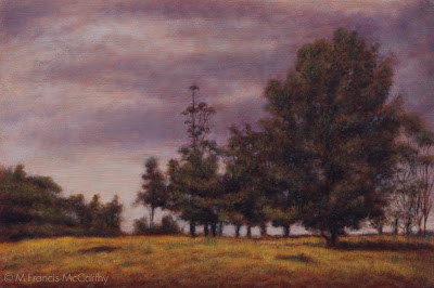
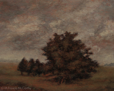 |
| Autumn Meadow (8x10) by M Francis McCarthy |
While I have never copied Inness I have probably read most every book out there about him and I believe that his achievement in landscape painting has not been equaled by anyone since.
The paintings of Inness contain very high spiritual attributes. This is not an accident as George Inness was a man driven by spirituality to an extreme.
There are many other great Tonalist painters I admire like Charles Warren Eaton, Robert Swain Gifford, Lowell Birge Harrison and John La Farge. But Inness was my first big draw.
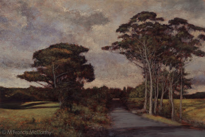
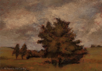 |
| Autumn Meadow (5x7) by M Francis McCarthy |
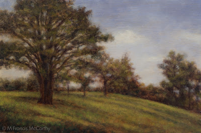
Is Tonalism making a comeback?
I cannot say that I know. All I know is that I personally resonate with this mode of painting. I've see quite a few modern artists attempt Tonalism. Not many of them have succeeded in my view. A big exception is Dennis Sheehan, no doubt there are others I'm not aware of too.
If you are interested in learning more about Tonalism I reccomend this book highly: A History of American Tonalism,1880-1920.
It doesn't look like Amazon is selling it directly anymore. I hope it's not out of print. I'd pick it up if you even remotely interested in American Landscape Painting as it is a great book.
In fact I own two copies. One for the studio and one here at my home office.
Cheers,
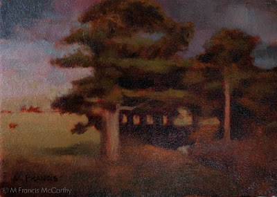
Landscape Painting - Subjects
I was out driving about Northland New Zealand yesterday. Pretty easy to do as that's where I live and work. New Zealand is full of great trees and rural scenery. Lots of scenes that are paintable out here.
Driving about with my wife I saw many great scenes and I like to stop and take photos of the ones that I think would make good motifs for paintings.
We've talked in the past about subject matter.
 |
| Twilight Meadow by M Francis McCarthy |
Driving about with my wife I saw many great scenes and I like to stop and take photos of the ones that I think would make good motifs for paintings.
One thing I appreciate more and more is realizing that my intuition will always lead me to a great scene and also tells me that a scene just won't work.
I can easily extrapolate my intuitions guidance if I need to. Its not magic. It's built out of observation, experience and gut feeling all together. The more you paint the more you should know what it is that works for you as an artist.
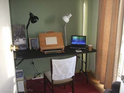 |
| First New Zealand Studio |
We've talked in the past about subject matter.
An amateur artist should draw and paint absolutely everything that interests them while learning their craft. Conversely in the fine art world it's best for an artist to paint one type of subject.
There are many obvious exceptions to this rule but in my many years in the art business I've noticed that the artists that painted one type of subject matter in one style did better than those who floated about.
The reason for this is that galleries and the art market in general need a way to market an artist. If your doing florals figures, cityscapes, landscapes and seascapes in 10 different styles. It's going to be hard to carve any groove into to consciousness of the art market.
I choose landscape painting as my specialty because I felt that I could convey the types of feelings and evoke the kinds of emotions with my art that I find desirable. Also, I find landscape painting infinitely challenging and I'm prepared to do it till I die or am unable to lift my brush.
If you're a student, explore, explore, explore. But think about what I've said and about what type of subject matter resonates most with you. At some point in your artistic journey you will find the right thing to explore more fully.
Cheers...
Drawing - Work at it
Putting up a few drawings today. These date from 1987 and were done on nice cold press illustration board with graphite in a lead holder. This was basically inking with a pencil and I used the range from HB to 6B leads.
I never could stand H leads with HB being the exception. H and higher is just too hard for me. For these drawings I used to 6B to fill in the blacks.
Now, the sad part is that these reproductions here are actually scans of copies not scans showing the range of grays.
It's difficult to draw well, at least at first. My draftsmanship is just ok and for me drawing correctly involves a lot of checking and rechecking as I was self taught and went down a few wrong paths. I don't regret my lack of academic training. I worked really hard at drawing anyway.
I never could stand H leads with HB being the exception. H and higher is just too hard for me. For these drawings I used to 6B to fill in the blacks.
Now, the sad part is that these reproductions here are actually scans of copies not scans showing the range of grays.
 |
| The Red Death by M Francis McCarthy |
One day I will have my suitcase full of art from the states and I'll definitely put these up again at that time as there is a real warm feeling you get with lead that just isn't showing here.
On to our topic: I think these drawings really show what working at a drawing is for me. There are things I see now that I'd change but I know at the time I did them that they were high water marks.
Especially The Red Death. Getting those folds right was a real challenge and required intense determination concentration and constant rechecking with the reference.
I've stated before that drawing is mostly just measuring. But, after you have those measurements right there's a world of different interpretations and styles that you can pursue.
The decisions you make in that area are a reflection of who you are, what you admire and your technical ability to realize your vision as an artist.
 |
| Fee Waybill by M Francis McCarthy |
It's difficult to draw well, at least at first. My draftsmanship is just ok and for me drawing correctly involves a lot of checking and rechecking as I was self taught and went down a few wrong paths. I don't regret my lack of academic training. I worked really hard at drawing anyway.
Getting your drawing ability sorted is the number one key to painting well. Painting can be seen as no more than colored drawing if you think about it and most illustration also hinges on good drawing. The exception being of course, straight photo illustration.
There is lots of nice illustration work being done these days with just photo manipulation in Photoshop. However I feel the best guys at large do know how to draw even if they manipulate photos to get the work done.
Get your sketch book out and make a regular habit of drawing everything, anything, all the time. I doesn't matter what you draw, what matters is doing it often enough that your eye and hand learn how to work things out on paper.
There is no shortcut for drawing practice. You could read twenty blogs today even more informative than this one and it wouldn't equal even one solid drawing attempt.
Cheers,
Landscape Painting - Let it Be
Just a brief post today. I've been working on my site and I've finally worked out a gallery/slideshow solution that I like.
So, what can we do about over working our art?
One thing that separates the professional artist from his amateur fellows is knowing when the piece they're working on is finished. The amateur often holds a mistaken belief that more time spent on a painting equals a better painting.
Nothing could be father from the truth. In actual fact even the professional artist can work on a piece past the point where it was well done.
 |
| Dawns Glow by M Francis McCarthy |
So, what can we do about over working our art?
My advice: "Let it Be" three simple words that can save you. While working I feel it's best to try and accomplish whatever is happening on the canvas/board in as few steps as possible. Just tell your self to let the art be. Let it breathe.
"When do I stop though" you say?
There is a still, quiet voice that tries to tell you when to stop. I call it intuition. We are going to talk a lot more about intuition later but for now I'll say, "intuition can guide you step by step if you listen to it".
Like any other skill it must be learned though. As you practice listening and acting in accordance with your intuition it becomes stronger and stronger.
Be aware that it is very easy to drown out this subtle guidance. There's nothing forceful about how intuition communicates. Though it speaks in a whisper it has the power of a hurricane.
Cheers
Landscape Painting - One Brush
Hey, lets get back to some technique after yesterdays philosophical discussion.
The cheapies are more trouble than you save from the cost difference from just getting good brushes. Cheapies shed hairs in your painting, have uneven sides and edges, don't last and basically make painting a drag because the brush will not respond to your hand very well.
I tend to use one or two brushes for 70 to 100% of each paintings passages. I know that many painters like to change up their bushes during a session but I tend to start with a big brush, say up in the sky and I'll do the whole sky with it.
For the sizes I work these days I favor #8 to #2 Flats and I will spend the extra dosh for good quality brushes. I've been using Robert Simmons Signet Bristle Brushes because they're good and I can get them out here in New Zealand. I really like Silver Brush Grand Prix Super Brushes also. Try those out if you're in the states they are top notch.
 |
| Homeward Bound (12x18) by M Francis McCarthy |
The cheapies are more trouble than you save from the cost difference from just getting good brushes. Cheapies shed hairs in your painting, have uneven sides and edges, don't last and basically make painting a drag because the brush will not respond to your hand very well.
I'll stick with that first flat for an entire passage unless I've a great reason to grab another brush. I'll get deeper into my process as the blog progresses but for now: I use that brush's edges and corner to get the paint down in varied ways.
I do wipe my brush off occasionally with a paper towel and if necessary I'll use some lavender oil to temporarily clean the brush.
For cleaning at the end of a session I now use kerosene. Kerosene leaves a nice oil on the brushes that conditions them. In my experience it keeps the brushes fresher for longer.
Be careful the brush is dry though before using it to paint again, kerosene that gets into your painting will keep the painting from drying!
Turpentine can give me a headache as does "odorless" mineral spirits. I've found some great alternatives like lavender oil. More on Lavender oil later.
 |
| Homeward Bound (5x7) by M Francis McCarthy |
When I move out of the sky I often will lay in my dark's with a #2, #3 or #4 flat depending on the shapes involved and the size of the passage. I like to get back into a #4 or #6 for the rest of the medium color areas for the same reasons that I use the #8 in the sky. Namely:
Bigger strokes just look better and the bigger the brush, the bigger the strokes. I find that being forced to use a corner of the brush for accents keeps the painting fresher. In my earlier days as a painter I liked getting the small sable rounds out and going to town on the details. I now feel this locks up the image and that's contrary to my artistic agenda of creating a loose relaxing space for the viewer to enjoy and contemplate.
Another good reason to mostly work with one brush for a passage is that it keeps a bit of the tone from each element mixed in each color. I like my color defined but definitely harmonic. Note: the main brush switch up that I do is when I go in with the dark's Having lot's of muck in your brush isn't a great plan for dark's but like I said can be an asset in your middle tones and lighter passages.
Obviously, brushes, brush technique and technology is a vast topic so we'll talk more about it down the road.
Cheers.
Art and Imortality
Why do you create art? What is the reason? Is it to impress girls or for some chance at fame? Money? Therapy? Recognition from your peers? What is it?
We all must have our own answer to that question. One answer is all of the above. But that doesn't seem to address the deepest cravings of artists to create, to communicate and relate.
In many cases all we have of our ancestors besides their DNA is their art. It reaches to us across the millennia and connects us to the minds, thoughts and feeling of those who lived before.
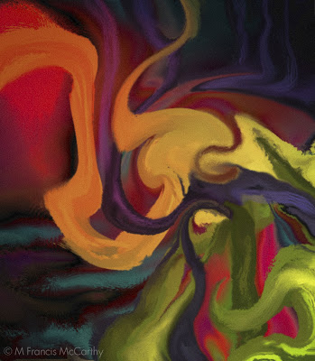 |
| Yuzex by M Francis McCarthy |
In a sense this has rendered those who created art from the past immortal. Or, at least their thoughts, ideas and visions have attained that state.
What is it in us that causes this drive to interact with the future? To leave something of ourselves behind that will last? What drove those ancestors of ours to do the same?
My personal answer to these questions is: Yes I want to leave a bit of something behind. Something good. Something that will be worth keeping around by people living in the future I can only dream about. I'm not obsessively fixated by these ideas. But, these things do cross my mind.
Being a working artist/hired gun for those thirteen years, I was often engaged in creating the temporary, the ephemeral. I know many other commercial artists that must do the same everyday.
It's hard to create something great only to see it discarded later. Not that there's anything wrong with artists who set out with that intent. Go ahead and build sand castles or hire your art gun to the highest bidder. Nothing wrong with it. But...
It's a fact that we are all here for a time, then we aren't. One can deny it, make light of it or ignore it but the wise person realizes that their life is an expression of the infinite and that every moment of it is sacred.
Life cannot be denied and art is the ultimate expression of creation. Every artist creates and communicates what their time was like. What their feelings were. What they saw or wanted to see and what they believed in. Cheers.
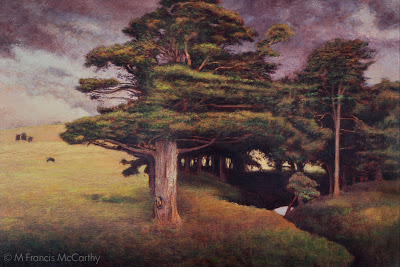
Landscape Painting - How Much Detail?
As a young artist I always looked up to and admired other artists that put a lot of detail in their work. A kid into comics, I and my mates loved Neil Adams style because of the realistic detail in his art.
It wasn't until I grew older that I became more aware of the beauty gained by simplifying one's work so that it's best attributes were put forward.
As far as super detailed landscape painting goes the Hudson River guys were probably the most detailed school though I suppose most any type of painting can be highly detailed. Here's a piece by Frederic Edwin Church:
 |
| Peaceful Sojourn by M Francis McCarthy |
As far as super detailed landscape painting goes the Hudson River guys were probably the most detailed school though I suppose most any type of painting can be highly detailed. Here's a piece by Frederic Edwin Church:
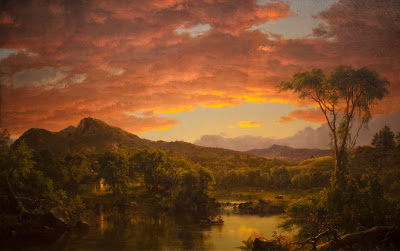 |
| Frederic Edwin Church - a Country Home |
This is fairly high rez so give it a click to see how Fred handled finish and detail. Granted this actual painting is huge but the level of finish detail is super high and in Fred's case it works quite well. I've seen Fred's work in person and it's awesome.
For me as an artist and landscape painter detail can be a straight jacket that locks up images. Like I said when I was younger I dug detail and drew plenty of detailed images. Now though I believe most every thing that's good in a picture, that's important, has nothing to do with detail.
If you work with photo reference as I often do, The fact that you can see all that detail in your reference can make it difficult not to render it all right into your painting. What you'l end up with is a box of detail more often than a cohesive painting, if you're not careful.
 |
| View of my old living room with studio beyond |
I'm not a scientist but I've read a bit about how we as humans "see". We actually see only a small bit of anything in our field of vision in sharp focus. The reason we think we see all detail in a given scene at once is that our brains sew together a panoramic image for us to perceive.
If you observe your own viewing process right now, you might notice that only an area about eight inches wide at 1 foot or so is in focus. To see more than that clearly, you must move your eye's. This is called scanning.
I try with my work to avoid scanning as much as possible. My feeling is that the painter should do the scanning for the perceiver of his paintings and present an image that just flows into the brain of the viewer. People look at the world and photos much the same way. They scan them. Good landscape paintings avoid this and lead the eye in a pleasant manner.
There are so many ways to do this that I will expand upon later but for the purposes of this post I'll point out one of the best ways. That is this; eliminate distracting detail from your work and present only pertinent detail that pays off the viewers attention. Cheers
Illustration - Digital Thoughts
Still deep into sorting my catalog of paintings. My computer muscles are getting a bit worn. So short blog post today.
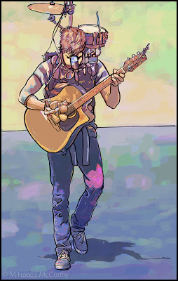 |
| Street Musician by M Francis McCarthy |
This illustration I did of a street musician was done soon after I'd arrived to live in New Zealand. It was drawn and inked and colored using a Wacom Stylus and tablet in Photoshop. The watercolor coloring was done by manipulating a photo using lots of filters and Photoshop mojo.
I'd been hatching this style in my brain for quite a while and it wasn't until getting to New Zealand and getting off the hamster wheel that I had time to figure it out.
I used photos extensively my entire career as a paid illustrator. These days its so easy to blur the boundary between photos and illustration it's not even funny. Frankly I've never been too hung up on it as for me art is largely about aesthetics and all the myriad decisions that go into creating a striking image.
It's fun to have a play and let your imagination, skill and talent take you where ever they may. Photoshop and other programs are great for that.
At the end of the day though I find the attraction of creating with a brush on wood panel to be far more satisfying. There's no undo but there is the tactile sensation of working a surface. Ultimately creating a unique object.
Landscape Painting - Work Small, at First
Lagging a bit on posting, I know. But, I do have an excuse. I've been working on my website and I'm sorting out some really nice portfolio pages. Still a work in progress but you're welcome to check em out if you like.
In addition to that I've been organizing many years worth of photos of paintings and other assorted tidbits, some of which will make it here on to my blog.
It's been my goal for awhile now to have an image archived on my site of every sold and unsold work that I've painted.
The California years are up now and I'm working on three New Zealand image galleries as well. Eventually, I will have all my years worth of drawings up too.
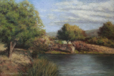
Behind the art department in Campbell where I worked there are these awesome percolation ponds and also Los Gatos Creek.
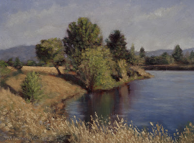 |
| Summer Reflections (6x9) by M Francis McCarthy |
Behind the art department in Campbell where I worked there are these awesome percolation ponds and also Los Gatos Creek.
I found many views there that inspired me and I did over thirty five or so paintings referenced from that area. "Summer reflections" is one of these. I'm still quite pleased with it and who knows, I may paint the theme again some time.
Now, my painting tip for today. If you're learning painting, work small. Two good reasons are: You'll have a lot more experience of painting different scenes in a far shorter period of time than if you do larger work and also, you'll also have far more paintings to keep, sell or give away.
The upside of having more paintings is that more of them are bound to be good. As far as the bad ones go, destroy them. Do it for yourself and also so the rest of us don't have to look at your crappy bad paintings either.
I've known far too many aspiring artists that spent all their time slogging on some large crappy paintings that they became invested in and thus felt obligated to keep around.
Working small means at least you can stick the bad ones in a drawer until you are able to release them to the trash can. Or, better yet burn em. So no one picks them out of the trash and hangs them up on their wall (not kidding, has happened to me).
I will say there's a downside to starting small that I personally found to be an issue. Only working small, can make painting larger a bit of a strain at first. I found it a bit of a strain at least. These days, I've no issues working up to 12x18. I'm going to be doing a 18x24 in a month or so and I expect that to go fine.
BTW, using bigger brushes for larger paintings is a good idea and makes transitioning from painting small sizes to larger much easier. Cheers...
Landscape Painting - Surface
My visit to the de Young Museum left me with two things. A big interest in pre impressionist American landscape painting, like the Hudson river school, the Luminists and most importantly Tonalism. And, I also learned to pay special attention to a paintings surface quality. I wanted my paintings to to have some of that classic feeling that I saw in the paintings of past landscape masters and I knew surface quality was a big part of the equation.
I abandoned canvas in favor of painting directly on wood panel. Liquin also factored in my new approach to surface quality as it allowed me to quickly layer colors while building a nice surface with paint, Liquin, the wood grain and my layers of clear gesso over the bare wood.
 |
| Late Summer (6x9) Pond by M Francis McCarthy |
Surface quality in a painting refers to the texture and reflective quality of the paintings finish. This aspect of a painting becomes most apparent when viewing the original piece obliquely but also effects the viewers spacial reference to and appreciation of, the painting.
Many great old paintings, often done on wood or heavily gesso'ed canvas, exude an awesome character that seems to be missing from a lot of modern work.
One reason is because many of today's painters, paint directly on top a store bought canvas's natty acrylic white pre-prepped surface. I'm not dissing them but I am saying that you get back what you put out. A cheap start will lead to a cheap finish, or it can.
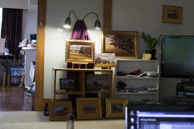
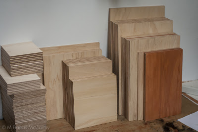
I feel that every stage of the painting should be done with love and care. Starting from using a properly prepared board or canvas. Here above are the Kauri Boards that I'm using for my current series. They are 100% lovely Kauri Marine plywood:
Marine plywood is manufactured from durable face and core veneers, with few defects so it performs longer in humid and wet conditions and resists delaminating and fungal attack. Its construction is such that it can be used in environments where it is exposed to moisture for long periods. Each wood veneer will be from durable tropical hardwoods, have negligible core gap, limiting the chance of trapping water in the plywood and hence providing a solid and stable glue bond. It uses an exterior Water and Boil Proof (WBP) glue similar to most exterior plywoods.
Marine plywood is frequently used in the construction of docks and boats. It is much more expensive than standard plywood: the cost for a typical 4-foot by 8-foot 1/2-inch thick board is roughly $75 to $100 U.S. or around $2.5 per square foot, which is about three times as expensive as standard plywood.
I prep my boards with two to three coats of sanding sealer and sand them in between. As stated, marine ply costs three times more than the cheap stuff but you can feel the quality when your painting on it vs pine or another cheaper product.
BTW pine can be nice for smaller paintings. I prefer when painting small to use a textured surface anyway. I create the texture for my 5x5's and 5x7's using clear acrylic gesso, paper and the side of a brush to create a nice uniform yet varied surface texture that will grab paint off of my brush.
For my more finished paintings I like to utilize the wood texture inherent in my substrate and also create more texture with my brush strokes. I work quiet thin so sometimes the paintings surface is only perturbed slightly form the flat wood grain.
A trail is left by the all work that went into the painting and the paintings surface tells that tale. Eloquently I hope, if not ant least the attempt was made and attention was paid.
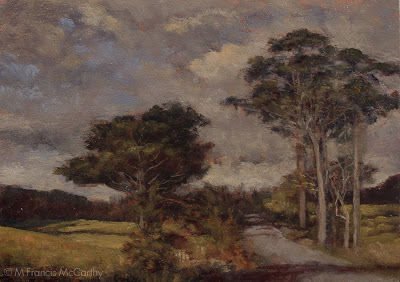
Landscape Painting Thoughts
Lately I've gotten around to sorting through years of photos of paintings in progress, reference pics and photos of failed attempts as well. What a ton of work it's been!
That work is going into a major update to my website landscapepainter.co.nz. I've tried a few online web services but I've settled on Ezgenerator. It's template driven but very flexible in it's own way. Can't say I enjoy doing the web work but needs must.
It will pay off for this blog too as I've discovered many litle forgotten gems that I'll be sharing as we progress along here at blog central.
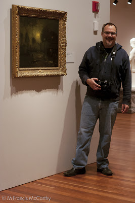 |
| M Francis McCarthy with a painting by George Inness |
Me and my hero's work at the de Young museum in San Francisco, California. They have a nice wing of great American Landscape Painting that was a big influence on me after I saw the original works on display there.
 |
| Pond Reflections 6x8 by M Francis McCarthy |
I started painting in a Impressionist vein. "Pond Reflections" reflects this style. As I've said before, I believe that many landscape painters are working in an Impressionist manner whether they are aware of it or not.
I know I was in the period I painted this. This painting was done with a super limited pallet of Cad Yellow, Alizarin Crimson, Ultramarine Blue and Titanium white. I was influenced in that color pallet by Kevin Macpherson who has written a few great books on Painting: Landscape Painting Inside & Out and Fill Your Oil Paintings with Light & Color. I recommend both of these books highly.
Hey, if your a real serious M Francisophile you can check out my first long abandoned blog The Rebel Artist. I keep it up just for fun. It documents a pretty good chunk of my early painting progression and I still like a lot of those paintings and will probably revisit a few of the motifs before I'm done landscape painting.
Cheers.
Inspiration - Past, Present, Future
Every artist must face their own best work. Whether their previous artistic highs inspire or torment them is one of the greatest factors in determining their success as artists. I have seen many friends and even other professional artists hit this particular block.
As for me, I am always aware of my previous work and I like to keep the best of it around to contemplate and appreciate. That said, I try to wear my work lightly. Ultimately I feel that good art is an expression of not just the artist alone, but of the Universe itself.
When one recons with the effort and different elements that must go into even a bad work of art, the mind boggles at the complexity of creating a high, artistic achievement.
I've written in the past about artistic blocks. The best way to eliminate blocks is to keep your breaks from creating art, brief. In other words, you should be making art all the time. Inspiration does show up for those that are actively pursuing their vision as an artist.
 |
| By the Brook (12x18) by M Francis McCarthy |
I've written in the past about artistic blocks. The best way to eliminate blocks is to keep your breaks from creating art, brief. In other words, you should be making art all the time. Inspiration does show up for those that are actively pursuing their vision as an artist.
There is many a talented artist that is unable to produce consistently high quality work. For the most part these poor folks are laboring under a certain type of belief in "inspiration". Their belief? That inspiration always strikes the artist like a bolt from the heavens, compelling them to rise off their bottoms to engage with their waiting easels and finally create that masterpiece.
Sure, we've all had an experience similar to the example above. The truth is that those sort of inspired moments happen most frequently in the early part of our artistic journey. As an artist progresses and creates a body of work, they taper off. What replaces these "lightning strikes" as the artist matures?
 |
| By the Brook (5x7) by M Francis McCarthy |
The answer for me is that I see inspiration as a collaboration between myself and the Universe. I have a desire to create beauty and I conspire with the universe to do so. I feel a "flow" well up from within. This feels natural like breathing. Creation should feel like that. Like a natural occurrence, like eating or breathing. Something you can do, something you must do.
Ideally, just like breathing you let your work come and go, ebb and flow, unselfconsciously. Expressing easily and naturally in the moment.
In closing, look at and learn from your best work and also the best work of other artists that may be doing things that you admire.
However, always keep your reflections positive. Fear and art are a bad combination. Nature favors the brave.
So, be present with the art you're doing now and make art a flow in your life, not a stop, start and struggle. I've more to say on this topic in future posts. Enough philosophical rambling for one day.
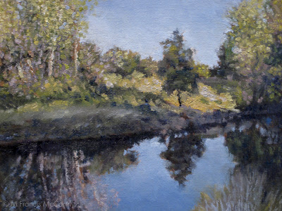
Landscape Painting - Revisting a Theme
 |
| Creek Reflections (6x9) by M Francis McCarthy |
I'm fond of this older 6x9 painting. It was painted on a maple panel that I textured with gesso. I was freshly under the spell of Tonalism and this panting reflects that. It has been painted with thousands of tiny strokes and is very diffused. It took me awhile to develop my brushwork so that is is diffuse yet articulated.
 |
| Creek Reflections (8x12) by M Francis McCarthy |
When seen reduced like this the newer "Creek Reflection" seems as diffuse as his smaller brother. Here's a detail.

Is it better? Just different really, both are nice paintings. I prefer the brushwork in the newer image though because it has character while still being somewhat diffuse.
Re the color shift between the two versions, that's more a function of my Tonalist re-expression of the theme.
I decided that for this painting that I wanted to eliminate blue from my pallet and used black as a blue substitute.
While this may seem odd to modern artistic intentions, artists prior to the late 1800's had scant access to blue pigments. It wasn't until the invention and marketing to artists of synthetic ultramarine blue that artists could really use blue as we do today.
Prior to this, natural blue pigments were very expensive and hard to grind. As a result many artists used black as a blue. It actually works well as lead white and ivory black make a cool grey.
I enjoy painting the same subjects more than once. I will usually investigate a new avenue rather than a direct copy. Copying a smaller piece up to a lager size can be rewarding but it's not as fun or artistic.
This touches on another topic though which I've been thinking of writing about. That is how we as artists perceive our work and ourselves in comparison to past work and accomplishments. A philosophical topic I'll get into tomorrow...
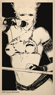
Illustration - Limited Pallets
Prior to my time working at Jack Nightingale Artworks I had done a lot of Black and white representational art and I'd also done a good amount of colorful abstracts using Photoshop What I had not done a lot of was colored illustration.
Today's illustration "Cougar" is a good example of a limited pallet image. His colors are: Black, brown, orange, tan,cool grey, warm grey, white. The astute reader might notice that makes seven colors.
The majority of the designs we did at Jack's we're for tee shirts. Lot's of Screen printers have 14 color machines, however many of the jobs we did were smaller runs with local printers. Most of these printers had 8 color machines. So, for many, many years I had to do complex illustrated designs with a very limited pallet.
 |
| Cougar by M Francis McCarthy |
Today's illustration "Cougar" is a good example of a limited pallet image. His colors are: Black, brown, orange, tan,cool grey, warm grey, white. The astute reader might notice that makes seven colors.
Often the eighth color had to be reserved for a white flash plate in case the design needs to be to be printed on dark colors. It was always a good idea to keep this in reserve as buyers tended to change things and without a bit of leeway the design could be radically altered by a color being taken away. Also other colors might be required by other elements in the design like type for example.
I now have unlimited colors at my disposal to paint with but my many years of working with restricted pallets have served me well. I always consider the tonal pallet for each painting that will be most harmonious. Too many colors thrown at the viewer creates disunity. That said it's so awesome to free of the eight color straight jacket that I worked under for so long.
Obligatory Disclaimer - This image was created for Jack Nightingale Artworks and they own the copyright. I show it here for review and portfolio purposes only. Cheers.
Drawing - Measuring
Drawing is measuring and make no mistake it can be learned by anyone why applies themselves with a bit of disciplined effort. To draw anything you must relate one shape in an image to the next and the next and so on. The best way to learn how to do this is just by practicing and checking your work with a critical eye.
If your shapes are in the right place, detail is unnecessary to convey a good idea of what is being rendered. Conversely if your drawing's proportions/measurements are off no amount of detailed rendering will save your image.
 |
| Wendy O by M Francis McCarthy |
Correct drawing is still a challenge for me after 47 years of practice. Being self taught, I have some bad habits that are deeply ingrained. I have developed ways of compensating though One good one is to hold the drawing up to a light and look at it from behind. Another good idea I use all the time is to turn my drawing upside down and look at it critically that way.
I highly recommend blocking in your big shapes and double checking the measurements before you do any serious rendering. I'm really speaking from experience here as I've been guilty of not following this advise and sometimes end up wishing I'd measured twice and rendered once.
A great way to train your eye is to do lots of quick sketches directly with pen on paper. This gets you to focus because you know you cannot erase.
I've mentioned developing a critical eye a few times in this post. This has got to be the most important part of drawing well. At each juncture of your drawing you should be measuring, correcting and critiquing your work. Not in a way that's harsh with yourself but in a way that's honest and pulls no punches. This is the best way to improve and get ever better.
Today I'm putting up a drawing from 1985 of the now dearly departed Wendy O Williams. Can't say I ever dug Wendy's music but she was definitely a sexy rock and roll icon.
My main recollection now of doing this drawing was that it was done quite large on a nice piece of illustration board. I remember drawing this in my first solo apartment. It was done with pencil, a lead holder as I recall. Those were great for getting a super fine point.
Obligatory Disclaimer - This drawing was drawn strictly for fun and I show it here for review and portfolio purposes only.
landscape Painting - Liquin
I love Liquin. There I said it.
This is from the Windsor Newton site:
Liquin is a general purpose semi gloss medium which speeds drying, improves flow and reduces brush stroke retention. It halves the drying time of conventional oil color (touch dry in 1-6 days depending on color & film thickness) and resists yellowing.
 |
| Dawn Breaks (8x12) by M Francis McCarthy |
Liquin cuts your drying time way, way down and if you use lead white (as I do) paintings are dry to the touch the next day if painted thinly. I usually dunk my brush in it before dipping into any colors. I also periodically add it to my mixes as I'm painting.
I've used straight up linseed oil as a medium in the past and it's slow drying. Many artists use quick drying mediums like sun thickened walnut oil or Gamblin Galkyd medium. I've tried the Galkyd and found it too glossy for my taste.
I love the satin finish of Liquin and after I discovered it I never looked back.

Many oil painters like to get into medium composition debates like it somehow enhances one's talent. A good artist can create good work with the barest minimum of materials. I utilize Liquin in my painting to the fullest extent possible and I'd miss is badly if I had to make do without it.
BTW Liquin isn't cheap but it's worth the cost. Don't buy more than you think you'll use in a six month period. It has a limited shelf life. Also, they've now changed over to a nasty plastic bottle. I decant mine from a big bottle into the smaller original glass bottle and it's never far from my pallet.
Today's painting "Dawn Breaks" was painted soon after my move to New Zealand.. At the time I painted it I was feeling pretty challenged. I'd still not completely got my technique and materials to conform to my inner vision.
Dawn Breaks was painted on a pine panel. I don't usually care for pine as a surface because it's too flat with not much grain. In this case, the board was textured with gesso before painting.
I'd experimented with textured boards a lot while painting in California but ultimately I prefer to use textured boards only for my 5x7 oil sketches and hardwoods like Kauri for the larger pieces. I'm actually pretty fond of this painting now and it is housed in the M Francis McCarthy Foundation for the Arts permanent collection.
Landscape Painting - Brush Technique 2
Yesterday, I talked a bit about brush technique. Today I'd like to go a bit further.
The brush is my preferred way of applying paint to my panels. I also use a pallet knife, but I use the pallet knife in a subtractive way. Mostly to scrape away surface dimples or sometimes to scratch away paint or even to blend passages.
Seldom do I apply paint directly with a knife. Many painters that I consider personal teachers such as Richard Schmid or Bob Rohm do paint with the knife. They both use it very well as do some other landscape painters out there.
 |
| Morning Glow by M Francis McCarthy |
I guess my biggest issue with pallet knife painting is that it can so easily feel contrived. Students of painting should give it a try though as it can be perfected as a painting implement. It's best used in moderation should you care to use it at all. If you're older like me you will recall the awful overdone impasto paintings that we're so common in the sixties and seventies.
When you're painting you have a nearly infinite number of approaches to your brush handling. You can go with chiseled strokes that are long or short. Or, completely blend out all indication of separate marks.
I like to show a bit of the strokes but I also like my strokes to interweave like a lattice. Diffusion is always an important aspect of my paintings but diffusion that breaks into contrasting edges here and there.
Here's a detail of Morning Glow that illustrates what I mean. I aim for my brush work to be expressive while also getting the image across. A good way to look at the brushwork in a painting is that it should look great from afar but also pay off for the viewer that gets up really close. I try to make my marks with character and sensitivity without being overly direct or contrived.
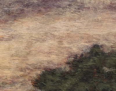 |
| Morning Glow Detail |
Here's a detail of Morning Glow that illustrates what I mean. I aim for my brush work to be expressive while also getting the image across. A good way to look at the brushwork in a painting is that it should look great from afar but also pay off for the viewer that gets up really close. I try to make my marks with character and sensitivity without being overly direct or contrived.
Another good tip I have for aspiring painters is to change-up how they are holding their brush. I like to use every angle of my brushes whether the edge, flat or especially the side.
I apply paint fairly thinly building up my paint in layers of successive brush strokes. I try to always leave a bit of life in the painting. By that I mean I try not to choke out the layers that went before. I leave a bit of them showing.
When my paintings are most successful in my view they are articulated with an economy of strokes. Many times I will have to apply multiple layers of smaller strokes to a painting to get my desired vision across but it's magical when I can do it in one pass of color over my initial under-painting/drawing.