Painting - Holding the Brush
I was working with a student today and we were doing a painting together. She has a good eye and is good with color so her painting resembled mine except in one important way.
Her brush strokes were all swishy and going the same direction. I said to her " hey look at your strokes, they're boring".
Often this is the biggest giveaway that a painting is the work of an armature artist but it's easy to avoid.
For one don't paint like a robot, you're not a human inkjet printer, your a human being and you should paint the way you feel. Not mechanically.
Also, stop and hold that brush another way. Change it up. Don't lick at the painting with it like a kitty cleaning itself. Use every part of the brush to create strokes.
Cheers,
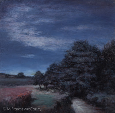
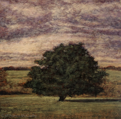
A bit about "Moonlit Meadow" I'm trying to do a "blue" painting here. Not sure I succeeded at my goal but I find this painting pleasant anyway. It went through a major revision although I've no photo of the original state.
It was blue also but the sky in the original was doing nothing special. This was another case of something that looked good in my reference photo but was too subtle and blah when painted.
And it was too subtle, as I'd resorted to rice grain like strokes in the sky in my effort to get the desired effect.
Also bothersome; the main bunch of trees was topped by a point, something that I found challenging visually. I was never happy with it and walked by day after day gritting my teeth a bit in displeasure.
Until one day it made it's way back onto my easel.
I'm actually fairly happy with this piece now. I redid the sky with one that had a hidden moon element that created strong light in the clouds and more contrast overall. I reconfigured the trees a bit and softened their edges. I also amped up the pink and aqua tones on the ground as well as pumping up the highlights on the stream.
"Moonlit Meadow" can be viewed live at my studio in the Quarry Arts Center in Whangarei New Zealand
Landscape Painting - Revisions
Hey all. I know I've been a bit lax re the blog but never fear I am still here.
My minds been full of painting lately, I've been on a revision kick sparked by some keen insights regarding my use of photo reference, composition and interest.
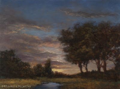
I'll be writing quite a few posts about these revisions I've been doing in the near future. Today I'm going to talk about this painting "Twilight Ember".
 |
| "Twilight's Ember" (12x16) by M Francis McCarthy |
I'm quite pleased with this painting now. I completed it last week.
Below I'm showing the 5x7 sketch that is very similar to Twilight Ember's first color stage. After I painted the color layer on the 12x16 version, I was not as happy with my motif, the sky, the tightness of my tree drawing or the grassy field.
Many of these problem areas are only suggested by the 5x7 shown here.
At the small size I wasn't aware that I had any issues really. 12x16 is much bigger though and after my first color layer it was apparent that I was going to have a blah painting on my hands unless I made some changes.
Here's what I did:
 |
| Summer Pastuire (12x16) by M Francis McCarthy |
Here's what I did:
- The sky was a nice transition from grey to peachy, but it was what I call "tubey" meaning that the spaces between clouds were to regular and not varied enough. I repainted the sky with an interesting glowing sunset going all the way up into a deep dusky grey blue.
- I removed that tree in the middle so I could install a better focal point in the space created.
- I completely did a 180 on the view. previously the sun was on the trees, now it is behind.
- I painted in a little brook where before there were only grasses. I feel like the scene would benefit from a higher horizon but I kind of like the uniqueness of the viewpoint as is.
- I created dark foliage in front of the trees on the right. I did this to help direct the viewers eye and create more mystery.
All in all I'm happy. It's not perfect but I enjoy looking at it far more now and I feel that it's over all a satisfying painting.
I hope you are getting something from this breakdown and that it helps you to look at your own work with that important critical eye.
Don't be afraid to tear a painting down and rebuild it if there are apparent issues in it. You may utterly mess it up but there's no real limit to how many times you can rework it if you need to.
Cheers,
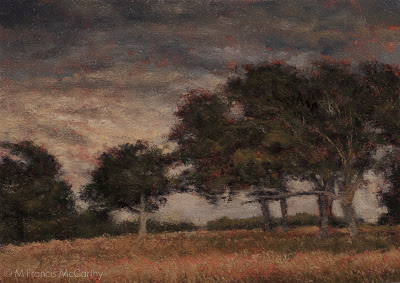
Landscape Painting - Don't Over Paint
Here is one I have to tell myself all the time.
Don't over paint.
I like to plan out my paintings. I take pictures, do drawings and paint a small color sketch.
Then I project my drawing up onto my board and trace it with charcoal. After that I finish that drawing with a brush and sienna and black. This functions as my under painting.
The process is the same for the 5x7's and their larger brothers. One difference between them is that I draw the scene with charcoal directly unto the 5x7 board while I project unto the larger. Also I do only one color layer on the 5x7's and up to three or more on the large version of the painting.
We all have our crosses to bear as individual artists.
Don't over paint.
I like to plan out my paintings. I take pictures, do drawings and paint a small color sketch.
Then I project my drawing up onto my board and trace it with charcoal. After that I finish that drawing with a brush and sienna and black. This functions as my under painting.
The process is the same for the 5x7's and their larger brothers. One difference between them is that I draw the scene with charcoal directly unto the 5x7 board while I project unto the larger. Also I do only one color layer on the 5x7's and up to three or more on the large version of the painting.
 |
| Day's End (9x12) by M Francis McCarthy |
Once in a while. I like my 5x7's better than their larger brothers. I enjoy their simpler forms and open brushwork
I sometimes have a tendency going back to my earliest drawing days, to over render forms and over delineate the details. I call this activity being "the robot". I'm a better painter than a robot so I watch for it.
 |
| Day's End (5x7) by M Francis McCarthy |
We all have our crosses to bear as individual artists.
How do I address mine?
The only way I know how, by painting a lot and looking, painting and criticizing. Always trying for better.
I also study the work of artists I admire and try to absorb some of their practice into mine where it's relevant and possible.
Every artist has their own way to their unique vision.
Sometimes it's good to strike a balance between what you know and what you should know. Question your assumptions a bit once in awhile. If you were right about everything you though was good in your art, all the time...
Wouldn't it be better?
Cheers,
Landscape Painting - One Brush
Hey, lets get back to some technique after yesterdays philosophical discussion.
The cheapies are more trouble than you save from the cost difference from just getting good brushes. Cheapies shed hairs in your painting, have uneven sides and edges, don't last and basically make painting a drag because the brush will not respond to your hand very well.
I tend to use one or two brushes for 70 to 100% of each paintings passages. I know that many painters like to change up their bushes during a session but I tend to start with a big brush, say up in the sky and I'll do the whole sky with it.
For the sizes I work these days I favor #8 to #2 Flats and I will spend the extra dosh for good quality brushes. I've been using Robert Simmons Signet Bristle Brushes because they're good and I can get them out here in New Zealand. I really like Silver Brush Grand Prix Super Brushes also. Try those out if you're in the states they are top notch.
 |
| Homeward Bound (12x18) by M Francis McCarthy |
The cheapies are more trouble than you save from the cost difference from just getting good brushes. Cheapies shed hairs in your painting, have uneven sides and edges, don't last and basically make painting a drag because the brush will not respond to your hand very well.
I'll stick with that first flat for an entire passage unless I've a great reason to grab another brush. I'll get deeper into my process as the blog progresses but for now: I use that brush's edges and corner to get the paint down in varied ways.
I do wipe my brush off occasionally with a paper towel and if necessary I'll use some lavender oil to temporarily clean the brush.
For cleaning at the end of a session I now use kerosene. Kerosene leaves a nice oil on the brushes that conditions them. In my experience it keeps the brushes fresher for longer.
Be careful the brush is dry though before using it to paint again, kerosene that gets into your painting will keep the painting from drying!
Turpentine can give me a headache as does "odorless" mineral spirits. I've found some great alternatives like lavender oil. More on Lavender oil later.
 |
| Homeward Bound (5x7) by M Francis McCarthy |
When I move out of the sky I often will lay in my dark's with a #2, #3 or #4 flat depending on the shapes involved and the size of the passage. I like to get back into a #4 or #6 for the rest of the medium color areas for the same reasons that I use the #8 in the sky. Namely:
Bigger strokes just look better and the bigger the brush, the bigger the strokes. I find that being forced to use a corner of the brush for accents keeps the painting fresher. In my earlier days as a painter I liked getting the small sable rounds out and going to town on the details. I now feel this locks up the image and that's contrary to my artistic agenda of creating a loose relaxing space for the viewer to enjoy and contemplate.
Another good reason to mostly work with one brush for a passage is that it keeps a bit of the tone from each element mixed in each color. I like my color defined but definitely harmonic. Note: the main brush switch up that I do is when I go in with the dark's Having lot's of muck in your brush isn't a great plan for dark's but like I said can be an asset in your middle tones and lighter passages.
Obviously, brushes, brush technique and technology is a vast topic so we'll talk more about it down the road.
Cheers.
Illustration - Digital Thoughts
Still deep into sorting my catalog of paintings. My computer muscles are getting a bit worn. So short blog post today.
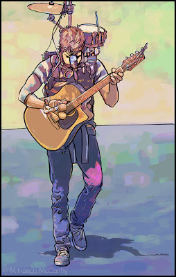 |
| Street Musician by M Francis McCarthy |
This illustration I did of a street musician was done soon after I'd arrived to live in New Zealand. It was drawn and inked and colored using a Wacom Stylus and tablet in Photoshop. The watercolor coloring was done by manipulating a photo using lots of filters and Photoshop mojo.
I'd been hatching this style in my brain for quite a while and it wasn't until getting to New Zealand and getting off the hamster wheel that I had time to figure it out.
I used photos extensively my entire career as a paid illustrator. These days its so easy to blur the boundary between photos and illustration it's not even funny. Frankly I've never been too hung up on it as for me art is largely about aesthetics and all the myriad decisions that go into creating a striking image.
It's fun to have a play and let your imagination, skill and talent take you where ever they may. Photoshop and other programs are great for that.
At the end of the day though I find the attraction of creating with a brush on wood panel to be far more satisfying. There's no undo but there is the tactile sensation of working a surface. Ultimately creating a unique object.
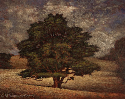
Landscape Painting - Brush Technique 2
Yesterday, I talked a bit about brush technique. Today I'd like to go a bit further.
The brush is my preferred way of applying paint to my panels. I also use a pallet knife, but I use the pallet knife in a subtractive way. Mostly to scrape away surface dimples or sometimes to scratch away paint or even to blend passages.
Seldom do I apply paint directly with a knife. Many painters that I consider personal teachers such as Richard Schmid or Bob Rohm do paint with the knife. They both use it very well as do some other landscape painters out there.
 |
| Morning Glow by M Francis McCarthy |
I guess my biggest issue with pallet knife painting is that it can so easily feel contrived. Students of painting should give it a try though as it can be perfected as a painting implement. It's best used in moderation should you care to use it at all. If you're older like me you will recall the awful overdone impasto paintings that we're so common in the sixties and seventies.
When you're painting you have a nearly infinite number of approaches to your brush handling. You can go with chiseled strokes that are long or short. Or, completely blend out all indication of separate marks.
I like to show a bit of the strokes but I also like my strokes to interweave like a lattice. Diffusion is always an important aspect of my paintings but diffusion that breaks into contrasting edges here and there.
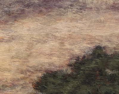
Here's a detail of Morning Glow that illustrates what I mean. I aim for my brush work to be expressive while also getting the image across. A good way to look at the brushwork in a painting is that it should look great from afar but also pay off for the viewer that gets up really close. I try to make my marks with character and sensitivity without being overly direct or contrived.
 |
| Morning Glow Detail |
Here's a detail of Morning Glow that illustrates what I mean. I aim for my brush work to be expressive while also getting the image across. A good way to look at the brushwork in a painting is that it should look great from afar but also pay off for the viewer that gets up really close. I try to make my marks with character and sensitivity without being overly direct or contrived.
Another good tip I have for aspiring painters is to change-up how they are holding their brush. I like to use every angle of my brushes whether the edge, flat or especially the side.
I apply paint fairly thinly building up my paint in layers of successive brush strokes. I try to always leave a bit of life in the painting. By that I mean I try not to choke out the layers that went before. I leave a bit of them showing.
When my paintings are most successful in my view they are articulated with an economy of strokes. Many times I will have to apply multiple layers of smaller strokes to a painting to get my desired vision across but it's magical when I can do it in one pass of color over my initial under-painting/drawing.
Landscape Painting - Brush Technique
Everything I write and teach on this blog is strictly my opinion. I hope that it is evident by the blog's title "M Francis McCarthy" but just for the record. Everything I write here is just my opinion. Other professional artists may have contradictory advice that works for them. I can only speak and teach from my own experience.
I was once guilty of making the same error but after constant reappraisal of the work I was doing I gradually ceased using those tiny brushes. I think it's far better to imply detail with glancing indicative strokes rather than try to impersonate a camera with a dinky little brush. Every stroke needs to have it's own beauty and also serve to build a whole image at the same time
I'm no fan of precious, over detailed brush strokes in landscape paintings. There is a landscape painting show currently running in my town by a decent painter. While her color and composition are good, I feel she's only decent because of her tendency to use lots of tiny strokes made with a small round brush. This to me is a sure sign of a beginning or amateur painter.
 |
| A Welcome Friend by M Francis McCarthy |
I was once guilty of making the same error but after constant reappraisal of the work I was doing I gradually ceased using those tiny brushes. I think it's far better to imply detail with glancing indicative strokes rather than try to impersonate a camera with a dinky little brush. Every stroke needs to have it's own beauty and also serve to build a whole image at the same time
This piece "A Welcome Friend is a good example of my technique. There are many small strokes. In fact maybe more than I would have preferred. My approach to painting is to always use a slightly larger brush than is comfortable to execute a given passage. This is one way to combat tiny brush syndrome.
Another way is to paint with your glasses off so you concentrate on the overall more than the specific. Note: if you have great vision you can semi close your eyes so that your vision becomes blurred and periodicity paint that way for the same result.
With a larger brush, the painter is forced to produce bolder, more painterly strokes. This is a good thing. The smallest brush I ever use even for my 5x7s is a #2 flat and more often than not I use that only for certain shadow passages.
Brush technique is a vast topic and I'm going to touch on it again in a future post. For now though just remember to use the biggest brush you possibly can. Your work will benefit immensely, immediately.
Landscape Painting - Color
More ruminations on landscape painting today, with a focus on color. I use a somewhat limited pallet as follows: Black, Cobalt Blue, Phthalo Blue, Dioxazine Purple, Viridian, Alizarin Crimson, Burnt Sienna, Transparent Earth Yellow, Yellow Ocher, Lemon Yellow (hue) and Lead White. I've also recently added Titanium White back into my Lead White for added body. I've arrived at this pallet through years of trying out different colors.
It's important to limit your pallet as much as possible, doing so creates better harmony in the painting. Some of the colors on my pallet are special effect colors like the Violet and the Phthalo Blue. I can get by without these easily.
 |
| Pastureland (11x14) by M Francis McCarthy |
It's important to limit your pallet as much as possible, doing so creates better harmony in the painting. Some of the colors on my pallet are special effect colors like the Violet and the Phthalo Blue. I can get by without these easily.
Others like Ivory Black are for knocking brightness off of a straight mix. Also black is great for making a warm rich green when mixed with yellow. When it comes to using black I almost never use it in an opaque manner. You must be careful with black as too much has a deadening effect. Also, it can be cool in an unforgiving way. I love black and would not want to be without it.
The lead white vs titanium debate is well known to any serious student of oil painting. I love lead white but I must import it to use in my paintings here in New Zealand as it's not freely available here.
The painting I featured today is called Pastureland. a very simple composition but pleasing in it's effect I think. Phthalo Blue features prominently in the sky here and I enjoyed pushing the color pretty far.
I work on a color principle of warm vs cool colors on my pallet. In the reds Alizarin Crimson is a cool red while I use Burnt Sienna as a warm red. I prefer sienna to any cad reds as I like it's earthy quality. It is made with clay and one of the ancient pigments.
In the Blues: Cobalt is a warm blue and Phthalo Blue is cool. For the yellows: Yellow Ocher is warm and earthy while Lemon Yellow is cool and quite "green". Viridian I use mostly mixed with Alizarin to create my shadow/dark colors. I use it to modify greens and cut reds as well. As a green it is not really in most landscapes but it is vital as a modifier.
 |
| Pastureland (5x7) by M Francis McCarthy |
The lead white vs titanium debate is well known to any serious student of oil painting. I love lead white but I must import it to use in my paintings here in New Zealand as it's not freely available here.
Lead white is far more transparent than Titanium and warmer as well. I use lead white exclusively except for when I teach. Recently though I'm mixing a bit of Titanium in with my Lead white. This is helps to lighten my paintings a bit. Also, it is a very permanent and light-fast color so contributes to their longevity.
 |
| Pastureland (sketch) by M Francis McCarthy |
The painting I featured today is called Pastureland. a very simple composition but pleasing in it's effect I think. Phthalo Blue features prominently in the sky here and I enjoyed pushing the color pretty far.
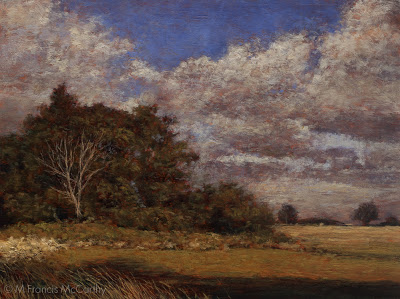
Landscape Painting Edges
Well, as the end of the worlds been postponed I guess it's incumbent on me to keep up this blog. Today I want to write about edges in painting. I'm posting a couple of recent paintings just for illustration. I could have posted just about any landscape painting that I've done as I very consistently pursue a certain edge quality in my work.
 |
| Clearing Storm 8x10 M Francis McCarthy |
That quality is all about getting the edges right. I cannot say that I always achieve the effect I want but that is one reason painting still fascinates me after doing it for a while now. Many great artists have mastered edges and deserve close study. Some that come to mind are George Inness and the French painter Corot. How a painter handles edges is one of the greatest determiners of what their style is.
 |
| Fleeting Light 8x10 M Francis McCarthy |
Below is a detail of "Fleeting Light" that shows a bit of my particular way of handling edges. Every painting is full of different edges and all must be approached in the appropriate manner for what is being rendered and the of the painting itself.
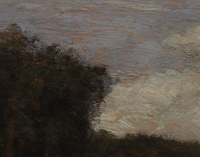 |
| Fleeting Light (Detail) M Francis McCarthy |
I'm focusing on the sky/tree edge challenge here because frankly it's the greatest challenge for me in any painting. This is because the sky is the brightest part of most landscape paintings and the vertical trees against it are generally the darkest part. Because of this inherent contrast difference the transition from light to dark has to done with care or the painter runs the risk of creating a cutout appearance in his scenes.
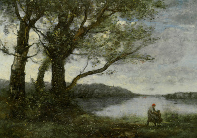 |
| Camille Corot Three Trees with a View of the Lake |
Above is a painting by Camille Corot. In my opinion Corot is one of the greatest edge painters ever!I saw many of his original works on my trip to the Louvre in Paris. Corot took a sort of flecky approach to his edges. They appear to be built up in many layers and there is always a feeling of air and silvery light in his work. He is a great guy to study. Any painter who's doing edges in a way you admire is good to study I reckon. I may revisit this topic in a later blog as it's absolutely crucial to creating a good landscape painting.
Direct vs Indirect Painting
 |
| A welcome friend M Francis McCarthy |
"Why are your paintings so dark?"
I get asked this once in awhile at my studio by visitors. I reply that the paintings are rendered in a lower key than what is currently fashionable. Also, to my eyes many modern landscapes seem excessively bright and their colors too chromatic and lacking in subtlety.
Paintings that are made using transparent or semi opaque layers tend to need a lot more light on them to reveal themselves at their best. For this reason many of these types of paintings benefit from having a light directly on them.
There are two distinct approaches to painting; direct and indirect. Good examples of direct painting are artists like: Monet, William Merritt Chase and Vincent Van Gogh. Good examples of indirect painting are: George Inness, Charles Warren Eaton and Whistler. You can do great stuff either way or by combining the approaches.
I prefer indirect for my final paintings as it can convey multiple layers of mood and color. Also because I can reflect and correct as I go but ideally there is a trail of movement just below the surface that shows the structure as well as the finish. I enjoy painting my oil sketches directly as they are small and quickly realized.
Layering transparent glazes of oil tends to darken as the light source must work it's way through the layers and bounce back to the viewer. More opaque styles reflect the source light more directly from the surface.
 |
| Late Summer M Francis McCarthy |
As a side bar. On my recent trip to Paris I saw many excellent paintings at the Louvre. Many of them would be considered quite dark. What was interesting to me as a modern painter was the focused use of intent contrasts between the lights and dark's in a painting that drew the views eye to where the painter wanted it. Someting thats hard to do if the whole painting is light.