Deadlines
I fist became acquainted with deadlines working as a manager for Jab Art Enterprises.
Every job we shipped had a tight deadline that could not be missed. Work crews would most often be at the destination site and scheduled to hang the art on a specific date.
Year in and out I hit those dates though many times I might be the last one there, loading a truck at 11:00 at night.
Later as the art director at Jack Nightingale Artworks I was responsible for scheduling our workload and getting the art out on time and also making sure it was good art.
The business JNA was in is competitive and there was always lots of good art for the buyers to choose from.
I never missed a deadline at JNA in the thirteen years I was there and we put out some great stuff on razor thin time margins.
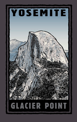 |
| Glacier Point Illustration by M Francis McCarthy Copyright Jack Nightingale Artworks |
I never missed a deadline at JNA in the thirteen years I was there and we put out some great stuff on razor thin time margins.
Deadlines can actually stimulate good work even though time is tight. I feel that this is because our subconscious mind becomes more fully engaged in an emergency situation and works double time to provide us with needed answers quickly.
The ability to access that part of our minds when it would help most is one thing that separates the winners from the losers in commercial art. Personally, I found it annoying when the other artist there Rico would tell me that I could receive art from him fast or I could have it good.
What utter bollocks and completely untrue.
I saw the work that other artists were doing in our field and I knew damn well from chatting with some of them at trade shows like Magic in Las Vegas, that their schedules were just as full and the times just as tight as in our art department.
I'll blog a bit about Magic some other time but for now I'll say that its the worlds largest apparel trade show and that I attended it every year from 2000 to 2009.
If your looking to produce more work and of an often higher quality, set yourself some deadlines and stick to them.
You'll be amazed at what you can accomplish.
Also if you, like Rico thinks it can be fast or good, hopefully I've disabused you of that misguided attitude and you can now start getting the art out a bit quicker and stop farting around.
Cheers,
A bit about "Glacier Point": This is illustration number 1001 I did of Yosemite's Half dome .. Just kidding, but I did illustrate half-dome at least 100 times in different ways, shapes and colors.
I was always fond of this design. I think the illustration is real nice and I also like what Jack did with the type here. Jack was and probably still is great with type. We could be a great team as he was strong with design and I was with illustration.
Unfortunately, sometimes he would lay some real stinky designs that I'd be forced to send out. He was the "Creative Director" after all, not to mention being one of the owners of the business.
I did my best to polish those turds...
Dinosaurs
I executed a lot of dinosaurs while I was at Jack Nightingale Artworks. Most of them in collaboration with the other illustrator there who I'll call Rico out of respect for his privacy. Rico was a good artist and we we're buds for most of the time we worked together. We both worked on the dinos, passing them back and forth in an effort to make them better and better.
Quite often we'd base our dinosaurs on reference from Jacks extensive morgue files and later on we'd use images from good ol' Google. Unlike animal illustrations that you can find photo reference for, dino photos we're not available. There we're no cameras back when they ruled the earth.
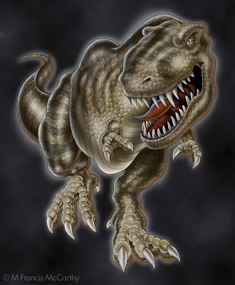
Rico did the preliminary sketch for these dinos and I did all the rendering. Every year we'd have to try and top the last. We'd add features like scales that were printed in puff ink or we'd do special glow in the dark plates.
These guys pictured here we're done near the end of the dino days at Jack's. The new technique that was added to them was the reflected highlights. White on one side and taupe on the other in this case.
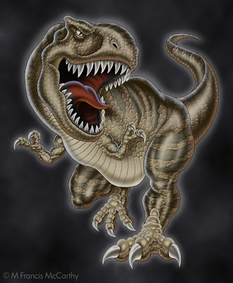
Doing dinos every year was fun for a while. I must say though that the printing of our designs often fell way short of the comps we produced. The reps that worked the dino account would often make "creative" contributions to the designs before the actually got printed. The additions or subtractions could be nightmarishly bad.
Another case of non artists expressing themselves at the expense of the artwork and the final product. I cannot say I miss viewing some of the train wreck tees produced from our painstaking renderings.
As a side note, these illustrations are copyrighted by Jack Nightingale Artworks and I show them strictly for review and portfolio purposes. BTW Jack didn't draw any dinos. He had a pretty good gig for many years adding type and background squiggles to the designs while taking credit and getting paid for the entire enterprise. Rico and I got a paycheck.
Hopefully, Jack is still receiving income from these dinos as I have seen reworked versions used on items like swim trunks and tees as recently as last year.
Drawings 3
This image was illustrated by me for a company I worked for in the eighties and nineties I will call Jab Art Enterprises. I worked for a guy I'll call Jude. I started there in 1984 and worked for Jude till 1997. For a long while I thought I would never be able to leave that job. More on that in some other post, some another time.
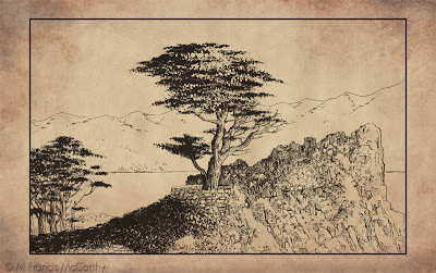 |
| Cypress Point by M Francis McCarthy |
Jude marketed this drawing and others to places like Montgomery Wards and J. C. Penney as part of a "California"series. The ink drawings were photocopied and then hand water colored. The Series featured points of interest in California
At Jab Art Enterprises we primarily did contract framing on a large scale. We also produced "graphics" for the hospitality industry. At the time I drew this we we're more into department stores. I'm not sure if any of them bought this.
The painter in me was coming out for the first time back then. You can see it for example in the way I knocked out the highlights from the cypress tree with white paint.
At that time I was taking painting lessons from Smitty, a customer of Jab Art Enterprises. Smitty taught oil painting to stressed out corporate types as a regular gig. He had a few companies that he would set up in after hours and their employees would come and learn how to paint. Smitty provided everything that was needed including frames that he purchased from Jab Art.
He practiced a form of the Bob Ross style, quick landscape painting that was easy to learn. For my part I always preferred to use actual landscape photos rather than copy the formula paintings from a book that Smitty provided as reference for his students.
I owe Smitty a lot as he not only taught me for free but he also provided the art materials and picked me up for class. A wonderful man I'll always remember with gratitude. He is one of the reasons I write this blog and share what I've learned about art freely.
Cheers, Smitty wherever you are now.
Cheers, Smitty wherever you are now.
Illustration - Hired gun
Let's go back in time to Jack Nightingale Artworks in 2000. Actually a really great time for me there. Jack Nightingale Artworks was a division of a company I will call Sales Today. Sales Today mostly sold tee shirts.
All the art was done by myself and the other artists at Jack Nightingale Artworks. While the actual printing was contracted out to local screen printers. In 2000 things were doing well there. We were selling lots of tees at the national parks, the San Diego Zoo and also money was flowing in from our newest account Starbucks.
I had started as art director after my friend David had left the position to work in New York and I was busy but nowhere near the crushing kind of busy that was in my future. I'd recently bought a home and life was good. I was happy to be making a good living as an artist and I'm still thankful to the universe for granting my desire.
I was however a hired gun. In 2000 I was pretty content to just be that hired gun and shoot the hell out of whatever came up. I really put all my creativity and passion into my work and I always endeavored to make each illustration the best I was able.
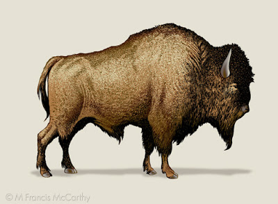
This bison was done for a Yellowstone tee shirt design. Yellowstone was a frustrating account as they always bought only a few designs but we did tons of art for those few.
This guy was never actually used in this format on a tee but was recycled for many designs over the years. I am proud of the hand stippling on this bison. I used to love to stipple the different colors on animal designs because it always printed well.
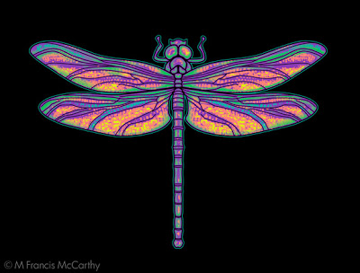
I'm happy with this dragonfly. I created it at my home studio. It was printed on a tee for The Nature Company. A now defunct chain of stores that sold scientific stuff, Cd's and Tees. I was so happy they choose it but unfortunately it was printed super tiny on the tee shirts.
A "creative" decision made by the buyer. Many buyers loved to put their stamp on others work. My theory is that many of them were frustrated artists. That said I've known some awesome buyers that were a joy to work with.
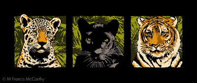
These cats represented a break through for me at Jack Nightingale Artworks back in 1998. The cats were never used with these colors on a tee. I did these illustrations while Jack was on a golfing trip in Hawaii. Something he did often in those days when Sales Today's business was good.
I had only been at Jacks for about 5 months and was still getting used to the compromises a professional hired gun has to put up with. By this I mean my art getting changed and quite often just so Jack could put his stamp on it.
He came back from his trip and loved my cats but decided to have me rework them in muted grays and tonal browns. The end result looked pretty good and sold great but I still feel these brighter cats have more appeal. Being the hired help though I could only cooperate in the dilution of my originally stronger idea.
Making a living with your art is great but it comes with a cost. Sometimes the cost is minimal, other times it's devastation to one's core passion as an artist. If this price is paid to frequently an artist runs the risk of losing their creative spark altogether. Like a horse thats been rode too hard for too long.
Animal Illustration
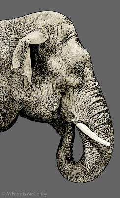
As an Illustrator working for Jack Nightingale Artworks I was called upon to execute many different styles for projects. A big account was San Diego Zoo. BTW all the illustrations in this post are copyrighted by Jack Nightingale Artworks. I just drew them and got paid. I show them here on my blog for purposes of review and education only.
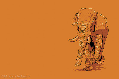
The style for this guy was taken from a image I saw of a elephant on the web. I simplified the color scheme and drew an Indian elephant in a quick line and shaded in Photoshop. What I liked about this illio was how it looked good on any color. Never got bought but looks like a winner to me still.
Ok, the Zoo was going to have a special Indian elephant exhibit and they needed a good image for a design. This image was definitely in consideration but not selected for the final design. Pity cause I really like the effect I got on this gal. This is a strong combination of photo shop and hand drawing. One day I would love to teach a class in this type of illustration.
I've seen this wolf illustrated by others, the reference is available online. This is a pretty detailed brush and pen drawing that's been scanned into Photoshop and then colored. I always tried get a certain look in the eyes of the animals I illustrated and I really enjoyed the work for many years.
 |
| Indian Elephant by M Francis McCarthy |
The style for this guy was taken from a image I saw of a elephant on the web. I simplified the color scheme and drew an Indian elephant in a quick line and shaded in Photoshop. What I liked about this illio was how it looked good on any color. Never got bought but looks like a winner to me still.
In my Early days at Jack Nightingale Artworks I had lots of time to really detail my illustrations but as each successive year passed less and less time was available. I feel that this was true for any art department in the early to mid 2000's.
You can still get great results in less time if you keep your eye on the prize and have the right attitude. I know from first hand experience that spending hours on a piece of artwork will not guarantee a great work of art.
 |
| Indian Elephant by M Francis McCarthy |
Ok, the Zoo was going to have a special Indian elephant exhibit and they needed a good image for a design. This image was definitely in consideration but not selected for the final design. Pity cause I really like the effect I got on this gal. This is a strong combination of photo shop and hand drawing. One day I would love to teach a class in this type of illustration.
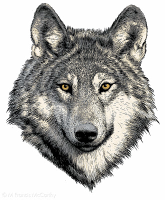 |
| Wolf by M Francis McCarthy |
I've seen this wolf illustrated by others, the reference is available online. This is a pretty detailed brush and pen drawing that's been scanned into Photoshop and then colored. I always tried get a certain look in the eyes of the animals I illustrated and I really enjoyed the work for many years.
Why paint?
I have been creating art for 42 years. In that time, I have worked with many different medias. For a long time I was content to use pencil and pen ink to create drawings. The mastery of rendering form in light and shade was for quite a while enough.
With the advent of the computer I began applying colour to my art work in both in the virtual realm and from without. The freedom that I felt working in the virtual world was incredible! I could change anything I wanted at any time. I could also add and remove things at will. It was amazing, a revelation really...
For many years I utilized the skills that I'd learned in creating artwork on the computer to make a living as a graphic illustrator. I found this work to be quite engaging and fulfilling for a time. However, I eventually began to feel a yearning for a deeper connection with my art and it's apprehenders. This desire is what eventually drove me to study painting in oil.
When I first started painting in oils in 2007 I found that many of the skills that I had acquired through a lifetime of creating artwork were applicable in this medium. I also learned that many of the things that work for me in the virtual realm did not work well when I was creating artwork by hand using oil paints and a hardwood substrate.
While creating an actual physical painting I am aware that a transference occurs. It seems this is a transference of energy and consciousness between myself the painting and the apprehender of the painting. Speaking only for myself I do not find this occurs when creating artwork digitally and printing it out. As far as I know this phenomenon exists only with original artworks being viewed by a person in the presence of the original art .
This is a fascinating and rewarding endeavour and is an interesting reason to paint as well. There are more reasons to paint of course and perhaps we will go further into those in future blog posts.