Dark Art
The art we make should be an expression of who we are as a person. What we like. What we see. What we feel.
If you're not expressing that, why create art at all?

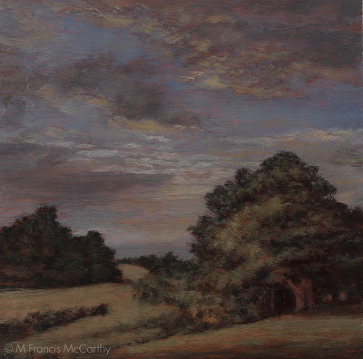
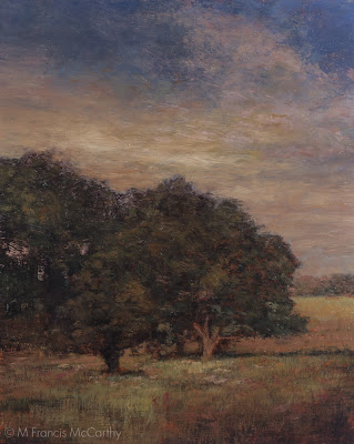
"Late Summer" (9x12) by M Francis McCarthy
This is a topic I've explored before on this blog. For me it cut's to the bone, having worked as an in house illustrator full time for 13 years.
I've alway loved creating art and spent many years just working at getting better. I wasn't too focused on subject matter for those early years. Mostly I was interested in acquiring the skill to create images that moved me and others. I also wanted to achieve at least a small level of the technical ability that was so obvious in the work of artists that I admired.
All that time I was making my living at jobs that only had art as a part of what I did. I was a manager, buyer and designer among other things. But, my dream was to make my living full time as an artist. I felt blessed when that dream came true.
It didn't take long before the compromises contained within my position as hired gun illustrator began to rub the wrong way. This rubbing process forced me to see beyond craft and to start looking deeply into what's behind creating art, the purpose, authenticity and processes involved.
Today's post is about creating art that compromises only with the universe in that we must put our egos out of the frame and let what's beautiful about us as unique individuals come forth.
I called this post dark art as I had a lady in my studio today looking to buy a painting for her home. Unfortunately my work was too dark for her decor so I recommended the work of some other local artists.
It got me thinking about my time as a commercial artist and how in that time I could have made a bright painting for her no problem. Now though it would feel wrong to use my art to chase a buck. At least my painting art.
I enjoy doing the odd graphic project . It's fun to use those skills but I'm so glad that I got out of the commercial art game while the gettin was good.
Now I work at finding markets and buyers for my paintings that are already looking for what I do.
Cheers,
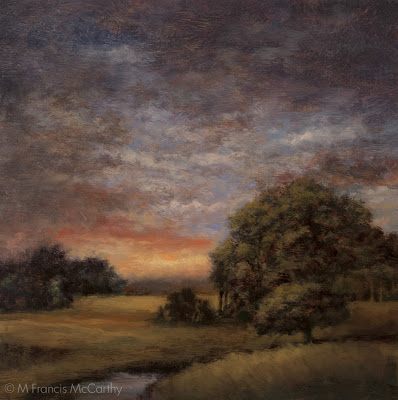
A bit about "Late Summer" I painted this about 8 months ago. It's pretty dark and is one of my last totally subdued paintings. I really held back on strong contrasts here. Many others that I'd painted from this period have since been repainted. I left "Late Summer" alone though.
The actual painting has a nice luminescent quality that I like. I had really worked hard at getting a certain feeling across. So, I've let it be what it is even though I can see ways that I could improve it. I know to do so would kill it.
Sounds like a topic for a future post.
Marketing
What the hell do I know about marketing?
Not enough, I'm sure of that...

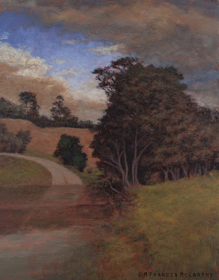
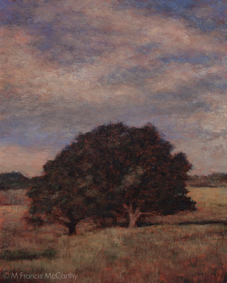
Edge of the Woods (5x7) by M Francis McCarthy
When I was a full time hired gun illustrator, the guy I was working for had to worry about marketing. All I had to worry about was creating saleable artwork that would do well in the marketplace.
Thats all changed now that I'm a full time landscape painter. Now I must do it for myself and I cannot say that I really enjoy it. But I am trying to learn. It's because I believe in my work that I feel I must get my art out there. This website of course is a big part of that process.
I'm not the only artist who struggles with this aspect of their careers. Heck, it was hard for us even before the economy contracted. Now it's harder but ultimately I feel it's doable.
This year I plan to get several more galleries on board. I'm super excited by the work I'm creating and I'm confident that it will do well when presented to it's proper market.
It's on me to get that job done, no one else seems to be stepping up.
I've studied quite a few books. Here's a few good resources that I've found in the case that you're also an artist like me, working to get their paintings seen and purchased:
Theres a few to get you started. I've purchased and read quite a few more than this but to be honest these are the clearest and most honest I've come across.
There seems to be an industry growing up around artist's need for this type of info. Unfortunately not everybody writing a book is giving out great advice. These guys I've listed are all on point.
Cheers,
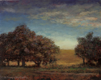
A bit about "Edge of the Woods" I think this is the first 5x7 I've featured solo in a blog post. I really love painting these small works and often times I'm more fond of the smaller oil sketch I've made of a motif.
In the case of "Edge of the Woods" there there exits a larger version waiting to be repainted. I've made those changes here in the 5x7. The larger version may never get redone . Thats ok though as every painting I do large or small is designed to stand on it's own as a work of art.
I'm pretty fond of this little painting especially the sky in it so I thought I'd share it with you all today.
Textured Boards
I'm working on a series of 8x10s at the moment. Most are progressing from motifs I've recently painted as 5x7s.

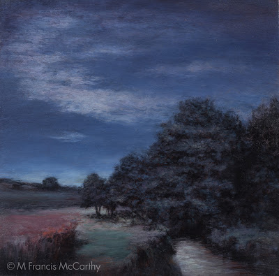
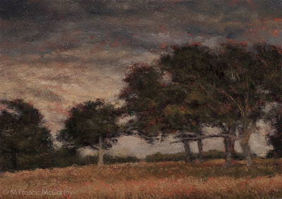
"Quiet Afternoon" (6x9) by M Francis McCarthy
I'm doing the 8x10's on some nice pine boards I have in my studio. They've been textured in a manner similar to how I like to prep my 5x7 boards.
I create the texture using the flat side of a large brush and some acrylic gesso tinted with Burnt Sienna. This gives me a nice random but even texture that helps pull paint off the brush.
The result is a bit more diffraction of my brushwork on the finished painting than on a smooth surface. I've been doing this on my 5x7 paintings for a few years now but moving up a size is new and pretty fun.
It's good to move things around a bit and change it up once in awhile. Still I really like working directly on a nice hardwood like kuari. So, I'm also doing about Five 8x8's with a smoothly prepped surface.
When I paint on a smoother wood board, the textures are more built up by the brush stokes. This looks nice but so does the textured surface. I've been playing with canvas also but I'm not sure I'll ever love it as I do painting on wood.
I'm thinking of developing the strongest motifs into even larger paintings. I never get the same painting twice though there are definite similarities.
I'm going to write more about revisiting motifs in a future blog I think.
Cheers,
A bit about "Quiet Afternoon". I painted this about four years ago. It's definitely a tonalist inspired painting. It was painted on a textured maple wood panel. The motif comes from the perc ponds behind my old art studio in Campbell California.
Not sure where my reference photo is now but I am sure that I worked pretty close to it. Thats one of the biggest differences in my painting approach now. I'm far more free with changing the scene to address compositional issues than I was four years ago.
I am happy with "Quiet Afternoon" and I recall putting a ton of work into this small painting. It's funny how long it takes to really understand the landscape painting "game". I'm not sure that anyone could ever hit the end of all that's involved with creating a good landscape painting. God willing I will have a few more decades to really get down with it.
Hey, Hey, Hey,
Whatta ya say?
I know, I just started a new Blogger blog recently and now... What's this? A new blog?
Again? Really?

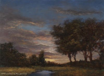
"Twilights Ember" (12x16) by M Francis McCarthy
No worries my friends, as I've imported both blogs into my new home here at Squarespace. So all that intriguing content is just a scroll down this page away...
The only downside so far is that the Blogger images all imported at a smaller fixed ratio than I'd like. Should you want to find the larger version of an image, just put the title into the "search" field on my old blogger site here
BTW, Squarespace looks awesome on all devices! Also, I can edit my site using a regular Internet browser so, no software either...
I'm still sussing this place out, but it looks far more professional and Squarespace is also lots easier to update my site with than my old program Ezgenerator.
Not to mention that my blog is now contained within my site. No doubt that we're going to have some transition pains but I hope you will all bear with me. For my part I'm going to amp up this blogs content by doing at least three blog posts a week and I'll try for more.
Cheers,
A Bit about "Twilights Ember". I wrote about my painting process for this piece here . I guess to day I'd like to say that I'm very happy with this painting! It captures a mood and feeling that I really enjoy and pursue often in my work. This painting is currently on display at the Helena Bay Gallery in Whangarei New Zealand.
What's it Mean Anyway?
What does art mean?
Why do it anyway? What purpose does it serve?

"Spring Light" (8x10) by M Francis McCarthy
All the answers to these questions must by definition be subjective. Any artist worth their salt should have their own ready answers to these questions."Spring Light" by M Francis McCarthy
If you don't, I'd be willing to bet that you're either a commercial artist or a beginner.
The choices you make as an artist have an impact on all humanity even if your work never receives a huge audience.
I chose now to be responsible for the energy that goes into what I paint and the feelings that my work creates in the hearts of my viewers. That means I try for magic in my work, for peace, thoughtfulness and repose.
As a commercial illustrator I often had to create work that affected much different areas of feeling. Nothing wrong with that if you're working for someone else and getting paid. It's fun to play with your craft too.
Ultimately though, it seems to defeat the purpose of even being an artist. I mean, if I'm going to spend my time and energy creating an illustration of a monster truck crushing stuff, why do art at all? I could probably make more money in the business world and spend my free time doing work I personally value.
So many artists lose their way in the mad rush to trade their art and energy for money. They forget why they wanted to be an artist in the first place. Many end up like used up old prostitutes willing to do a blowjob for five bucks.
BTW, I'm not dissing those of you that are using your art to make a living. I was that and I may be again one day should no other path be available.
I do feel this world is sick with people selling what they are for pennies on the dollar. Often their compromises run so deep and long that they forget about the magic that started them off. They forget about moving people and about expressing their unique vision as an artist.
The best of course is when you are getting handsomely paid for doing what you love. That is possible and I'm trying over here to do that everyday. That is my dream.
It's not the easiest dream to actualize but if you don't have a dream, how can your dream come true?
Cheers,
A bit about "Spring Light". Hey, one reason I started this blog was so I could repost paintings I already put up once ;-) I wrote a whole post about "Spring Light" here. I like this painting. It's a great example of what I like to do in landscape these days.
Working Small
I've been working on a lot of small pieces lately.

"Moonlit Meadow" (11x11) by M Francis McCarthy
I started oil painting with small sizes, reasoning that I could cover a lot more ground by working small and expedite my learning curve. I still paint fairly small but I'm comfortable at larger sizes when the feeling strikes."Moonlit Meadow" (11x11) by M Francis McCarthy
I love painting 5x7 and 5x5 oil versions of most of my motifs. I call them oil sketches for pricing purposes but truth be told they are all valid oil paintings and I put my soul into them just as I do my larger works."Moonlit Meadow" (5x5) by M Francis McCarthy
What I enjoy most about painting small is the way it helps focus me on the colors and design of the motif. I cannot put in much detail as generally I'm painting with a #4 brush which is quite large for a painting that small.
I don't worry much about following the 5x7 versions when painting larger. Sometimes I'll use it as my main reference but more likely I'll paint the motif larger using my comped reference for inspiration.

"Moonlit Meadow" (5x5) by M Francis McCarthy
If I find things need to be restructured for a motif it usually shows up on the larger painting. I will often use my 5x7 version to retool the design and then take those ideas back to the larger painting.
More and more in my work practice I see things that need improvement after living with a painting awhile. These days I will just change the painting. In my early days I seldom did this. I think my reticence came from my career as a professional illustrator. There, a job needed to be done when it was done and that was fine as the art was generated for commerce.
Now I make paintings because I want them made and I also like them to be done well. Truth be told the only impediment to that process is me as the artist. When I get out of the way and let it flow, the paintings are always better.
So, some good information and some rambling for you all tonight. Be well.
Cheers,
"Moonlit Meadow" was conceived as a "blue" painting. I've seen other artists pull this off and I wanted to give it a try. Not sure I did pull that off but over all I'm pleased with "Moonlit Meadow".
This painting was repainted a few months back. Mostly I replaced the old sky which was a bit too indistinct and halfhearted. The result of cleaving too tightly to my source reference. I also pumped up the colors and removed a pyramid top from the main tree mass.
"Moonlit Meadow" is currently on display at my studio located at the Quarry Arts Center in Whangarei.
Perfectionism
Painting on some nice stretched canvas today.
Normally I paint on wood panels but Takapuna Art had some sweet stretched canvas last time I went down there so I picked up a few to have a play with.

"Summer Storm" (8x10) by M Francis McCarthy
I enjoyed the change but found it frustrating too. A lot more of my technique than I thought relies on the smooth surface of my beloved kauri marine ply. I found myself doing a lot of scrubbing whereas I'm used to gliding.
Still, it's good to stretch a bit and not always do the same things the same way.
Which leads us to today's topic perfectionism.
First off I'm guilty. Though for most of my life if you'd asked me if I was a perfectionist, I'd say "nope". This is because I've worked with some first rate perfectionists in my time but wasn't seeing the entire phenomenon or my ownself clearly. That's one great thing about getting older, experience precedes wisdom.
As I see it now there are two forms of perfectionism, a positive and a negative.
Positive perfectionism drives the artist to higher and higher levels of their art but pushed too far can totally immobilize the artist.
The negative form tends to hold down almost all creative output do to overthinking and narcissism. In addition, negative perfectionism can keep the artist from showing and marketing their work due to the myriad aspects that are not under their control.
Examples of positive perfectionism would be artists like M C Escher and Stanley Kubrick. Negative examples, um my old boss Josh or dudes like Kevin Shields the songwriter and brain behind My bloody valentine. Not dissing Kevin BTW. I'm just saying...
My advice for those afflicted like myself with bouts of perfectionism?
I'd say make sure you set limits on your working methods. Keep it focused and produce many pieces reflecting your core ideas as opposed to exerting all of your efforts on only one work.
There may come a time that you need to create something big that requires all of your attention but unless you happen to be a genius (like Kubrick for example) as well as a perfectionist you'd be better off creating many pieces that continue to perfect up to your ideals rather than only one or a few.
Cheers,
A bit about "Summer Storm", Originally this painting was based on a scene from California near where I used to work. I'd painted it straight except for a better sky. Later though, I revised it using my imagination to paint the scene from a more magical perspective.
Not airy fairy magical but more the feeling that magical places give us. I've found that this effect is easier to get when reworking a painting without reference.
This painting is currently hanging in Helena Bay Gallery here in Northland New Zealand
Price vs Value
What is art worth?
The obvious answer, art is worth what people will pay for it. But, is that all it's worth?

"Edge of the Woods" (9x9) by M Francis McCarthy
Pardon me while I get out my soapbox and preach a bit..."Edge of the Woods" (9x9) by M Francis McCarthy
I'm tired of the way everything in our consumerist culture has to have a price. People are just too attached to valuing things with dollars that should be valued for their real worth to the artist and the world at large.
We've all seen crappy art that was going for big bucks while art of value languished on the gallery wall. Why is this?
It's mostly because people buy art for a number of reasons that have little to do with the feeling that art creates in our hearts. In my view art should not be a popularity contest or a marketing ploy foisted upon a saleable image.
Art should be a deeply held communion between the artist, the universe and all of mankind. Great art can communicate volumes of information that can be expressed in no other way. This is why great art is priceless.
All that said, I enjoy selling my paintings after I've had them around awhile and my attentions are more focused on my most recent work.
Early in my painting career I sold four painting in a row right after I'd finished them. Unfortunately I didn't have closure with those pieces and I still pine for them. Funny enough I've others just as good from that period I'd be happy to see in someones home warming up their walls.
I feel that too many artists focus on selling too early in their art careers. As an artist your attention should be on creating the absolute best art possible. If you've done that with all your heart, your art will have real value that the market may or may not notice. Either way if you've bought something meaningful and beautiful into this world you have something to be proud of.
Cheers,
A bit about "Edge of the Woods". This one was painted on an old board my friend Baz gave me. This was repainted over once as the original had some niggling issues in the sky and below on the ground. Getting the sky right is really important to me.
As an aside I'd like to say that being a stern but fair critic of your own work is crucial to hitting the higher levels of painting. An artist whose guilty of being over enamored with their own work will have a hard row to hoe.
Conversely, it's also good to see what's good about what you do and be happy to let your painting have some room in this world even if they fall a bit short of your vision. A balance must be struck between these two concepts.
Payoff Skies
A nice thing about starting this new blog, is that I can write about topics once more that I'd covered previously on my other blog.
I've written about "payoff skies" before, in fact I believe it was one of my first posts
on the M Francis McCarthy Blog

"Twilight Hillside " (8x10) by M Francis McCarthy
Like I stated there, I feel that my paintings must provide an emotional payoff for the viewer. While many that visit my studio only see the trees in my work, it is the sky that I relish painting the most and it is in the sky that I can express the greatest emotional impact with color, light and shadow."Twilight Hillside" (8x10) by M Francis McCarthy
Like so many things that I thought I knew about painting but only knew at a certain level, payoff skies are something I've had many revelations about in the last six months. I thought I was amping things up in my work before but as you can see on todays painting, I go much farther now with color and contrast.
I'd avoided sunset and twilight skies filled with orange, pink and gold in my previous work. I think one reason was I feared creating cliched landscapes. Another was that I was using only sky reference that I had photographed myself. While I have tens of thousands of sky pics I've taken, most are lacking the sort of drama I want in my work.
These days I will just invent a sky or I cruise about the net looking for something that might spark my imagination. As far as cliches go, I can care less now. If it moves me I'm pretty sure it will move someone else too.
Cheers,
A bit about "Twilight Hillside". I repainted the hell out of this landscape. The original bears little resemblance to what the painting is now. I wrote a ton about the repainting process on my last blog. Suffice to say here that I will repaint any work of mine until satisfied that it is the best I can do.
The original had an interesting sky but much of it was compositionally flawed. I decided one day to end it's misery and basically made up a lot of what you see now. Overall I'm pleased with the painting as it stands.
If you'd like to have a gander at "Twilight Hillside" come on down to my studio at the Quarry Arts Center in Whangarei and check it out.
Reasons for Doing Art...
Five reasons that creating art is vital to human existence:

"Winter Morning" (12x12) by M Francis McCarthy
- It's what we do. About all we have left of most human civilizations is their art and maybe a few bones. Art connects us to our ancestors in the outside world just as our DNA connects us within.
- Art expresses deep symbolic structures that cannot be expressed any other way. A work of art can get across feelings and ideas that would use up enough words to fill a library. Art utilizes a compact symbolic language that's born deep within the superconscious.
- It's magical. It's too easy to forget the power of art to change people. I choose to make art that creates a peaceful feeling and reminds us of the magic of nature itself. I've created many different types of art in my time and each form has different effects. As an artist I believe in being responsible for the energy and feelings created in response to my work.
- It feels great to make art. The better the art the better you feel. Nuff said there.
- It beats doing nothing. Really this could be the best reason to create art. If you spend you life as a consumer cow grazing your field of food and entertainment. What has been accomplished? What did you add to the human experience? When you find your true work you find your true worth.
Cheers,
A bit about "Winter Morning". I painted this a few months back. It's a survivor of the purge my studio went through during the last six months. It's painted over a siena drawing done on a kauri wood panel. The drawing of the tree was pretty detailed for my current mind set but overall I'm happy with the finished painting.
"Winter Morning" reflects my new love of orange in my skies. I love putting blue against orange and mixed together they create a neat grey that is awesome for using in skies. "Winter Morning" also represents a good merging of drawing, photo reference and imagination. Something I've struggled with as an artist. I'm happy to report that imagination will continue dominate that struggle. More on imagination in a later post.
Inspiration
In my experience the best art comes from inspiration and not from an overly planned or over delineated approach.
Where does inspiration come from?

Close to Dusk
- You'll get different answers depending on who you ask and what you mean by inspiration but I feel that inspiration comes from the universe. By that I mean the Void, God, Infinite Intelligence whatever your favorite term may be.
- I like the term universe because it's synonymous with " all that is" meaning everything."Close to Dusk" (8x10) by M Francis McCarthy
So how can I work from a place of inspiration as a human being and an artist?
It can not be accomplished be addition, by adding onto what you are. Though in seeming contradiction to that fact one must be educated and trained in craft for the most part to produce inspired work on a regular basis.
Assuming I have put in that time how can I access that font of inspiration when needed and create superior paintings all the time?
Inspiration can be accessed by removing that which blocks the flow from within.
- Inspiration is blocked by assumptions of what makes our work good.
- Inspiration avoids over reliance formulas and techniques.
- Inspiration is your birthright but you must claim it. It will not be given without preparation or a proper outlook.
- Inspiration is self contained.
- Inspiration is rode like a wave.
- Inspiration must be worn as lightly as silk.
- Inspiration cannot be planned for but must be readily accommodated if it is to feel welcome.
- Inspiration shows up for the working artist not for lazy dreamers.
More on inspiration later...
Cheers,
A bit about "Close to Dusk". I'm pretty happy with this painting. It is painted over an earlier work that was based on a photo of a road winding about a hill. I re imagined the scene first as a 5x7 oil sketch that was inspired by a tiny image of an old painting I had in my morgue.
It is a pretty dark painting but taking a cue from the many landscape paintings I saw by old masters on a recent trip to the Louvre, I embraced the dark and contrasted it sharply with a bit of bright cloud. Many that have visited my studio have commented on the darkness of of some of my paintings and fore a while I struggled. Now I embrace the darkness and revel in the light also.
"Close to Dusk" is a good example of this evolution in my painting.
Unify, Simplify, Amplify
Greetings again from the land of Zed.
Yesterday I said I'd talk about the other note on my easel in my studio.
That Note says: "Unify, Simplify, Amplify" I borrow the term from Ken Carbone over at
Co Design He uses it for marketing advice but I think it applies very well to landscape painting also.
When we create a landscape painting it has no reason to exist other than it pleases the eye of the beholder. If it does not accomplish this there is nothing else that it can be used for other than to possibly re-use the canvas for another painting.
"Spring Light" (Final) 8x10 by M Francis McCarthy
So how does this motto this help us create beautiful pictures that deserve to be beheld?
Let's beak it down with some bullets:
- Unify - This mean that every part of the painting should work with every other part. Some aspects dominant while others supportive but all parts must reflect and coordinate with each other to create a unified whole.
- Simplify - This directs us to look for and represent in our painting a simplified pattern of pleasing large shapes subdivided by smaller pleasing shapes. Simplifying the scene is vital to create unity and amplification. It is difficult to create unity from immense amounts of detail all vying for the eyes attention.
- Amplify - Much of what I said yesterday about "More Light, More Dark, More Color", falls into this area. Adding contrast and amping up the color create more interest and attraction for the viewer. However to sucessfully amplify a picture it must be clear before it is amplified. Otherwise you just get a loud mess.
"Spring Light" (First Revision) 8x10 by M Francis McCarthy
Together these three ideas add up to better paintings. It's taken me awhile to apply these concepts to my landscape painting. But I always tried for a similar result when I worked as an illustrator.
It's only recently that I've become aware of the core differences between illustrating and landscape painting. I will expound on this more in a future post as it's definitely something I thought I knew all about. In reality I had it Wrong with a capital "W".
"Spring Light" (Original Painting) 8x10 by M Francis McCarthy
Okay, Lets talk about what I did to "Spring Light".
This painting has actually been revised twice. The original was painted last year and I repainted it around February.
I had the original up on my studio wall for quite awhile and though I liked the atmospheric quality I was bothered by elements of the picture. Heres how I addressed those bothersome areas.
First revision:
- Removed the hill from the background. This was creating an unpleasant downward arrow where the tree and hill met.
- Softened the diagonal band of clouds in the sky.
- Simplified the background and the sky.
- In the foreground I painted in a path or river coming in from the right. This only sorta was an improvement. Still, I was happy to be abandoning my photo reference and be creating with just imagination.
- Added a clump of trees to the right side where the previous hill had crested.
- Closed off the left side clump of trees. This helps direct the viewer's eye in a more pleasing manner and creates intimacy in the scene as well.
The revised "Spring Path" sat on my wall for another few months. I was happier but still not satisfied. Heres what I did to reach the final version.
Second Revision:
- Lowered the hills and indicated the horizon with a streak of distant foliage.
- Reworked the sky losing the diagonal completely.
- Increased the lightness at the base of the sky.
- Painted away my previous path from the left adding a pool or puddle of water in the center instead.
- Made the meadow behind the trees brighter.
- Softened the tops of the trees in the clump on the right.
All in all I am pleased with the result. I feel that "Spring Light" now has a feeling of intimacy, space and a peaceful quality that rewards the viewer.
"Spring Light" is currently on display at my studio in the Quarry Arts Center' Whangarei, New Zealand. Feel free to come and check it out.
Cheers,
More Light, More Dark, More Color
Back from my extended stay in the studio, amongst other worthwhile pursuits.
I'm still busily reworking paintings I've done over the last year. Not all of them but far more than I thought I would when I began this revision process a few months ago.
Generally speaking for most of my artistic life, I've been hesitant to revise my work.
However since I made a quantum leap in my understanding of painting a few months back. What painting is. What it can be and what I want it to be for me as an artist. I've had to change my way of working in light of this greater capacity to see and address the shortcomings of my paintings.
 |
| "Clearing Up Revised" 8x8 by M Francis McCarthy |
One of the major insights I gained from my of my leap in understanding painting, was realizing that I can change anything I see that rings as false or that fails to create unity in my work, at any time and to whatever degree is necessary to bring the painting into a harmonious and unified state. Regardless of time already spent on the painting or it's fealty to to source material.
 |
| "Clearing Up" 8x8 by M Francis McCarthy |
- Painted another foreground tree to cover that annoying trunk from the previous version.
- Created a sloping arc for the foreground hill, softening the previous slashing diagonal there.
- Established the horizon more clearly with less clutter.
- In the sky I went with a strong twilight coloration.
- Broke up the strong diagonals there and introduced more contrast.
- I placed a brook that followed the same compositional diagonal that was in the previous version .
- Opened up the distant field and simplified it also amping up the color to a golden grass color.
- The clump of trees on the left I made smaller.
- Softened the harsh edges against the sky for all the trees breaking the horizon line.
Cheers,
Landscape Painting - Narrative
It's autumn here in New Zealand. Getting colder and darker everyday now.
I'm still getting used to the season flip from the US and the fact that theres not going to be a halloween in two weeks.
Today I want to chat about "narrative" in art. I am not an expert on art terms or art history being self taught. So my ideas about narrative may be different from the orthodox view. To define the term narrative as it relates to landscape painting, I mean, contextualized artifacts that create stories.
I avoid narrative in my painting. That means I do not put people in my landscapes or even things like houses, fences, fence posts, cows, sheep etc.

My Studio "just painted" area
I've no issue with artists that use these elements in their work. In fact I know first hand that they're handy for solving many compositional problems. For me, those benefits are outweighed by the attention these focal points draw and more importantly the narrative that is generated when they are present.
For example, if I paint a young girl with a basket into a scene of a field. Many questions about her and her situation are created. Where is she going? Is she happy? What's in the basket? Do her parent's own the field?
Or if I paint an old barn in that field, you could ask, who works there? Is there anybody in that barn now? When was the last time anyone used that barn and so on.
On the other hand if I just paint a field with some trees and maybe a brook and an interesting sky. I've created a space that can be filled by the viewer of the painting without creating context. There is nothing between them and the emotive space that I've created for them to occupy. They are free to expand their consciousness into it and in so doing, relax and feel good.
Thats my goal and intention as a landscape painter if the truth be told.
I wish for the viewers of my paintings to feel good but thats just the beginning of what I'm after. As they go deeper into the painting they might begin to wonder why we are all alive anyway and why is life so beautiful?
Or they could begin to experience that feeling of stillness one has at that moment after the sun's just passed over the horizon and you find yourself deep in the seeming timelessness of the gloaming. A space between light and darkness and between life and death.
I should mention that my idol
often painted figures into his works. Not only was he able to do this without the sort of repercussions I've mentioned, but his best painting easily achieve all the things that I wish for my paintings to do as well.
All I can say is that Inness was a genius and that the rest of us must just do the best we can.
Cheers,
A bit about todays picture. This was taken today with my iphone at my studio in the
. The area of my studio pictured is to the right of where I paint and I set things there to dry and also keep recent things there to look at.
Looking at one's work is nearly as important as painting it. I generally feel close to the work I've just painted. The word "enamored" comes to mind.
However, more and more thats been replaced with a more critical mindset.
I'm determined now more than ever to push each painting to the limit of what I can accomplish at this time. That means, more color, more contrast, more light, more darkness and no muddy half hearted scenes will be tolerated.
The work you do..
 |
| "Along the Path" by M Francis McCarthy |
Painting - Holding the Brush
Assumptions
This affects our work in positive and negative ways.
On the positive side, we need assumptions so that we are not forced to reinvent drawing or painting every time we sit down to work. We all have a collection of techniques, formulas and stuff we recall other artists saying that we bring to bear in our work all the time.
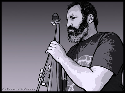 |
| "Baz on Bass" by M Francis McCarthy |
On the negative side, those assumptions often create blind spots that we are unaware of.
Landscape Painting - Revisions 2
 |
| "Autumn Twilight" Final (8x10) by M Francis McCarthy |
Onto today's painting "Autumn Twilight". I had a bad feeling about this one from the get go. Still, I believed that I could power through my inner misgivings and do something cool.
 |
| "Autumn Twilight" Previous Version (8x10) by M Francis McCarthy |
The revised version is at the top of this post. It would have made sense to post the early version first and the correct down here but I could not bear to have it leading off a post so please just scroll up to check out what I've done.
Here's what I did:
- Closed off the left side so there was a clear focal area. As is the picture had a sort of two face composition, with each side of the painting fighting for the viewers attention. This was the biggest issue with the painting by far.
- Created a better sky that "payed" off. I've written before about payoff sky's here. Funny enough, I thought I'd set up a good sky but it suffers from "tube syndrome" and was not working at all.
- Reshaped and reformed the trees. I also lightened them where they meet the sky. The darkness against the light was too intense and this is something that is very common in photographs that made it into this painting.
- Lightened the grasses below the trees creating more interest there.
- Darkened the lower right hand corner. I'm still a vignette fan. I did it here to help steer the eye towards the main focal point (the field behind the trees).
- Lightened the area where the background foliage/hills meet the sky. This creates more atmosphere and also lessons the harshness of that distant edge.
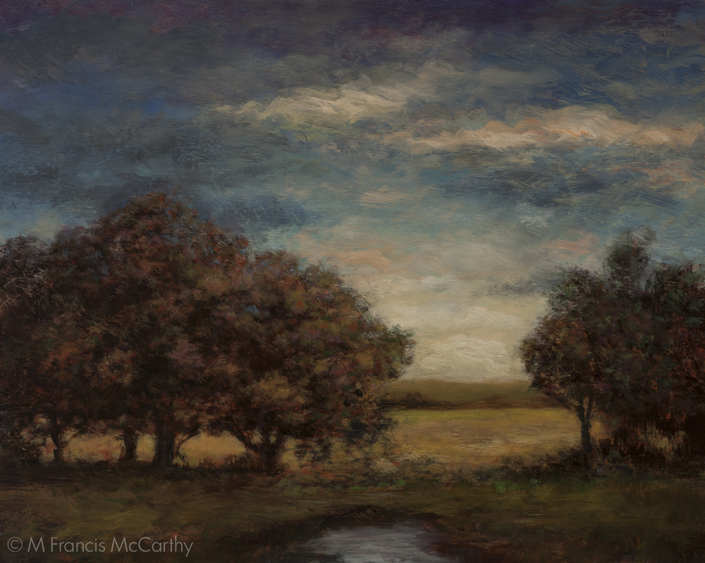
Landscape Painting - Revisions
 |
| "Twilight's Ember" (12x16) by M Francis McCarthy |
I'm quite pleased with this painting now. I completed it last week.
 |
| Summer Pastuire (12x16) by M Francis McCarthy |
Here's what I did:
- The sky was a nice transition from grey to peachy, but it was what I call "tubey" meaning that the spaces between clouds were to regular and not varied enough. I repainted the sky with an interesting glowing sunset going all the way up into a deep dusky grey blue.
- I removed that tree in the middle so I could install a better focal point in the space created.
- I completely did a 180 on the view. previously the sun was on the trees, now it is behind.
- I painted in a little brook where before there were only grasses. I feel like the scene would benefit from a higher horizon but I kind of like the uniqueness of the viewpoint as is.
- I created dark foliage in front of the trees on the right. I did this to help direct the viewers eye and create more mystery.
Illustration - Graphic Quality
This quality is created by the placement of blacks and also very much by the type of hatching used to render the halftones.
I look at my work from a quarter century ago and I notice how carefully each stroke is placed. Back in the day I always worked in ink directly with a deep reverence for line.
I still have a respect for line and that graphic quality but after decades of doing art commercially and otherwise I'm not as precious with things now.
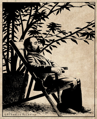 |
| "Henri de Toulouse-Lautrec" by M Francis McCarthy |
Is that a bad thing?