Unify, Simplify, Amplify
Greetings again from the land of Zed.
Yesterday I said I'd talk about the other note on my easel in my studio.
That Note says: "Unify, Simplify, Amplify" I borrow the term from Ken Carbone over at
Co Design He uses it for marketing advice but I think it applies very well to landscape painting also.
When we create a landscape painting it has no reason to exist other than it pleases the eye of the beholder. If it does not accomplish this there is nothing else that it can be used for other than to possibly re-use the canvas for another painting.
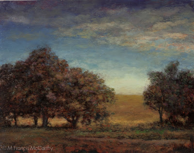
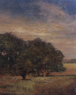
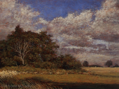
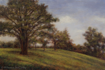
"Spring Light" (Final) 8x10 by M Francis McCarthy
So how does this motto this help us create beautiful pictures that deserve to be beheld?
Let's beak it down with some bullets:
- Unify - This mean that every part of the painting should work with every other part. Some aspects dominant while others supportive but all parts must reflect and coordinate with each other to create a unified whole.
- Simplify - This directs us to look for and represent in our painting a simplified pattern of pleasing large shapes subdivided by smaller pleasing shapes. Simplifying the scene is vital to create unity and amplification. It is difficult to create unity from immense amounts of detail all vying for the eyes attention.
- Amplify - Much of what I said yesterday about "More Light, More Dark, More Color", falls into this area. Adding contrast and amping up the color create more interest and attraction for the viewer. However to sucessfully amplify a picture it must be clear before it is amplified. Otherwise you just get a loud mess.
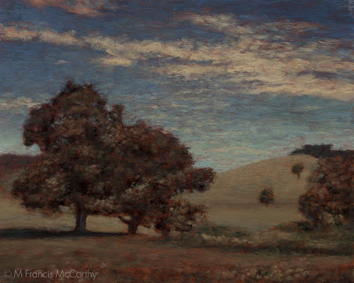
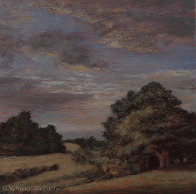
"Spring Light" (First Revision) 8x10 by M Francis McCarthy
Together these three ideas add up to better paintings. It's taken me awhile to apply these concepts to my landscape painting. But I always tried for a similar result when I worked as an illustrator.
It's only recently that I've become aware of the core differences between illustrating and landscape painting. I will expound on this more in a future post as it's definitely something I thought I knew all about. In reality I had it Wrong with a capital "W".
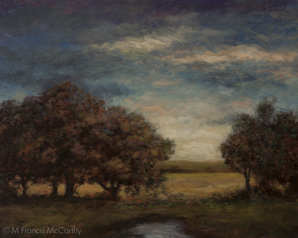
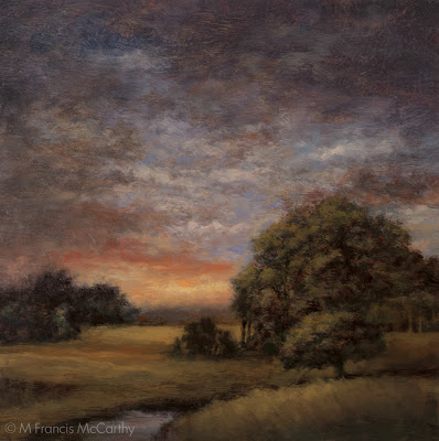
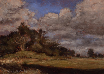
"Spring Light" (Original Painting) 8x10 by M Francis McCarthy
Okay, Lets talk about what I did to "Spring Light".
This painting has actually been revised twice. The original was painted last year and I repainted it around February.
I had the original up on my studio wall for quite awhile and though I liked the atmospheric quality I was bothered by elements of the picture. Heres how I addressed those bothersome areas.
First revision:
- Removed the hill from the background. This was creating an unpleasant downward arrow where the tree and hill met.
- Softened the diagonal band of clouds in the sky.
- Simplified the background and the sky.
- In the foreground I painted in a path or river coming in from the right. This only sorta was an improvement. Still, I was happy to be abandoning my photo reference and be creating with just imagination.
- Added a clump of trees to the right side where the previous hill had crested.
- Closed off the left side clump of trees. This helps direct the viewer's eye in a more pleasing manner and creates intimacy in the scene as well.
The revised "Spring Path" sat on my wall for another few months. I was happier but still not satisfied. Heres what I did to reach the final version.
Second Revision:
- Lowered the hills and indicated the horizon with a streak of distant foliage.
- Reworked the sky losing the diagonal completely.
- Increased the lightness at the base of the sky.
- Painted away my previous path from the left adding a pool or puddle of water in the center instead.
- Made the meadow behind the trees brighter.
- Softened the tops of the trees in the clump on the right.
All in all I am pleased with the result. I feel that "Spring Light" now has a feeling of intimacy, space and a peaceful quality that rewards the viewer.
"Spring Light" is currently on display at my studio in the Quarry Arts Center' Whangarei, New Zealand. Feel free to come and check it out.
Cheers,
More Light, More Dark, More Color
Back from my extended stay in the studio, amongst other worthwhile pursuits.
I'm still busily reworking paintings I've done over the last year. Not all of them but far more than I thought I would when I began this revision process a few months ago.
Generally speaking for most of my artistic life, I've been hesitant to revise my work.
However since I made a quantum leap in my understanding of painting a few months back. What painting is. What it can be and what I want it to be for me as an artist. I've had to change my way of working in light of this greater capacity to see and address the shortcomings of my paintings.
 |
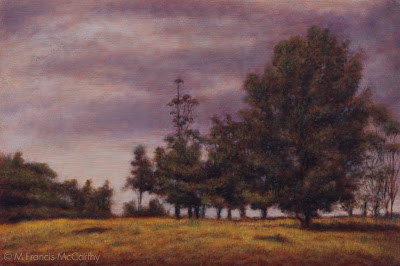
| "Clearing Up Revised" 8x8 by M Francis McCarthy |
One of the major insights I gained from my of my leap in understanding painting, was realizing that I can change anything I see that rings as false or that fails to create unity in my work, at any time and to whatever degree is necessary to bring the painting into a harmonious and unified state. Regardless of time already spent on the painting or it's fealty to to source material.
 |
| "Clearing Up" 8x8 by M Francis McCarthy |
- Painted another foreground tree to cover that annoying trunk from the previous version.
- Created a sloping arc for the foreground hill, softening the previous slashing diagonal there.
- Established the horizon more clearly with less clutter.
- In the sky I went with a strong twilight coloration.
- Broke up the strong diagonals there and introduced more contrast.
- I placed a brook that followed the same compositional diagonal that was in the previous version .
- Opened up the distant field and simplified it also amping up the color to a golden grass color.
- The clump of trees on the left I made smaller.
- Softened the harsh edges against the sky for all the trees breaking the horizon line.
Cheers,
Landscape Painting - Narrative
It's autumn here in New Zealand. Getting colder and darker everyday now.
I'm still getting used to the season flip from the US and the fact that theres not going to be a halloween in two weeks.
Today I want to chat about "narrative" in art. I am not an expert on art terms or art history being self taught. So my ideas about narrative may be different from the orthodox view. To define the term narrative as it relates to landscape painting, I mean, contextualized artifacts that create stories.
I avoid narrative in my painting. That means I do not put people in my landscapes or even things like houses, fences, fence posts, cows, sheep etc.

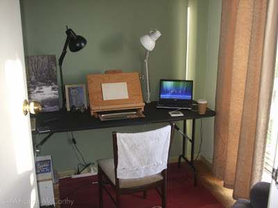
My Studio "just painted" area
I've no issue with artists that use these elements in their work. In fact I know first hand that they're handy for solving many compositional problems. For me, those benefits are outweighed by the attention these focal points draw and more importantly the narrative that is generated when they are present.
For example, if I paint a young girl with a basket into a scene of a field. Many questions about her and her situation are created. Where is she going? Is she happy? What's in the basket? Do her parent's own the field?
Or if I paint an old barn in that field, you could ask, who works there? Is there anybody in that barn now? When was the last time anyone used that barn and so on.
On the other hand if I just paint a field with some trees and maybe a brook and an interesting sky. I've created a space that can be filled by the viewer of the painting without creating context. There is nothing between them and the emotive space that I've created for them to occupy. They are free to expand their consciousness into it and in so doing, relax and feel good.
Thats my goal and intention as a landscape painter if the truth be told.
I wish for the viewers of my paintings to feel good but thats just the beginning of what I'm after. As they go deeper into the painting they might begin to wonder why we are all alive anyway and why is life so beautiful?
Or they could begin to experience that feeling of stillness one has at that moment after the sun's just passed over the horizon and you find yourself deep in the seeming timelessness of the gloaming. A space between light and darkness and between life and death.
I should mention that my idol
often painted figures into his works. Not only was he able to do this without the sort of repercussions I've mentioned, but his best painting easily achieve all the things that I wish for my paintings to do as well.
All I can say is that Inness was a genius and that the rest of us must just do the best we can.
Cheers,
A bit about todays picture. This was taken today with my iphone at my studio in the
. The area of my studio pictured is to the right of where I paint and I set things there to dry and also keep recent things there to look at.
Looking at one's work is nearly as important as painting it. I generally feel close to the work I've just painted. The word "enamored" comes to mind.
However, more and more thats been replaced with a more critical mindset.
I'm determined now more than ever to push each painting to the limit of what I can accomplish at this time. That means, more color, more contrast, more light, more darkness and no muddy half hearted scenes will be tolerated.
Landscape Painting - Revisions 2
 |
| "Autumn Twilight" Final (8x10) by M Francis McCarthy |
Onto today's painting "Autumn Twilight". I had a bad feeling about this one from the get go. Still, I believed that I could power through my inner misgivings and do something cool.
 |
| "Autumn Twilight" Previous Version (8x10) by M Francis McCarthy |
The revised version is at the top of this post. It would have made sense to post the early version first and the correct down here but I could not bear to have it leading off a post so please just scroll up to check out what I've done.
Here's what I did:
- Closed off the left side so there was a clear focal area. As is the picture had a sort of two face composition, with each side of the painting fighting for the viewers attention. This was the biggest issue with the painting by far.
- Created a better sky that "payed" off. I've written before about payoff sky's here. Funny enough, I thought I'd set up a good sky but it suffers from "tube syndrome" and was not working at all.
- Reshaped and reformed the trees. I also lightened them where they meet the sky. The darkness against the light was too intense and this is something that is very common in photographs that made it into this painting.
- Lightened the grasses below the trees creating more interest there.
- Darkened the lower right hand corner. I'm still a vignette fan. I did it here to help steer the eye towards the main focal point (the field behind the trees).
- Lightened the area where the background foliage/hills meet the sky. This creates more atmosphere and also lessons the harshness of that distant edge.
Reworking
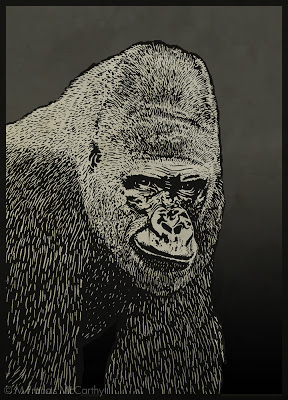 |
| Gorilla by M Francis McCarthy |
A while back I found that I could produce more good paintings by planning things out before painting.
- Picking at paintings is a recipe for disaster and is too easy to do if you don't leave your work alone.
- Nothing is ever perfect. It's good realize this and let things be.
- Gotta keep moving. Better to produce many paintings, than spend too much time picking and scratching at a few.
Intuition vs Intellect
It's too easy to drown out that quiet inner voice. Too easy to think we know what we're doing even if what we're doing is at cross purposes with our true intentions as artists.
I've written before about intuition here.
There is a reason that intuitive types are compelled by the arts. All art requires almost countless decisions to be made. The intellect alone finds this process tiring while our subconscious mind can do the same work automatically and effortlessly.
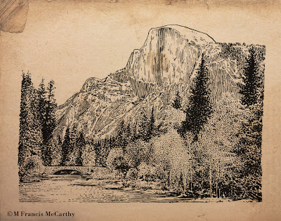 |
| " Halfdome" by M Francis McCarthy |
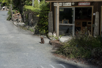 |
| My Studio at The Quarry Arts Center in Whangarei, New Zealand Also pictured is Denny the Poodle, My cohort at arms. |
"I'm convinced already! What can I do to tap into this intuition more?" you're saying.
To access our intuitions more fully we can:
- Do that thing we just thought of doing. Don't put it off, act now.
- Take a stab with the brush loaded, at a spot on the painting that's bothering you. Then, deal with it...
- Don't lie to yourself when you see something wrong in your work. Intuition is always trying to point out those bad areas. BTW my personal tendency is to drown this voice out with lots of justifications.
- Pick up that book, find that bit of reference or ask that person to pose that you've been thinking about.
- Look for coincidence.
- Welcome the random into your work.
- Paint once, think twice.
- Use the biggest brush possible and turn that thing. Make it work.
Landscape Painting - Don't Over Paint
Don't over paint.
I like to plan out my paintings. I take pictures, do drawings and paint a small color sketch.
Then I project my drawing up onto my board and trace it with charcoal. After that I finish that drawing with a brush and sienna and black. This functions as my under painting.
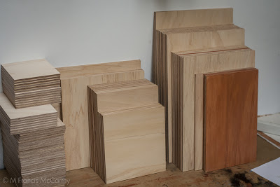
The process is the same for the 5x7's and their larger brothers. One difference between them is that I draw the scene with charcoal directly unto the 5x7 board while I project unto the larger. Also I do only one color layer on the 5x7's and up to three or more on the large version of the painting.
 |
| Day's End (9x12) by M Francis McCarthy |
 |
| Day's End (5x7) by M Francis McCarthy |
We all have our crosses to bear as individual artists.
Landscape Painting - Subjects
 |
| Twilight Meadow by M Francis McCarthy |
Driving about with my wife I saw many great scenes and I like to stop and take photos of the ones that I think would make good motifs for paintings.
 |
| First New Zealand Studio |
We've talked in the past about subject matter.
Landscape Painting - Let it Be
 |
| Dawns Glow by M Francis McCarthy |
So, what can we do about over working our art?
Landscape Painting - Work Small, at First
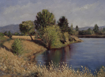 |
| Summer Reflections (6x9) by M Francis McCarthy |
Behind the art department in Campbell where I worked there are these awesome percolation ponds and also Los Gatos Creek.
Landscape Painting - Surface
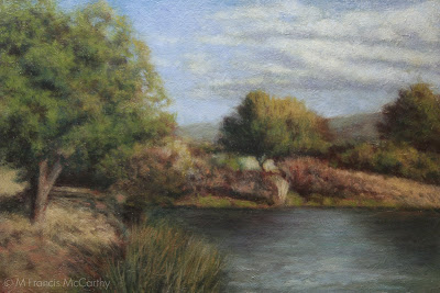 |
| Late Summer (6x9) Pond by M Francis McCarthy |