Day Thirty Four: Wayside pool by Alexander Helwig Wyant
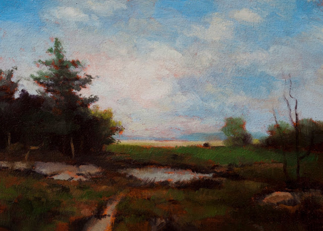 |
| Painted after - Wayside pool by Alexander Helwig Wyant, Study by M Francis McCarthy - Size 5x7, Oil on wood panel |
Today's study is of 'Wayside Pool' by Alexander Helwig Wyant
Alexander Helwig Wyant was a Tonalist painter born in 1836 and died in 1892. He was a contemporary of George Inness and like George Inness, his style modulated over the years from a very detailed Hudson River School approach to a more diffuse and obfuscated Tonalist approach.
I will be covering some biographical information about Alexander Helwig Wyant in today's video so check that out if you'd like to learn more about him. Also, there is a great site dedicated to his work here.
Over the last several weeks we've been discussing different defining aspects of Tonalism and today, I'd like to discuss painting in a Minor key versus painting in a Major key. As in music, Major keys tend to be more bright, celebratory, and open. Whereas music in Minor keys is more moody, poetic and dark. For the purposes of art you could consider Impressionism Major and Tonalism Minor equivalents.
One of the first things that I did after deciding to work in a more Tonalist style was to darken the pallet of my paintings significantly. Prior to that I was working with a more impressionistic style which tends to be brighter and higher key.
I am sometimes asked by people who come to visit my studio why I tend to favor a more dark approach to landscape subjects. I always answer that it's much like music in that, most songs you hear on the radio are not happy songs, they tend to have a bit of melancholy. Also it is quite difficult to achieve a poetic result in a bright painting just as it is difficult to get a melancholic approach across in a song by a marching band.
Sometime around late 2012 after having visited the Louvre in Paris and studying the work of Master painters there, it also dawned on me that even if a painting is quite dark that you should have spots of intense light to create an interesting contrast. Prior to that I was usually keeping the overall key of my work very low and avoiding strong contrasts.
At that time I also kept the chroma of my colors fairly muted. This is something you'll see in evidence in quite a few Tonalist paintings. However this is not true of all tonal paintings. A good example of a Tonalist painter that used strong chroma would be George Inness himself who is a preeminent Tonalist painter.
Cheers,
M Francis McCarthy
Landscapepainter.co.nz
A bit about 'Wayside Pool' by Alexander Helwig Wyant, I really like the original painting by Alexander and I quite enjoyed doing a study from it. One of the things I concentrated on was getting that fresh morning quality into the study. This painting is also very similar in composition to the sort of thing I like to do on a regular basis.
To see more of my work, visit my site here.
 |
| Original painting, Wayside pool by Alexander Helwig Wyant |
Day Thirty Three: Woodland Scene by George Inness
 |
| Painted after - Woodland Scene by George Inness, Study by M Francis McCarthy - Size 5x7, Oil on wood panel |
Today's study is of 'Woodland Scene' by George Inness.
On today's video I read a passage from the book George Inness and the Science of Landscape. We discussed George Inness quite a lot on this blog and we will be discussing him a lot more in the future.
Today I would like to talk about reproductions of paintings. For example, the trend towards doing inkjet prints on canvas and in some cases, texturing those prints to resemble original oil paintings. Reproductions have a long, interesting history and relationship to art. They have certainly had their place for long time and I myself have owned many posters and reproductions of paintings that I enjoyed.
With the advent of computer technology and it's ready access on the desktop. It is easy for just about anybody now to print out any image that they find on the Internet and have it look pretty decent. Many artists take good photographs of their work and do the very same thing or, a have the prints done on canvas somewhere else.
While there's nothing intrinsically wrong with this, I believe the time has come for humanity at large to embrace affordable original artworks. I for one, do not especially believe in the validity of an art print market wherein the prints being sold are just inkjet reproductions of original paintings with a limited-edition assigned. There was a time when creating reproductions was a very laborious and time intensive process but that is not true any longer.
Mechanical reproduction of artwork these days is effortless and easy. Meanwhile, technology is replacing human industry almost anywhere you turn. It seems to me that the way forward for humanity is to embrace ideas like being an artist and creating one-of-a-kind works of art. Speaking for myself, I can say that after years of creating artwork on the computer and printing out the result, having the ability to paint with oil paint on an actual wood panels is a lot more valid and satisfying for me as an artist.
It makes me feel good to sell my artwork to somebody that appreciates it. I also have the satisfaction of knowing that what they're buying is a one-of-a-kind item that was created by me and is not a reproduction.
I have invested a lot of time in the studies of this series which are in a sense, copies of the originals. though in this case, I would argue that my intentions actually resulted in works of art. Unlike factories in China that are full of painters that will create exact copies of any painting you desire, my intention as an artist, was to impart my impression of each painting that I selected for this series. In the process, many wonderful small paintings were created. I have had some people that were interested in having larger versions of some of these images painted. but I have declined to accept these offered commissions because of the aforementioned reasons.
When it comes to creating art, intention is everything. Intention is the difference between somebody who is a professional and somebody who is an amateur. Intention is the difference between an artist who is commercial and one who is a fine artist. Intention means a lot.
Cheers,
M Francis McCarthy
Landscapepainter.co.nz
A bit about 'Woodland Scene' by George Inness, as I stated in the video in many ways this painting is a mirror image of 'Summer Montclair' which was the first study I did in the series. The colors in 'Woodland Scene' are more subdued but the compositional motif is in strong evidence.
These compositional structures, were for the most part invented by George Inness. This is something he was able to do after a lifetime of landscape painting. So intensely had he internalized nature that he was able to create scenes like this out of his imagination.
I enjoyed painting this study and it went quite quickly. I'm very happy with the result and I learned quite a lot which I am putting to use in my own work.
To see more of my work, visit my site here.
 |
| Original painting, Woodland Scene by George Inness |
Day ThirtyTwo: Passing Shower by Thomas Moran
 |
| Painted after - Passing Shower by Thomas Moran, Study by M Francis McCarthy - Size 5x7, Oil on wood panel |
Today's study is of Passing Shower' by Thomas Moran.
Thomas Moran was a Luminist, a Hudson River School artist and was also a member of the Rocky Mountain School. Thomas Moran transcended all of these labels and is one of the greatest painters who has ever lived. I've had the good fortune of seeing his work in person, it glows and pulsates with energy.
Of all the different types of painter that Thomas Moran was considered to be, Tonalist would not be chief among them. He lived and worked through the entire period that encapsulated Tonalism in the 19th and 20th centuries. I selected 'Passing Shower' for a study because I felt it evidenced many strong tonal tendencies.
I've been speaking for the last few blog posts about the various aspects of tonalism that differentiated it from the schools of painting that came before and after.
The selection of subject matter is key in defining if a painting is Tonalist or not. Thomas Moran was quite famous for painting huge expansive vistas that inspired a sense of awe in the viewer. He is one of the best at doing this type of painting.
Tonalism however, is more about portraying an intimate and subdued approach to the landscape. Good subjects for a Tonalist painting might be a vacant lot with some trees in it or an abandoned field, subjects that people see all of the time in their daily lives. These types of scenes can be easily grasped and that people can see themselves occupying them.
I've always been attracted to this particular aspect of tonalism, probably because of its great accessibility. Not all of us can travel to the Rocky Mountains or the Grand Canyon. While it is certainly valuable to paint subjects like those in an expansive way, there is also much to be said for finding beauty and poetry in the landscape that surrounds us locally.
Sometimes I wonder if I was a Tonalist painter in a past life, because I resonate so deeply with all of the myriad aspects of this style of painting. I was not very aware of tonalism until later in my life but as soon as I came across it, I knew that this was the way that I wanted to paint, that this was the manner of depicting the landscape that resonated with me at the deepest soul level.
Cheers,
M Francis McCarthy
Landscapepainter.co.nz
A bit about 'Passing Shower' by Thomas Moran, I'm very happy with the way this study turned out. I was keen to do it after finding the initial reference for this painting in my search for subject matter. It is quite unlike most Thomas Moran paintings I've seen. It is really just a painting of a field with a little pond in it and a big sky full of clouds.
My study is quite dynamic and represents the painting by Thomas Moran well. I'm pleased with the way the greens offset the grays and blues of the sky. There's not that many Thomas Moran paintings that would work in the series like this but this one feels very appropriate. I am glad to have executed the study and I learned a lot.
To see more of my work, visit my site here.
 |
| Original painting, Passing Shower by Thomas Moran |
Day Twenty Eight: Landscape by Percy Gray
 |
| Painted after - Landscape by Percy Gray, Study by M Francis McCarthy - Size 5x7, Oil on wood panel |
M Francis McCarthy
Landscapepainter.co.nz
A bit about, 'Landscape' by Percy Gray. As you'll see from the video this one took me a while and really challenged me.
Ultimately I feel I succeeded at making a good study of Percy's painting. The greatest challenge was working in a style and manner that was quite different than my usual. All in all a good experience. Watch the video to see how I did it!
To see more of my work, visit my site here.
 |
| Original painting, Landscape by Percy Gray |
Day Twenty Seven: In the Field by George Inness
 |
| Painted after - In the Field by George Inness, Study by M Francis McCarthy - Size 5x7, Oil on wood panel |
Green, green, green, what a lovely color it is. Today's study really celebrates green in a big way. Nobody really got the greens across as well as George Inness.
On today's video I discuss a little bit about George Inness' love of metaphysics. Spirituality and metaphysics deeply informed the way that George Inness approached painting. He endeavored to portray a spiritual reality just below the surface of our shared physical reality.
I think he succeeded remarkably in this aim. not all of his paintings are successful but a great many of them are amazing and of those, some are the best paintings ever created
We're making the blog post a little bit short today as I had to invest some time in upgrading my computer to Windows 10. So far so good, but I've been putting it off because I didn't want to disrupt the day-to-day flow of the blog the update can wait no longer..
Cheers,
M Francis McCarthy
Landscapepainter.co.nz
A little bit about, 'In the Field' by George Inness. This was an enjoyable exercise in mastering greens.
One of the greatest Tonalist painting secrets is using a warm reddish color for the under painting or ground color of the canvas. This actually makes painting green a joyous process. Most greens look pretty good when you paint them on top of a reddish under color.
To see more of my work, visit my site here.
 |
| Original painting, In the Field by George Inness |
Day Twenty Six: Landscape by Camille Corot
 |
| Painted after - Landscape by Camille Corot , Study by M Francis McCarthy - Size 5x7, Oil on wood panel |
Today's study is 'Landscape' by Camille Corot.
Another day another Corot. We've done a Camille Corot previously and I think we've five more to go. Camille Corot was actually a Barbizon painter, but he was such a huge influence (in my view) that I'm treating him as a Tonalist for this series. Another reason why he's in the series is that I wanted to learn as much as I could about how he painted.
M Francis McCarthy
Landscapepainter.co.nz
A bit about 'Landscape' by Camille Corot. Corot liked to put allegorical and mythological figures in his landscapes. I'm not into that aspect of his work though I'm certainly not dissing it either. For this series, I chose to remove almost all of the figures from the different studies that I've painted. Theres a lot more mood and atmosphere in this painting without the figures capering about.
I focused on getting the silvery quality that Corot is famous for and I really enjoyed doing this study.
To see more of my work, visit my site here.
 |
| Original painting, Landscape by Camille Corot |
Day Twenty Five: Ipswich Marshes by Arthur Wesley Dow
 |
| Painted after - Ipswich Marshes by Arthur Wesley Dow , Study by M Francis McCarthy - Size 5x7, Oil on wood panel |
Today's study is 'Ipswich Marshes' by Arthur Wesley Dow.
M Francis McCarthy
Landscapepainter.co.nz
A bit about 'Ipswich Marshes' by Arthur Wesley Dow. Definately not the kind of scene I usually paint and that was one of the main reasons I chose it. It was fun to do a painting with no trees at all for a change.
The study is really all about the subtle shifts off color in the fore ground and middleground grasses. I feel that I got some good insight into how subjects like this could be painted by me in the future.
To see more of my work, visit my site here.
 |
| Original painting, Ipswich Marshes by Arthur Wesley Dow |
Day Twenty Four: Spirit of Autumn by George Inness
 |
| Painted after - Spirit of Autumn by George Inness, Study by M Francis McCarthy - Size 5x5, Oil on wood panel |
Today's study is 'Spirit of Autumn' by George Inness.
A nice George Inness study for you folks today! This one was lots of fun and the study looks really good in real life. In my research for today's blog I came upon a scalable version of George's original painting on Artsy. The contrast looks pretty low in the image. I'm sure that Inness' original has or had more panache back when he painted it.
By now you must be aware of how big a fan I am of Inness. I've done nearly a third of the 100 studies from Inness paintings. I can say that I did manage to assimilate more of what made his art unique but it's mostly been absorbed internally and unconsciously. I've always had a tendency towards picking and pecking on my paintings and judging from that high rez scalable image I linked above, so did George Inness.
I've got to do some final processing on the photos of my latest series of paintings tonight, so we are going to give my definitions of Tonalism talk a rest but stay tuned true believers. We will pick up that thread tomorrow or the next day.
Cheers,
M Francis McCarthy
Landscapepainter.co.nz
A bit about 'Spirit of Autumn' by George Inness. many who've seen this study have commented on how nice it is. I really felt in a flow with this study.
Maybe old man Inness was giving me a hand from the spiritual realm. It's the composition and color handling that make this painting unique and I got a lot out of doing a study after the Master.
To see more of my work, visit my site here.
 |
| Original painting. Spirit of Autumn by George Inness |
Day Twenty Three: Venice at night by John Enneking
 |
| Painted after - Venice at night by John Enneking, Study by M Francis McCarthy - Size 5x5, Oil on wood panel |
 |
| Original painting, Venice at night by John Enneking |
Day Twenty Two: Potomack by Karl Termohlen
 |
| Painted after - Potomack by Karl Termohlen, Study by M Francis McCarthy - Size 5x7, Oil on wood panel |
I will find some more biographical information about him which will no doubt find its way onto the narration of the video.
Over the last few days we been discussing the different aspects of painting that define it as Tonalist. Today I would like to discuss working in the studio versus painting en plein air outdoors. I have done some plein air painting and I found it relatively enjoyable, however I feel that for me as an artist it functions best as a learning aid.
In my experience most plein air paintings take on a sort of samey quality. This is not to denigrate any artists that produce work outdoors, but in the effort to capture the various passing colors and light effects of nature in passing, one is generally driven to paint very quickly and this is often at the expense of imagination and compositional originality.
Working in the studio enables the artist to be more expansive in his vision. Countless painters did all of their work in the studio, though various artists like George Inness were known for doing drawings and studies in plein air and then later, using these to complete paintings indoors. In the studio it is far easier to inject imagination in the form of enhancing composition, shadows or colors in the landscape. Working in the studio also enables the artist to create work that is more individualistic.
There are many painters from the late 19th century that embraced both Impressionism and Tonalism, Alden Weir being one that immediately comes to mind. You can almost define the difference between Tonalist and Impressionist paintings by whether they were painted outdoors or indoors. Impressionism is very much about capturing light effects that one sees in nature whereas Tonalism is more about creating tone, atmosphere and mood, inspired by nature. There can certainly be some overlap but most paintings would firmly be in one camp or the other.
Cheers,
M Francis McCarthy
Landscapepainter.co.nz
A bit about 'Potomack' by Karl Termohlen: As I stated above, this is a painting that I've admired for a long time. I like the way that the group of trees on the right is offset by the brightness of the white clouds, there is also a very nice sense of distance that is created by having the foreground in shadow with the distance in light. This is a trope that I use quite often in my own work. Perhaps it was unconsciously assimilated from looking at this painting.
One of the things in this study that I do not usually do in my own work is paint a blue sky with fluffy white clouds. I have done this occasionally but for the most part I prefer to inject color and mood into my skies.
I completed this study in two passes. I was pretty happy with it after one pass but in the second pass, (as you'll see on the video) the study was improved by darkening the shadow areas and lightning the light areas. This is something I do my work quite a lot since 2013.
In late 2013 I visited the Louvre in Paris and there, I noticed that many paintings while being dark had areas of brightness as well. In my experience this creates more dynamics and therefore more interest in the landscape painting.
To see more of my work, visit my site here.
 |
| Original painting, Potomack by Karl Termohlen |
Day Twenty One: Out of the Studio Window, Montclair by George Inness
Hello and welcome to day 21 of 100 days tonalism.

Painted after -Out the Studio Window by George Inness, Study by M Francis McCarthy - Size 5x7, Oil on wood panel
Today's studie is 'Out the Studio Window, Montclair' by George Inness.
On today's video I read a passage from a book about George Inness called
"Inness landscapes" by Alfred Werner
. The quote refers to some of his Barbizon school influences namely: Corot, Rousseau and Daubigny.
I didn't narrate this in the video, but the same book goes on to state that Inness was also under the spell of Constable, who saw the outward forms of nature "imbued with the spiritual significance," and who firmly believe that the artist could "extract from the physical world around him elements of moral truth." He also admired Turner, who painted in accordance with the dictum, " I do not imitate nature, I improve upon it."
I think it's interesting that this book mentioned Constable today, as I feel that this painting by George Inness bears some resemblance to Constable's own work. The two artists are not often mentioned in the same breath but there is no doubt that Constable was among the great giants of landscape painting and it is easy to see how his work could influence Inness.
Over the last several days I've been discussing different aspects of what I consider the defining characteristics tonalism, especially as it pertains to landscape painting. So far, I discussed narrative or the lack thereof, and also the concept of unity. In regards to unity so far we have concentrated on unity in composition especially in the selection of landscape subject matter.
Today I'd like to discuss the idea of unity as it pertains to color. Many tonalists used a colored ground to tone their canvases prior to painting. This is in line with some painting traditions going back to the great masters wherein, they would use a brown toned canvas or, in some cases a raw umber or gray tone. It's become fashionable these days to paint directly on white canvas and this is something that I believe the Impressionists did quite often as well.
Painting on a toned ground creates a lot harmony in a painting. The reason for this is thin oil colors will show some of the ground color coming through. Also, in many cases bits of ground color will peek out between various brushstrokes therefore unifying color.
One of the big secrets to achieving vibrancy and unity in landscape paintings, is to use a warm red tone as the ground color and over that, apply cool tones like blues and greens. This creates an interesting vibrational effect. I first read about this in a book by Birge Harrison called
. This is a very good book and easy to find on Amazon. By the way, it is also available for free online in the form of PDF on google books.
Other ways to create unity with your color are to add small amounts of a particular tone to each mixed color painted on the canvas. This technique was employed quite often by Whistler among others. I like to create tonal harmony by pre-mixing about eight or nine colors prior to laying in my first color pass. I do not mix the bits of the same color into each ala' Whistler, but I do seek harmony from the start. Also color unity can be achieved by limiting your color palette. This is something I discussed often on my other
in the past.
Cheers,
M Francis McCarthy
A bit about 'Out of the Studio Window, Montclair' by George Inness: I was attracted to doing a study of this painting because of the vertical composition. Mystudy went together quickly and most of it was painted in one pass. I find the colors in this painting to be quite un-Inness like. I cannot think of that many other paintings of his that featured a blue sky.
Or, upon checking out the reference painting, a grey sky? As with almost every other study I've done in this series, there's a lot less of a yellow tint in this study than the reference image. It would be a pretty easy task to glaze every thing with a raw umber/yellow tint to impersonate aged varnish though I prefer what I feel is a cleaner look.
To see more of my work, visit my site
.

Original painting, Out the Studio Window Montclair by George Inness
Day Twenty: Landscape by Charles Appel
Hello and welcome to day 20 of 100 days of Tonalism.

Painted after - Landscape by Charles Appel, Study by M Francis McCarthy - Size 5x7, Oil on wood panel
Today's study is of: 'Landscape' by Charles Appel.
Charles Appel,a very mysterious guy. No doubt he was not terribly mysterious when he was alive but while researching him online this evening it became quite apparent that however popular he was when he was alive, he was definitely more popular than he is now. After some rigorous searching I was able to find some very basic biographical information about him. He was born in 1854 and died in 1928. I've read the short biography I found about him in the videos narration, so check that out if you want to learn more.
The defining characteristic of Charles seems to be his very colorful twilight skies. I quite like his work and if I should do a second series of studies, I will be sure to include some more of his work.
I was listening to a podcast today wherein the interviewee of the program was discussing how art history likes to skip from Impressionism to Surrealism which is about a 30 year jump in time. Its an unfortunate coincidence that tonalism occupies this supposedly uninteresting time in art history. This would be the time from the Civil War until just after World War I, Certainly a time of incredible changes in the way people lived, worked, created and interacted with art.
Continuing on with our conversation about the defining characteristics of tonalist paintings, I'd like to discuss the concept of unity today. We discussed this a bit in the video narration for
which featured a study after a George Inness painting. However, most of that narration was from a quote by George Inness, I thought it would be good to write about unity in an actual blog post too.
Unity is achieved in a landscape painting by avoiding expansive vistas and/or convoluted compositional motifs. The reason for this is that a scene that needs to be scanned to be perceived, is interacted with visually by the viewer in a very similar manner to the way we perceive nature itself. In other words the scene is scanned point by point and an image is then created in the mind of the viewer. The ideal would be for the scene to be perceived by the viewer all in one go with no scanning required.
I won't repeat the quote by George Inness here verbatim, but basically it goes something like this: "cut a hole in a piece of paper about 3x6" and place that piece of paper 10 inches away from your face, everything that can be seen through that hole can be perceived by the human eye in one scan". You wouldn't have to move your eyes or your head to take in a scene like this. For this reason a scene of this type would be compositionally more restful than something that is much broader in scope.
This is a very simple and yet subtle idea. Subtle in that it's easy to miss this sort of idea especially when working with photographic reference while painting. It's too easy to believe that just because the scene is encapsulated within a rectangle that the scene can be portrayed with visual unity. Unity is something that needs to be installed into your picture and I feel it's very worthwhile to do so.
Cheers,
M Francis McCarthy
A bit about Landscape' by Charles Appel. This was a fun study to do and I am happy with the final study. I enjoyed painting the colorful sky. I worked very quickly and most of the application of paint here is done quite thinly as well.
There is an interesting contrast in this study between the intense chroma of the sky opposing the desaturated colors of the landscape itself. I embraced the absence of detail as evidenced in the original. I believe that Charles Appel abandoned detail in favor of enhancing the emotional content.
To see more of my work, visit my site
.

Original painting, Landscape by Charles Appel
Day Nineteen: Landscape by Edward Mitchell Banister
Hello and welcome to day 19 of 100 days of Tonalism.

Painted after - Landscape by Edward Mitchell Banister , Study by M Francis McCarthy - Size 5x7, Oil on wood panel
Today's study is of: 'Landscape' by Edward Mitchell Banister.
I knew little about Bannister until doing the narration for today's video. He appears to be a very interesting man. One thing is for sure, his paintings are very fine. Apparently Bannister was an African American, a fact I was unaware of till tonight. While this is an interesting fact given the times he lived and worked in, it's really beside the point of his art.
Yesterday, I mentioned that I was going to address some of the ways that a painting can be defined as Tonalist. I had in the
started discussing the inclusion of figures in the landscape and how that automatically generates narrative content in the painting. I'll continue on that theme today with the idea that many Tonalist painting eschew figures and. how that is one of the defining traits of Tonalism.
There are many Tonalist painters that included figures in their work. Foremost among them was George Inness. His paintings almost always contained small to very small figures. Some could argue that these figures were crucial to the compositions. but I'd tend to disagree. In the case of Inness I feel that he was still clinging to the traditions that came before him in which figures were not just present but prominent. Landscapes without figures take on a more synthetic/abstract quality as I wrote in blog post seventeen, Landscapes without animal or human figures have far less narrative content.
To sum up. Many Tonalist painters have figures in their work, but Tonalism was one of the first art movements to portray the pure landscape and for that reason I see the absence of figures to be a defining trait.
Cheers,
M Francis McCarthy
A bit about: 'Landscape' by Edward Mitchell Banister. As I've said, I left off with Ed's 'man' on the path. This painting was also a challenge in that the shadowed group of trees on the left was nearly black in the reference that I had. I had to wing it there.
The painting has a very strong, almost abstract composition and I almost chose not to do it for that reason. After I finished the study I felt okay with the paintings structure and feel that I got some good insight into Edward's stylististic and compositional achievement.
To see more of my work, visit my site
.

Original painting, Edward Mitchell Bannister, woodcutter on path
Day Eighteen: A Pastoral Landscape by George Inness Jr
Hello and Welcome to day 18 of 100 days of Tonalism.

Painted after - A Pastoral Landscape by George Inness Jr , Study by M Francis McCarthy - Size 5x7, Oil on wood panel
Today's study is of 'A Pastoral Landscape' by George Inness Jr.
I spoke in a bit about George Inness Junior in the video narration and read a short biography of him as well. George Inness Junior was active as a painter from 1875 to 1925. He worked in the same tonal style as his father, George Inness and he was one of the last torchbearers for the movement.
As I mentioned in a previous blog post, I'm going to cover some of the various aspects of Tonalism as I see them. There is an excellent
by David Cleveland where in he outlines his ideas what constitutes Tonalism, for the most part I'd say he's right on the money.
The primary aspects of a painting that would define it as being tonal in nature are as follows:
Tonalist paintings feature intimate views that are contained in one scan of the landscape as opposed to broad vistas.
Colors are tonally unified by means of a color ground/surface and, or application of oil paint glazes.
Landscapes are generally devoid of figures, or if there are figures they are subsumed by the larger scene.
Tonalist paintings are generally accomplished in the studio not painted directly outdoors.
Detail is generally supplanted by a greater attention to diffused forms.
Tonalist paintings often portray early morning, late afternoon or evening scenes.
Tonalist paintings strive for an emotive/poetic resonance.
Tonalist paintings lean more towards a minor key than a major one.
Generally speaking, Tonalist paintings hold off from a higher color key as is in evidence in most Impressionist works.
These are the definitions that come to mind readily. Over the next few blog posts I will talk about each of these points one by one.
Cheers,
M Francis McCarthy
A bit about today's study; at first I was not going to do a study of this painting. I felt that it might be too saturated in chroma. Also, it's not as strong as most of the paintings of George Inness Junior's father George Inness. After some consideration though I decided that it would be appropriate.
As it turns out I really enjoyed doing this study and I think more highly of George Inness Junior after having completed it. You will see here below where I have included an image of the original painting that I did a study of, I eliminated the fisherman that was in the middle of Junior's painting. This in my view elevates the scene quite a bit. It just seems too hokey to have some guy in a boat standing there fishing. The scene certainly has more dignity without that addition.
I did the painting in two stages and I'm really happy with the way the glazes in the second pass accentuated the voluminous clouds in the sky. This was achieved with the application of thin black oil paint. The glazes were rubbed in and then rubbed off
To see more of my work, visit my site
.

Original painting, George Inness Jr. Angler in a Pastoral Landscape
Day Seventeen: Camille Corot Landscape
Hello and welcome to day 17 of 100 days of tonalism.

Painted after - Camille Corot Landscape Study by M Francis McCarthy - Size 5x7, Oil on wood panel
Today's study is of: Camille Corot 'Landscape.'
Today we are doing our first study of a painting by Camille Corot. I selected seven paintings by Camille for this project. Camille Corot a was very influential painter of the 19th century. He was also a huge influence on George Inness and for that reason a huge influence on tonalism in general.
You will notice below that I removed the figures from Camille's painting. At the time that Camille Corot was painting, pure landscape art was not in favor and was being only being executed by the Dutch painters. The tradition of pure landscape painting for the rest of the West, began with the Hudson River school in America and extended into tonalism. In France many Impressionist painters also eschewed figures in their landscape paintings.
I think this points to the fact that, as human beings we consider other human beings to be the central focus in our art. For that reason prior to the late 1800s figures are generally prominent in almost any painted scene. Even in the work of George Inness we see small figures in evidence.
Early on in my painting career I experimented with figures in my landscape paintings but I always felt very unsatisfied. It seems that any figure, human or animal becomes the focal point of the painting should they be present, regardless of how large or small they are the painting. If figures are present, this automatically creates narrative in that the viewer is presented with many questions about the figures there. Questions like: Who is that? Why are they there? Where are they going? Where were they before? Etc.
This is the nature of narratives, we create stories very easily when we see people present in art. There's nothing wrong with narrative in art if that is appropriate for what you are trying to do. In my case I prefer to create a scene that is empty except for a pervasive sense of emotion and poetry that invites the viewer in. In this way the viewer can occupy the painting fully without the impediment of narrative to cloud their minds.
Cheers,
M Francis McCarthy
A bit about 'Landscape' by Camille Corot: You can see from the video that this is one of the quicker paintings that I did in the series so far. This is because most of the tree is silhouetted against the bright sky and is quite dark, therefore lacking in a lot of objects to be rendered or details that need to be executed.
One of the main things I tried to accomplish with this study was to get the feeling of air into the trees. This is a hallmark of Camille Corot's style and something he did brilliantly. He did not execute his paintings quickly. Most of them he worked on for quite a while. You can see when you look at his actual paintings in real life that there are a lot of subtle modulations of values executed with a very small brush that give his work the shimmering silvery quality that he became so famous for.
The study is the shortcut approach I reckon. Basically I just used thin paint at the edges of the trees over my sienna ground to get an equivalent effect. All in all I am pretty happy with the results. I do feel that the figures that are present in the original were certainly central to the composition possibly because they were located in the center of the painting LOL!
Either way I learned a lot.
To see more of my work, visit my site
.
Day Sixteen: Homestead by J Francis Murphy
Hello and welcome to day 16 of 100 days of tonalism.

Painted after - Homestead by J Francis Murphy, Study by M Francis McCarthy - Size 5x7, Oil on wood panel
Today's study is of 'Homestead' by J Francis Murphy.
At LAST we've arrived at a painting by J Francis Murphy! J Francis is one of my favorite all-time landscape painters and his work has been a big influence on my own painting.
In today's video I've read some biographical information from the site artsy so I will leave off from that here. J Francis is really an artist that I need to learn more about. I believe he is covered in the book; "a history of American tonalism" I haven't got to the section that mentions second-generation tonalists yet.
This work is very moving and moody. A trait that some of his work shares with George Inness. I ended up inserting this particular image because I had run into a issue of duplicate imagery even at this early stage in the series. By the way the reference that I got off the Internet is very tiny and lacking in detail. This was not overly bothersome since I'm working at the small size of 5 x 7," it would be more of an issue if I was working larger.
One of the great things about doing all of the studies in a small format, is that there are quite a few paintings that I only had very small reference images of. As a sidenote; this is the first series of paintings that I've done where I did not actually print out my reference imagery but instead used a digital photo frame. I really love working with that frame now and it's saving me a lot of money on ink and paper.
Cheers,
M Francis McCarthy
A bit about 'Homestead' by J Francis Murphy. There's a lot going on in this painting. I imagine the original is quite a bit more complex than my simplified study. I was attracted to the intense red color in the trees which is mirrored on the ground. J Francis Murphy was an excellent painter of ground as you will note in his paintings and gets varied tones and textures there.
I'm quite happy with the way that this study turned out although I was a bit trepidatious at first due to its apparent complexity. As with most subjects I pursue, I just threw myself into the work and got after it. Notice that this painting has an interesting juxtaposition between greens and reds. It is a very complementary color scheme that is offset by the neutral sky. J Francis' sky is more neutral than the one I created but I felt I had to inject some additional color.
You never actually know what you're dealing with when you are working off images from the Internet. Also many paintings have been varnished and they tend to yellow over time.
To see more of my work, visit my site
.

Original painting, Homestead by J Francis Murphy
Day Fifteen: An Autumn Afternoon by George Inness
Hello and welcome to Day 15 of 100 days of Tonalism.

Painted after - An Autumn Afternoon by George Inness, Study by M Francis McCarthy - Size 5x7, Oil on wood panel
Today's study is of: 'An Autumn Afternoon' by George Inness.
Another George Inness today! My favorite painter by a long mile. 'Autumn Afternoon' is definitely a second stringer for George, but his seconds are better than many other painters best work. On the video I was reading a bit that Inness wrote concerning unity in scene composition. This is an important and often overlooked aspects of Tonalism and yet it's one of the foremost ways that Tonalism differs from the American tradition of landscape painting that preceded it.
The United States is nothing if not big and full of big scenic vistas. Naturally the early generations of American painters were drawn to portraying this scenic splendor on expansive canvases filled to the brim with cunning details. While these paintings are awe inspiring, like the nature they represent, they are not intimate nor are they especially poetic. The large Hudson river school do inspire a spiritual reverence for nature but they do so by engulfing the viewer, not by coaxing him to reverie.
In future posts I'll be discussing some other aspects of Tonalism that broke with the traditions that preceded it and also of the many ways that Tonalism is evident in the work of many great masters of painting that came before.
Cheers,
M Francis McCarthy
A bit about; 'An Autumn Afternoon' by George Inness. This was an enjoyable painting to do and it was yet another study in reds and greens. This time with the same definitely tilting towards more earthy greens. The composition of this piece is made unique even for George Inness. This composition almost challenges us to get to the scene in the distance. There is a tree set in the center of the middle acts almost as a impediment. The trees on the side act as curtains and also creates a half circle arch.
Really this is not a very successful painting even though it has many good qualities. I chose to paint it because it evidences many things tonally that I really like about George Inness. The soft edges, the implied shapes of buildings and the liberal use of shadow all contribute to an effective, yet still flawed design.
To see more of my work, visit my site
.

Original painting,
An Autumn Afternoon by George Inness
Day Fourteen: Near the coast by Robert Swain Gifford
Hello and welcome to Day 14 of 100 days of Tonalism.

Painted after - Near the coast by Robert Swain Gifford., Study by M Francis McCarthy - Size 5x7, Oil on wood panel
Today's study is of: 'Near the coast' by Robert Swain Gifford.
Robert Swain Gifford was a first-generation Tonalist. I've admired his work for quite some time and this particular painting was one that I was looking forward to doing a study of. I spoke quite a bit about Robert on the video today which is a longer video than usual at six minutes long.
The reason that the video is longer is that I spent quite a lot of time on the second painting stage adding glazing and refining the textural feel of the painting. I'm not sure if people are reading the text of these blogs more, or paying more attention to the videos, so I try to give each aspect a bit of attention.
I was speaking yesterday a little bit about why I chose to pursue more traditional methods in my landscape painting, I was also discussing how there seems to be a prevalent idea of evolution in the arts these days. There is some technical progression and also new ways of creating art, like being able to use computers to assist in the art process or,even to paint complete artworks.
I first got started with doing art using a computer back in 1994. I was very enamored with the potential of the computer as an art tool and I've created quite a lot of art using computers both professionally and for fun. After 15 years of using the computer to realize and finish visual art almost exclusively, I began to yearn for an actual surface to paint on. At first I was just painting on canvas board and very thin wood panels that are used for making doors. After being exposed to some of the works of masters at museums in San Francisco, I began to focus more on better grades of wood panel and also experimented with various types of surface texturing.
These days I couldn't see doing art strictly with the computer anymore. You can work very, very hard and create quite beautiful artwork, however that the end of the day it all comes out very flat. It all comes out of a printer. There is nothing that can replace the beauty and special feeling of an original oil painting no matter how large or small it may be.
Cheers,
M Francis McCarthy
A bit about Robert Celine Gifford 'Near the coast.' Really happy with the way the painting turned out. As I discussed in the video, I've seen many different versions of this painting online so I have no real idea what it looks like in real life. It would be awesome to be able to visit the Metropolitan Museum of fine arts and check this painting out. Maybe even do a study there at the museum, that would be fantastic.
I spent quite a lot of time on the second color pass of this study. I applied glazes of both yellow brown and black. The application of glazes is one of the real secrets behind getting a Tonal feeling in your work. Quite a lot of pieces by George Inness and other Tonalists were painted quite light in value and then gone over with a glaze coat of thinned oil paint and then painted over again.
To see more of my work, visit my site
.

Original painting, Near the coast by Robert Swain Gifford.
Day Thirteen: Gloaming by Charles Harry Eaton
Hello and welcome to day thirteen of 100 days of tonalism.

Painted after - Gloaming by Charles Harry Eaton, Study by M Francis McCarthy - Size 5x7, Oil on wood panel
Today's study is of 'Gloaming' by Charles Harry Eaton.
Just researching Charles, He's not a painter that I'm super familiar with but after scanning Google and his site on Artsy, I can say, I really like what I've seen of his work. I can see he has a similar approach to composition as I do and his work really resonates. There's some biographical info on Artsy, doesn't say when he was born but he died in 1901.
I've been using this blog as a bit of a soapbox for the last few days. I hope you don't mind. I could write (actually rewrite) more biographical stuff on the artists whose work I've done studies of ,but I'm not an art historian, I am a painter. I have a lot of opinions about art that are quite easy for me to communicate. Feel free to skip my diatribes and coast around the net gathering your own information should the work of any of these artists surprise or inspire you.
Ok, we were talking yesterday about the idea of evolution in art.
When I first started painting I just got some paints, brushes and some photo reference and just got to it. I had a few books as well that helped me jump in. What I didn't have was a truly good understanding of the history of Landscape painting or, a great sense of the giants whose shoulders I'd need to stand on to become a great painter.
I've written elsewhere about my discovery of the great American painters and, by extension the various European schools. Today I want to talk about my decision to try and capture some of the feel and surface quality of the masters in my own work. I made this decision because their work moved me deeply. I was filled with their reverence for painting almost as soon as I saw some of these great works in person. So I changed course, I had no choice because, what I saw at the museum had a quality missing from 95% of the contemporary paintings I was looking at.
We'll continue talking about this progression that I had as a painter tomorrow.
Cheers,
M Francis McCarthy
A Bit about 'Gloaming' by Charles Harry Eaton. I mention on the video the issues I have with Charles composition on this painting. I decided to go after it any way. Sometimes intuition must overrule the intellect. Painting is very much a collaboration between the mind, the intuition and the universe. All three must come together to create anything worthwhile. A good artist knows how to go with the flow.
I like the greens/reds juxtaposition of the trees and grass in this painting and it's another study that I went in quite thinly with the paint, at least at first. As I progressed I got a bit thicker with the paint.
You might think that this is breaking the thin over thick rule but it isn't, because most of the painting is wet on wet, so the paint film will dry as a whole. Also drying time is sped up because I use Alkyd mediums.
To see more of my work, visit my site
.

Original Painting,
Gloaming by Charles Harry Eaton
Day Twelve:Near Barbizon by George Frederick Munn
Hello and welcome to day twelve of 100 days of tonalism.

Painted after - Clearing after a Storm by Charles Harold Davis , Study by M Francis McCarthy - Size 5x7, Oil on wood panel
Today's study is of Near Barbizon by George Frederick Munn. Hard to find good info quickly on George Frederick Munn. I did find the text of a book on his art written by a friend of his here. I read a little from this book on today's video.
As with any artist that you may find interesting in this series I encourage you to research them on your own. I am a working artist, not an art historian. I would if I had more time make these post exhaustive but I feel my time is best spent in actually painting and then sharing that work with you, my dear reader.
Back to the soap box I was on yesterday. I was talking about the perception that many people have that art evolves. While technical advances have occurred through the ages, I think that a good argument can be made for the highest achievements of the old masters of painting not being topped to this day.
We all know the narrative of how abstraction became more prevalent in western art starting around the turn of the twentieth century. The idea was that representational art had grow staid and needed to be replaced with "modern art". There is 'modern art' that I like, but the reality is that there is far, far, more that I do not think deserves to be called art at all.
This idea that artists should eschew formal training and just 'express themselves' was all the rage in the 60's and 70's when I was a kid. Those of us that wished to draw and paint in representational ways well were on our own for the most part. We had very few good teachers at that time. Most of the good teaching I found was from illustrators and comic book artists.
I'll continue with my thoughts on this subject tomorrow...
Cheers,
M Francis McCarthy
A bit about Near Barbizon by George Frederick Munn. As I stated in the video, I've admired this painting for many years. It speaks to me deeply. The composition is one I use myself quite often. The video is a bit truncated as it appears I had videotaping issues the day I did the underpainting. Sigh, I try to record every step of all my paintings and for the most part I do, but occasionally I'll mess up. Usually I think the camera is running, but, it isn't.
This painting was fun and relatively easy to do. I enjoyed painting the grass and treesw in the midle vdistance. On this painting I experimented with quite thin application of vthe oil paingb and suibltly worked in shading on my second color pass.
To see more of my work, visit my site
.

Original painting, George Frederick Munn